Rejected The Pitch - Medium | Submission One by ft18m

Status
Not open for further replies.

Anthony (ft18m)

Well-Known Member
ELITE
ft18m
ft18m
ELITE
Joined
Mar 29, 2020
Posts
70
Ratings
56 1
#1
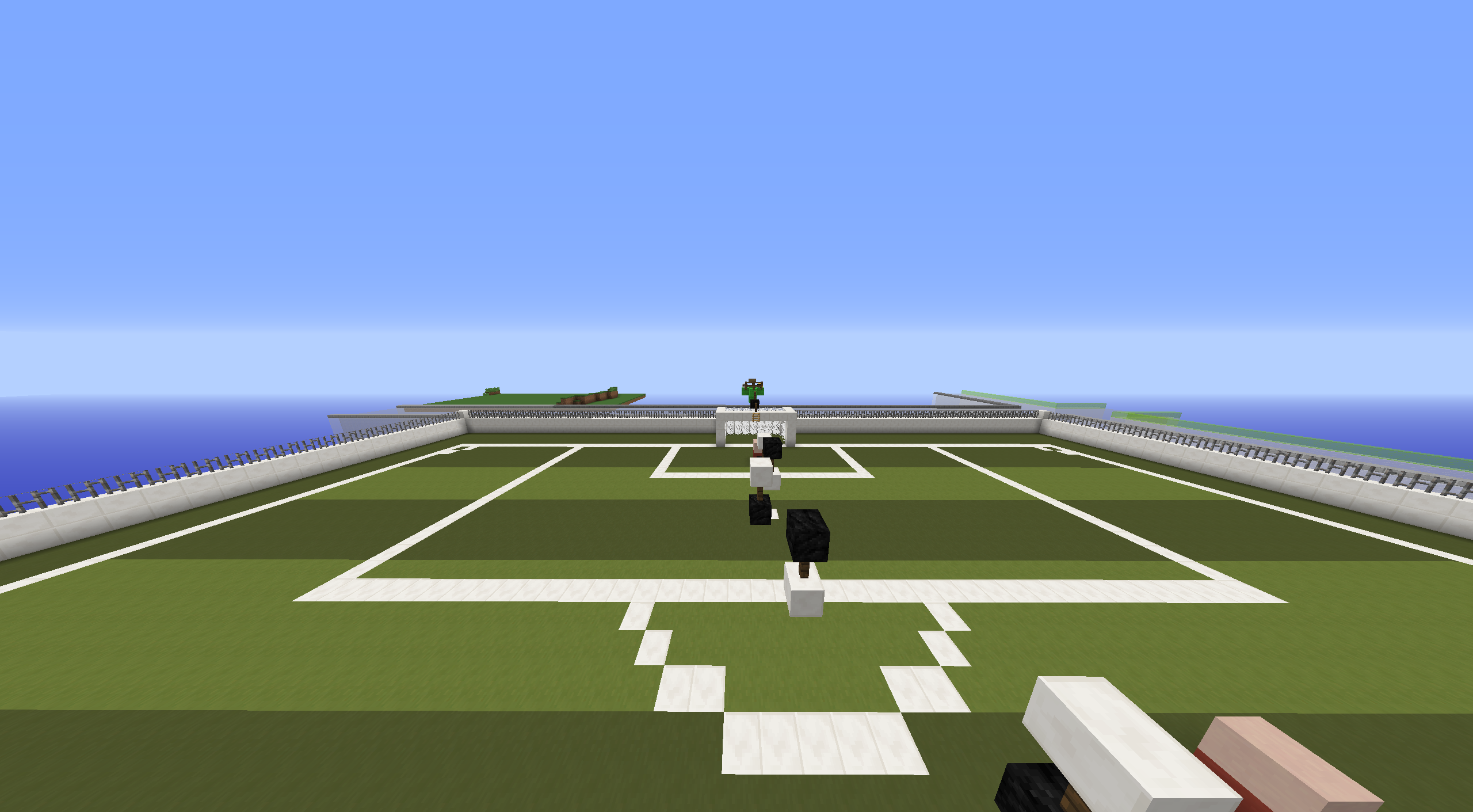
Hello! I love soccer, so I thought this would be a fun map. There is a lot of jumps. However, they aren't difficult. :D
Username: ft18m
Map Name: The Pitch
Difficulty: Medium
Number of Jumps: 100
Plot #: 1

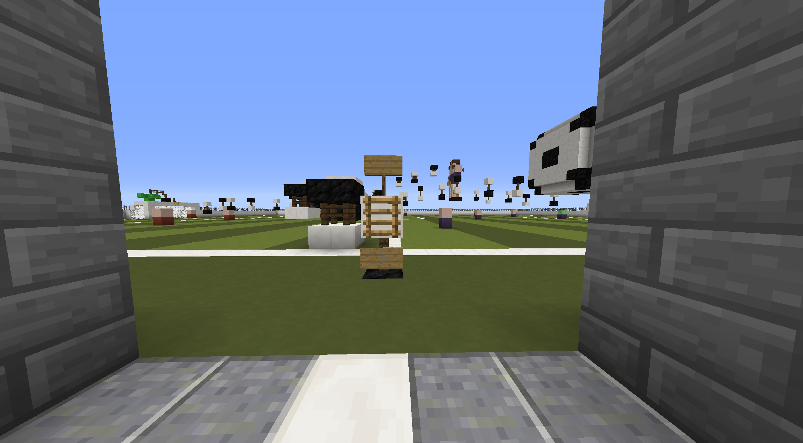
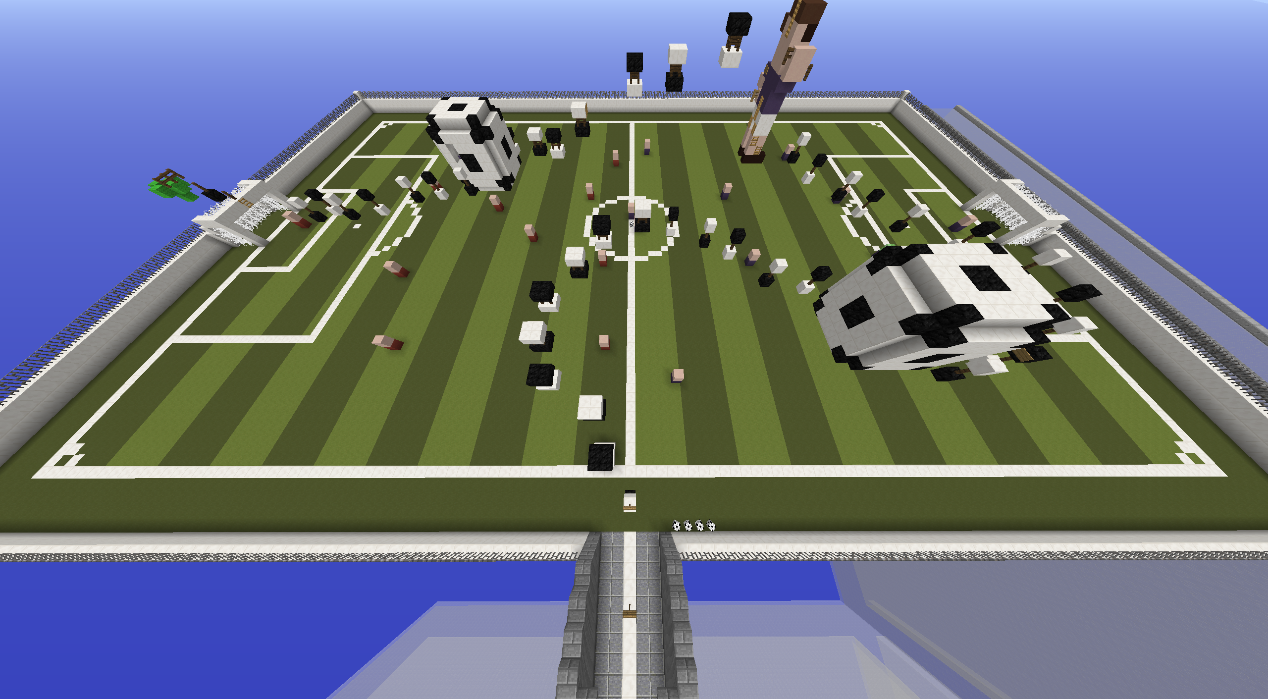
If this is rejected, please tell me a couple of things to change. I know the build is pretty large and most likely violates the second rules regarding width.
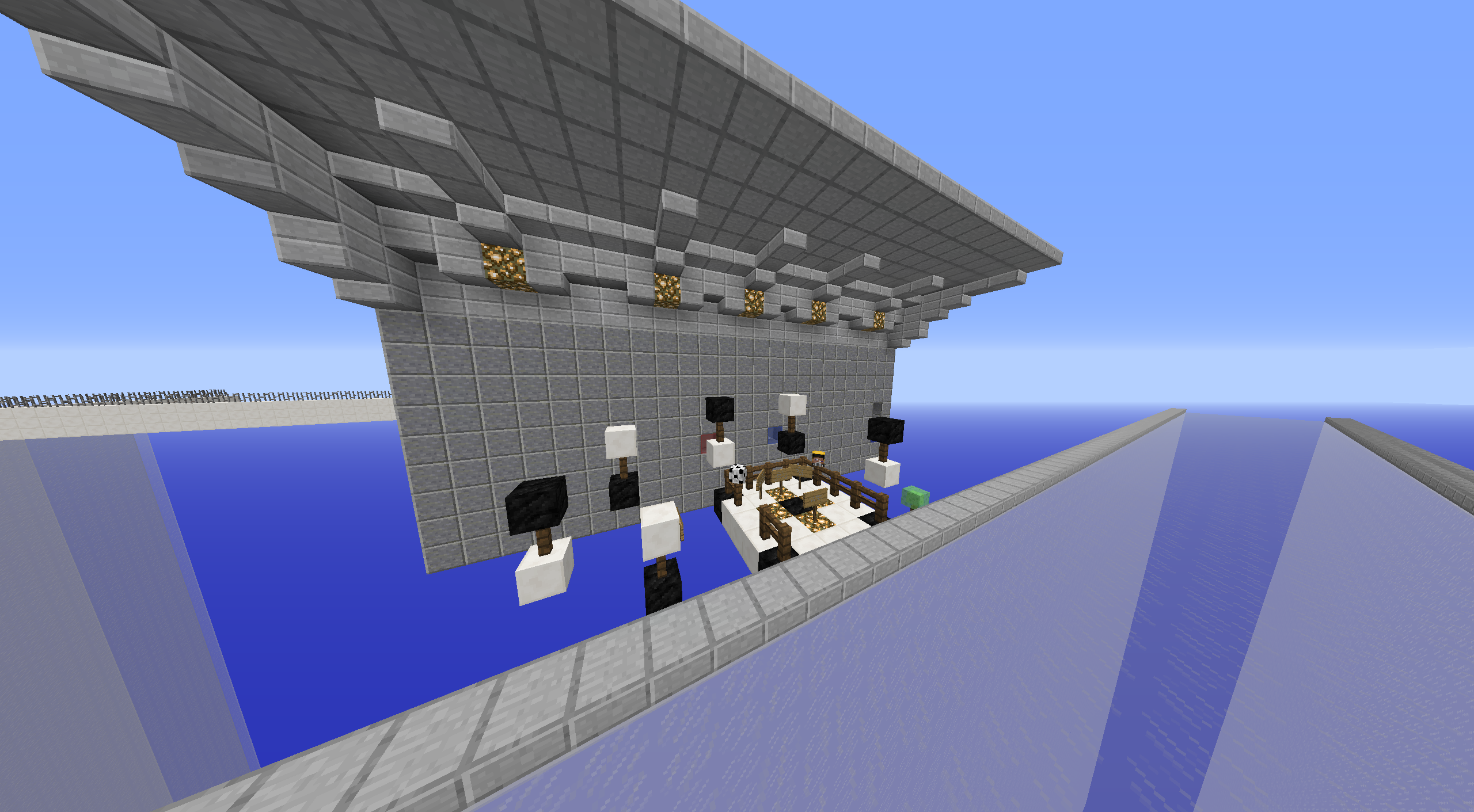
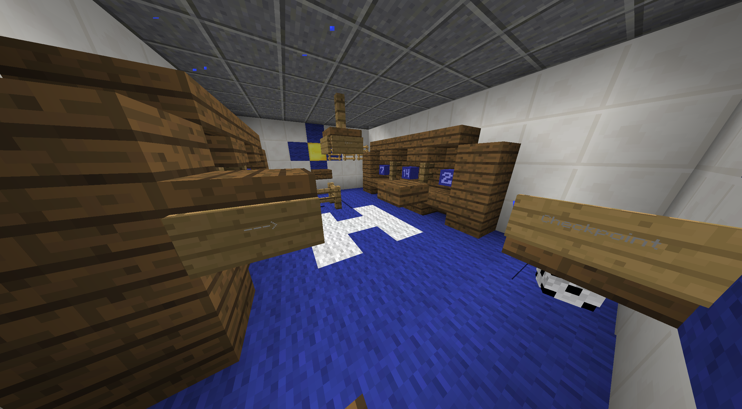
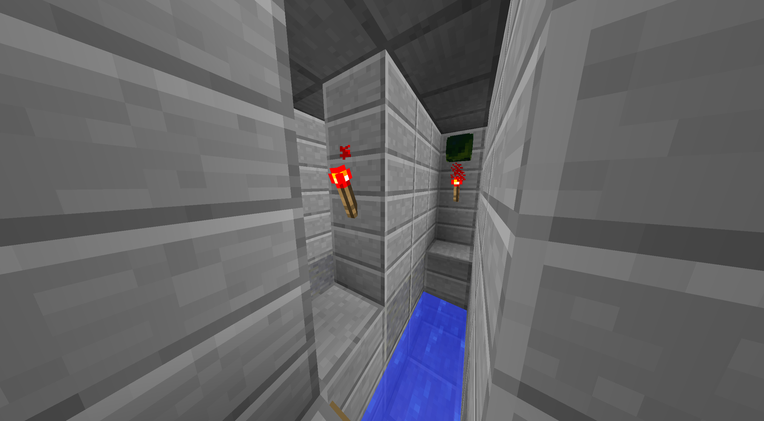
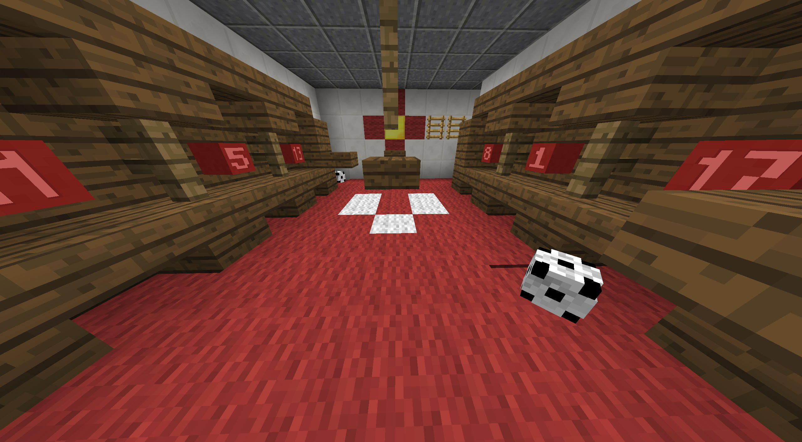
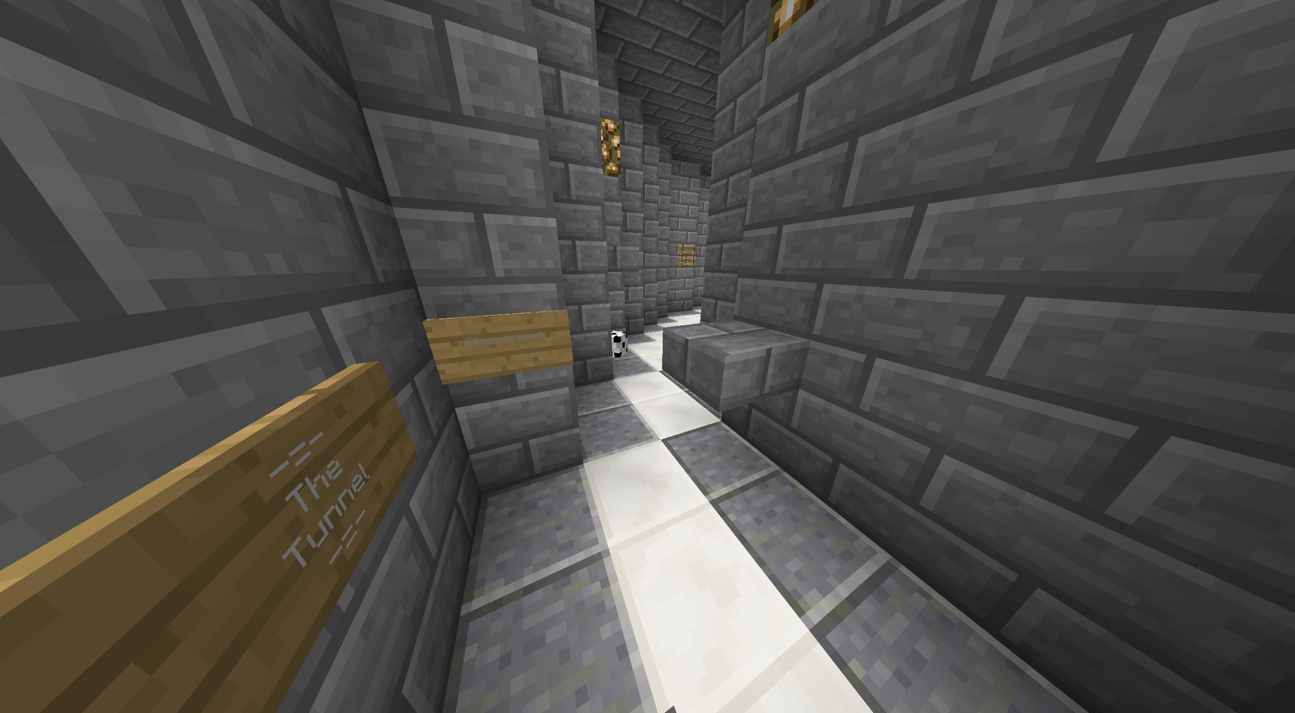
2020-03-29_04.44.27.png
2020-03-29_04.45.01.png
2020-03-29_04.45.22.png
2020-03-29_04.45.41.png
2020-03-29_04.45.49.png
2020-03-29_04.45.57.png
2020-03-29_04.46.10.png
2020-03-29_04.46.15.png
2020-03-29_04.46.19.png
2020-03-29_04.46.25.png
 

Uneasilly // Sil

Forum Master
ELITE
Uneasilly
Uneasilly
ELITE
Joined
Nov 21, 2019
Posts
943
Ratings
522 6
#2
Hey ft18m! Unfortunally, this map is unorginal, as we already have several soccer-themed maps. The build looks decent, but it could have some more detail, in my opinion. The parkour is way too long for a medium course, since a medium map should have around 30-50 jumps. Also, you could try to add more variation in the parkour, since you mostly used normal blocks. Try to use blocks such as vines, water, fences, trapdoors, brewing stands, panes & heads, etc. This will make the parkour more fun and interesting to play.

I hope these tips help, best of luck! -Sil
 

Shinxray

SrMod | Parkour Manager
Senior Mod
Shinxray
Shinxray
Senior Mod
Joined
Sep 6, 2017
Posts
1,115
Ratings
695 11
#4
Hoi ft18m,
Sorry to tell you that your map have been rejected.
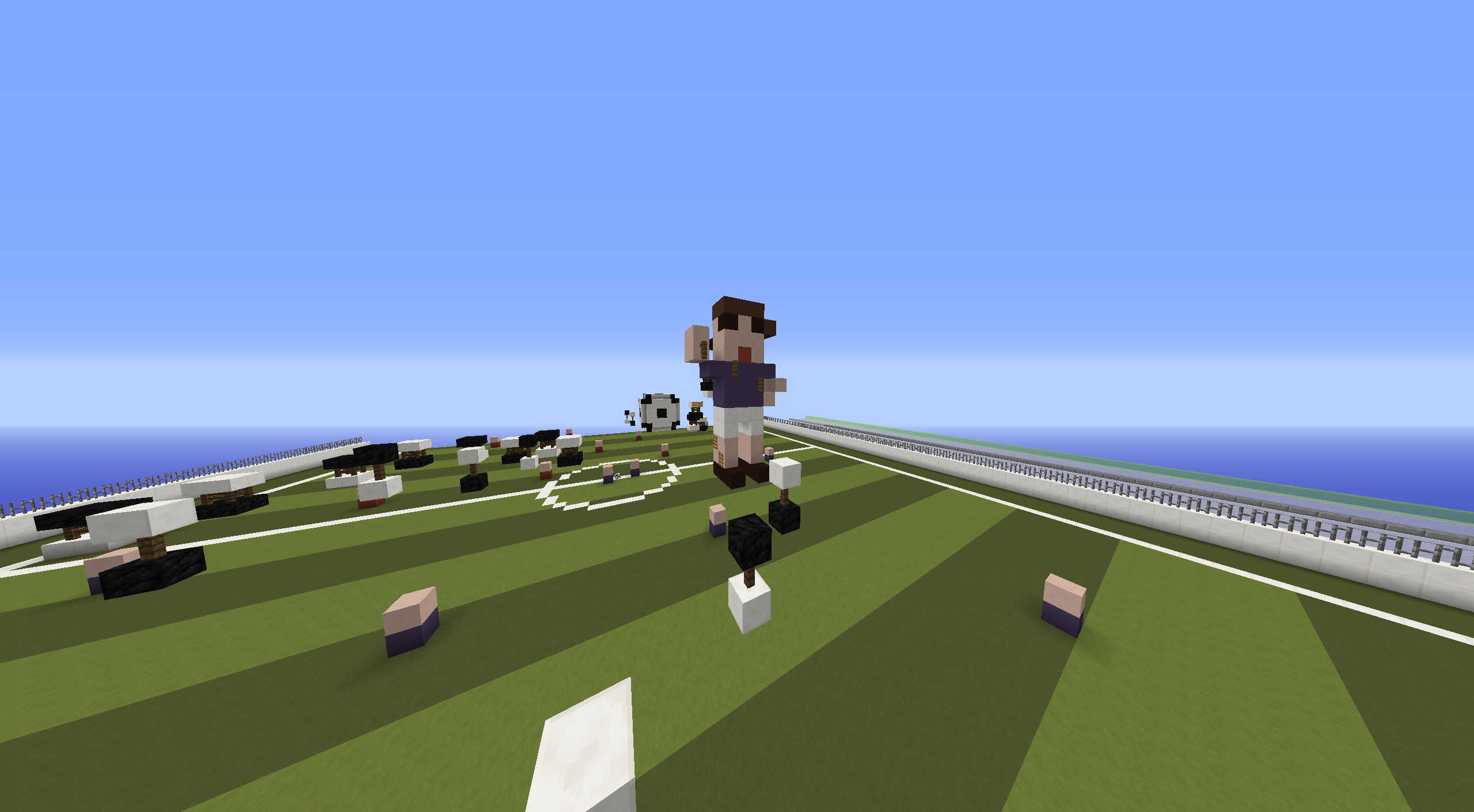
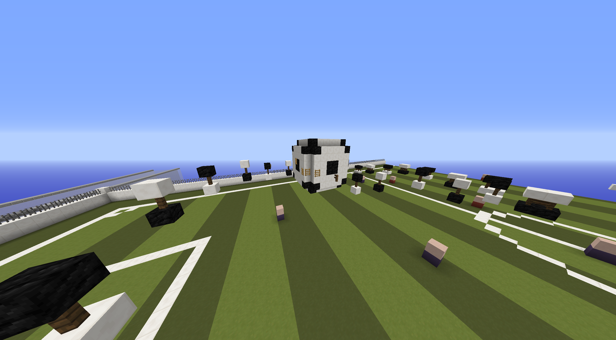
The theme is not really original, as we already have one Soccer/Football theme map (Soccer), so please be careful next time ! The build could be better, while I think the terrain looks cool, I have 3 problems : 1 ,the build is too big width wise (your build is 125 blocks wide), 2 : the parkour on the terrain make the map quite messy, please try building your parkour on/in the build and not around, and 3 : I feel it would have been better if we could see the terrain from the start, but the first parts are hiding everything, which is quite sad. The parkour is also not really good, while I like the variety of blocks on the first part, the rest of your map feel really repetitive, since it's mostly normal and ladder jumps, so please try using the ices, soul sands and fences you used at the start, but also vines, iron bars, flower pots.. through the map, I also don't really like the maze part at the beggining, it make the map a bit confusing. Lastly, like sil said, 100 jumps is way too long for a medium, try aiming 40-60 for a medium map.

Thanks for submitting your map, would be really good to see more maps from you !
 
Status
Not open for further replies.