Rejected Abandoned Manor - Medium

Status
Not open for further replies.

Tomburgers

Active Member
PATRON+
Tomburgers
Tomburgers
ELITE
Joined
Sep 21, 2019
Posts
36
Ratings
25
#1
The map creator and designer of the course is Tomburgers.

Was created on Tomburgers' plot.
Command In game - /Plot v Tomburgers 1

The course has 53 jumps and tests the players ability in block, ladder, fence and wall parkour. It also throws new and challenging jumps in the way to prepare new players for further jumps and more difficult maps.

The map has a more natural style of parkour rather than being overhauled with floating blocks. The map is not exploitable as precautions have been taken place and I have had many volunteers test the map and have made sure every jump is possible and accurate to the difficulty of the map.

I had 0 helpers create the course, meaning the entire course was my own work. This is however my first map and I attempted to get it as perfect as I wanted it to be.

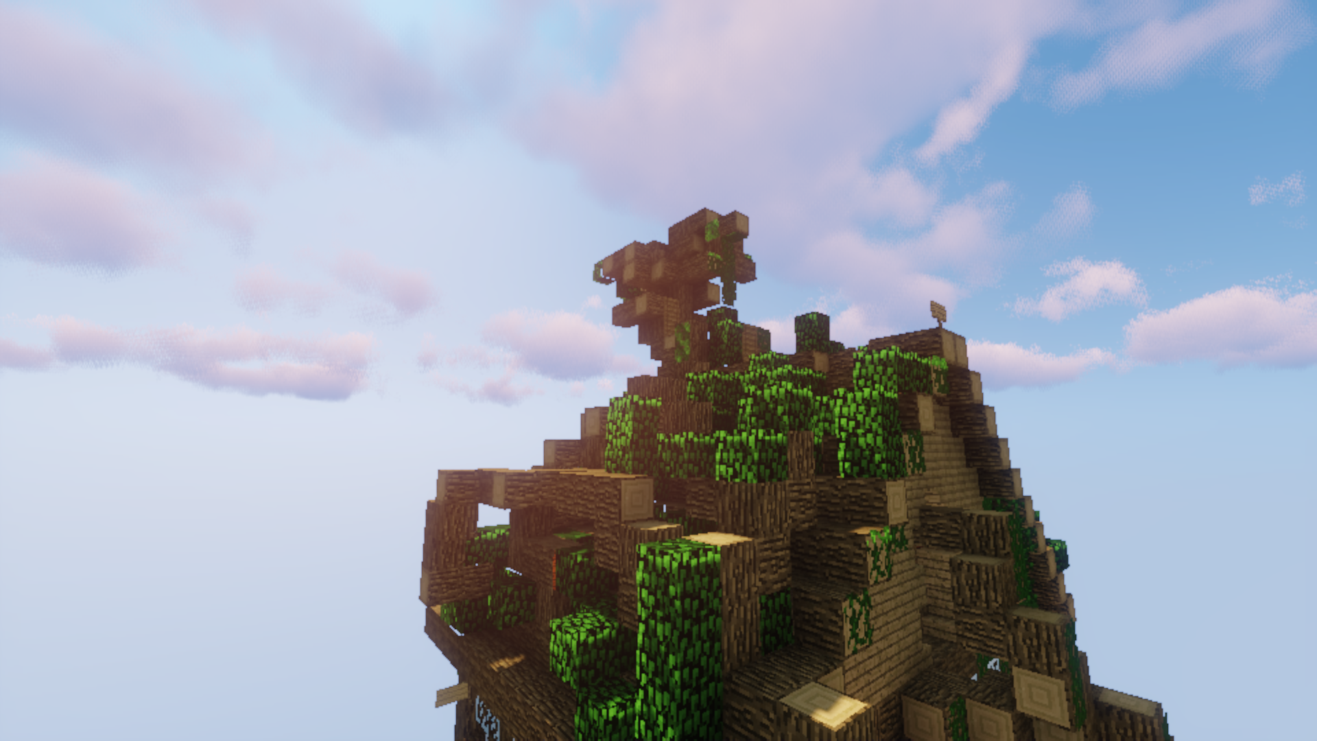
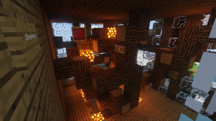
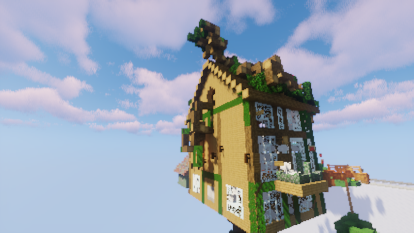
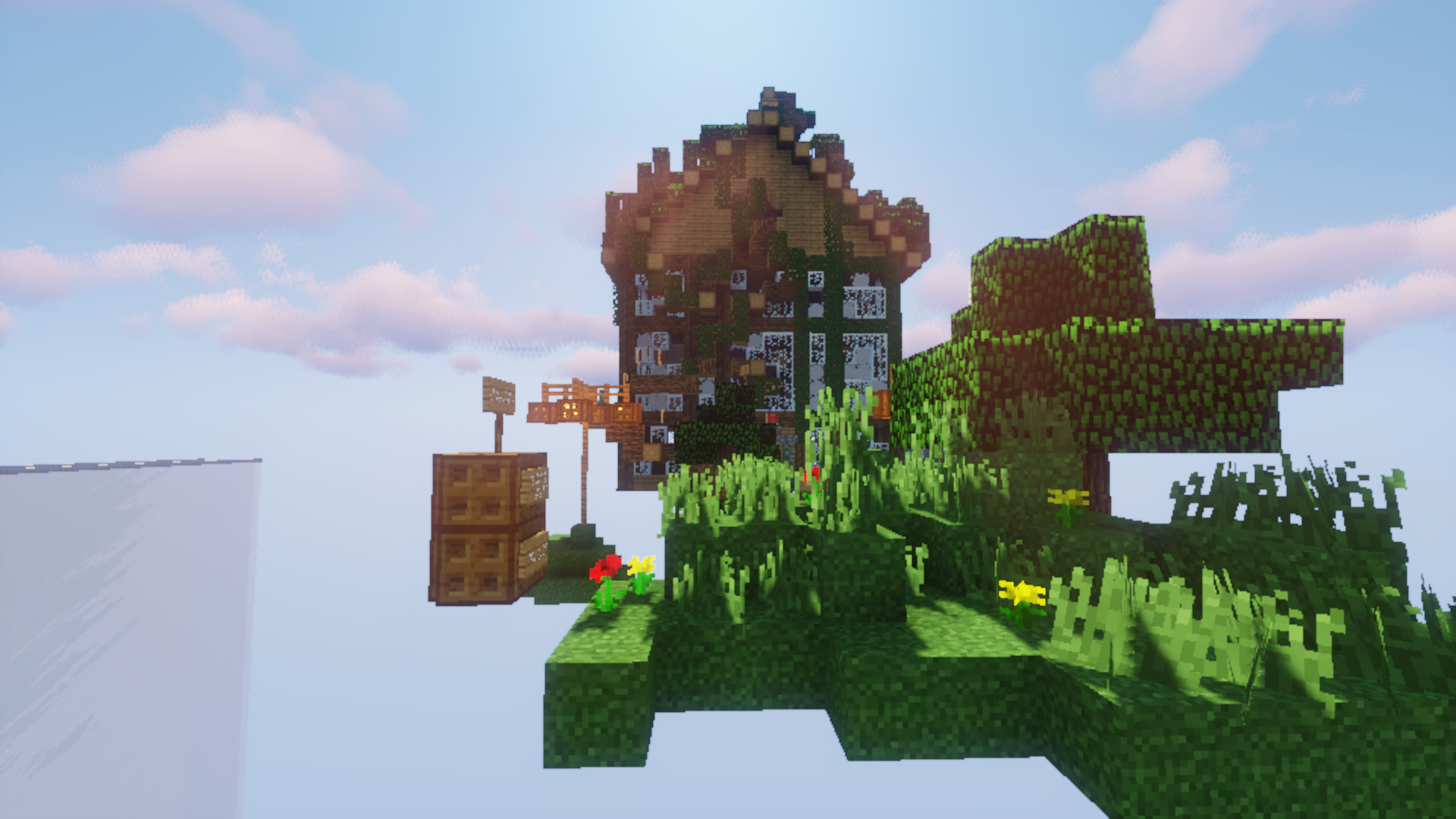
Map overview:
2019-11-07_23.02.38.png

2019-11-07_23.08.05.png
2019-11-07_23.16.32.png

2019-11-07_23.18.05.png


I have attempted to make the course as pretty as possible to entice players to come and play the map and hopefully enjoy it.
 

Cogsworth

Well-Known Member
Cogsworth
Cogsworth
Joined
Oct 27, 2019
Posts
66
Ratings
21
#2
+0.25 The build is nice, but might be a too bit messy. Especially the tree growing inside the manor. The theme is a little bit unoriginal, as we had houses/manor/mansions before.

I have not checked the parkour. Since I'm writing this on mobile.

Overall, nice build but you could probably clean it up a little and add more detail, especially to the texture of the house as it looks a bit plain using just wood and log.
 

Tas

Member
ELITE
ManaLabs
ManaLabs
ELITE
Joined
Nov 2, 2017
Posts
1,620
Ratings
1,315 43
#3
Theme:
Originality: 2/10. We have many house-themed maps and many "abandoned" maps.​
Creativity: 3/10. You simply combined two unoriginal themes.​
Build:
Attractiveness: 3/10. Despite being drenched in vines, the walls of the house were flat and plain and not very interesting. The floating islands were completely flat on the bottom, which is unrealistic and unattractive.​
Palette and variety: 4/10. The house is entirely oak logs and planks, which is not a good palette at all. The brick shed off the side was nice, though, good job on that!​
Detail: 3/10. This could have been detailed, but has been so covered in "details" to the point of just being a mess. The cobwebs in the windows are nice but the vines are really too much for the build, and I can't understand the random placement of oak logs that fill the house. Remember: everything in moderation.​
Parkour:
Difficulty: 7/10. The bright side to this map is that the difficulty matches Medium well. However, a percentage of the difficulty is based on a very confusing path, and two surprisingly difficult jumps (http://prntscr.com/ptzhxn and http://prntscr.com/ptzi67).​
Variety: 2/10. Aside from a few fence jumps, the parkour was almost entirely normal jumps and ladders. Although I'm a big fan of natural parkour, don't be afraid to use a variety of blocks! It's an important part of the parkour.​
Fun: 3/10. As I said, the parkour was repetitive and confusing, as well as a good amount of it being in a swamp of oak logs, so it was not a fantastic experience.​
Verdict:
3/10. Unfortunately I don't see this map being accepted, even with improvements to the build and parkour, because of the original theme. You're an active player and so I encourage you to experiment with some unique build ideas and jumps.​

Good luck, and I hope you keep making maps!

P.S. There's a pretty big skip here (http://prntscr.com/ptzjoy) that allows you to skip almost the whole map.
 

k_rissy

Forum God
PATRON+
k_rissy
k_rissy
Patron+
Joined
Jan 2, 2018
Posts
2,740
Ratings
1,322 25
#4
Hello Tomburgers,

I regret to inform you that your map is being rejected.
The theme is unoriginal, as we already have some house/abandoned related maps (AbandonedFactory, ModernHouse.)
The build is good, and I can tell that a lot of effort went into it, so good job on that! However, I think it would have been better without the excessive vines; not only does it make the build look messy, but there's also the huge exploit that Tasses pointed out.
The parkour was
varied in certain spots, but it was also quite confusing. I do believe it fits the difficulty, so good job on that!

Thank you for submitting your map, I would love to see more submissions from you!
Have a nice day,
Kristina
 
Status
Not open for further replies.