play.manacube.com
Loading Status...Rejected Articuno - Insane
- Thread starter carvhes
- Start date
- Status
- Not open for further replies.
My only critique is I feel the build could use a tiny bit more texturing because the body is entirely wool

Hello carvhes, awesoness, and GamersDecision,
I regret to inform you that your map is being rejected.
The theme is original, so well done there.
The build is one of the concerns. Overall, while it is semi accurate to what you were going for, there are a few issues;
-The legs are not really accurate to Articuno. They are too skinny and disproportioned compared to the rest of the body. In certain parts, it looks like it was worldedited in.
-The wings are also off. The glass parts feel rushed, and the ice at the end is a bit clumpy.
The parkour has concerns of its own. There are consistency issues with the difficulty; the start of the map is quite easy and needs to be buffed, while there are jumps too difficult toward the end. Some of the chains could also be removed or reworked; there is a lot more room for creative jumps. These sections will be identified below.
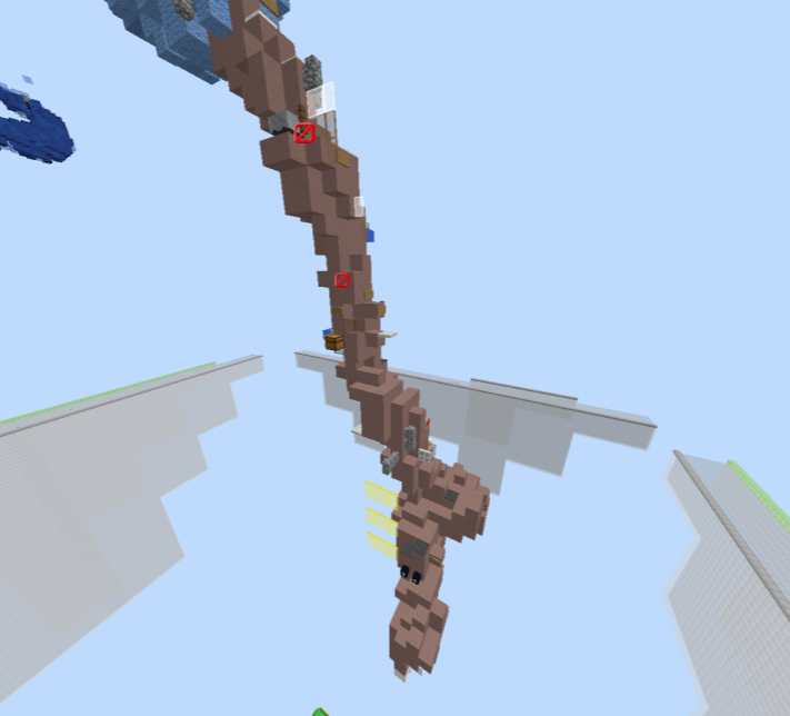
Most of the parkour on this leg could be buffed.
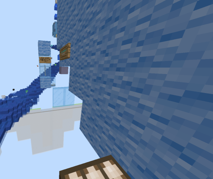
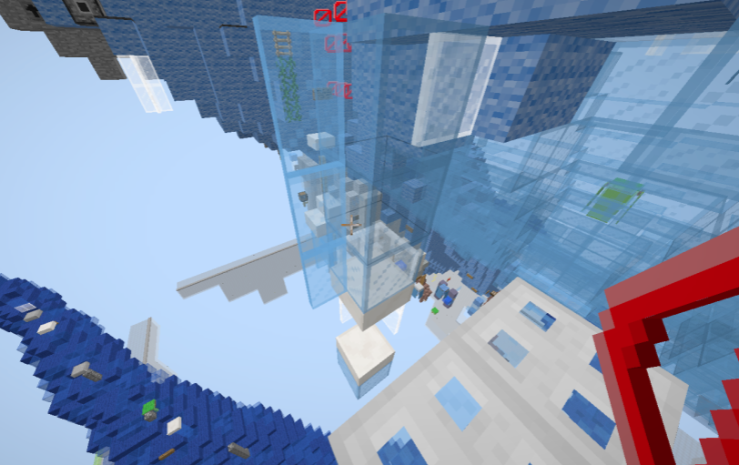
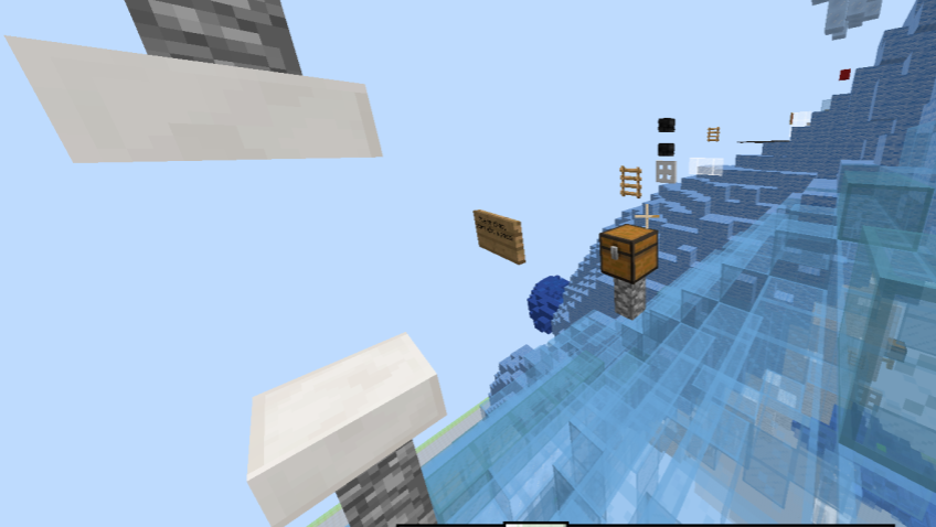
The next jumps could all be nerfed:
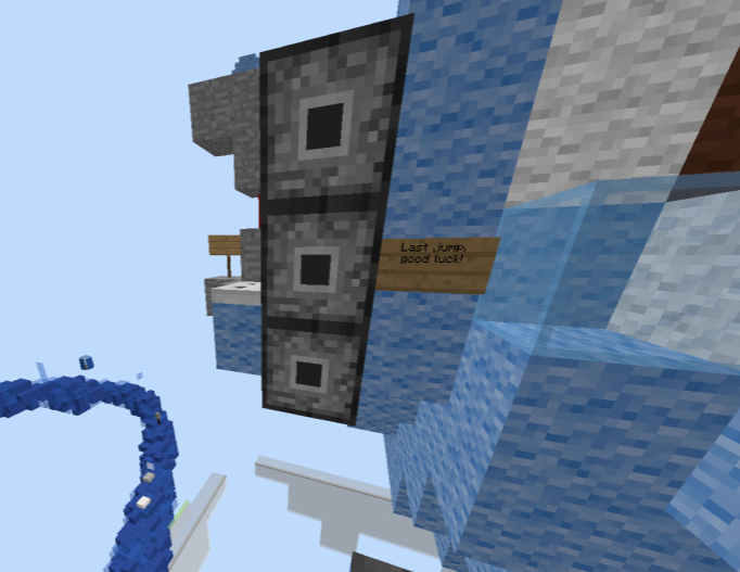
Thank you for submitting this map, I would love to see more submissions from you!
I regret to inform you that your map is being rejected.
The theme is original, so well done there.
The build is one of the concerns. Overall, while it is semi accurate to what you were going for, there are a few issues;
-The legs are not really accurate to Articuno. They are too skinny and disproportioned compared to the rest of the body. In certain parts, it looks like it was worldedited in.
-The wings are also off. The glass parts feel rushed, and the ice at the end is a bit clumpy.
The parkour has concerns of its own. There are consistency issues with the difficulty; the start of the map is quite easy and needs to be buffed, while there are jumps too difficult toward the end. Some of the chains could also be removed or reworked; there is a lot more room for creative jumps. These sections will be identified below.
Most of the parkour on this leg could be buffed.
The next jumps could all be nerfed:
Thank you for submitting this map, I would love to see more submissions from you!
Attachments
-
517.7 KB Views: 116
- Status
- Not open for further replies.
2013 - 2024 © ManaLabs Inc.
ManaLabs is an Official Minecraft Partner
ManaCube is a multiplayer network for Minecraft Java Edition. IP: play.manacube.com
The ManaCube server is not endorsed by Mojang, AB.
ManaCube is a multiplayer network for Minecraft Java Edition. IP: play.manacube.com
The ManaCube server is not endorsed by Mojang, AB.
