play.manacube.com
Loading Status...Rejected Backyard / Insane
- Thread starter ILeftTheGame_
- Start date
- Status
- Not open for further replies.
Hello there :)
I won't give this map a rating for now as I'm not online, but I would like to say a few things:
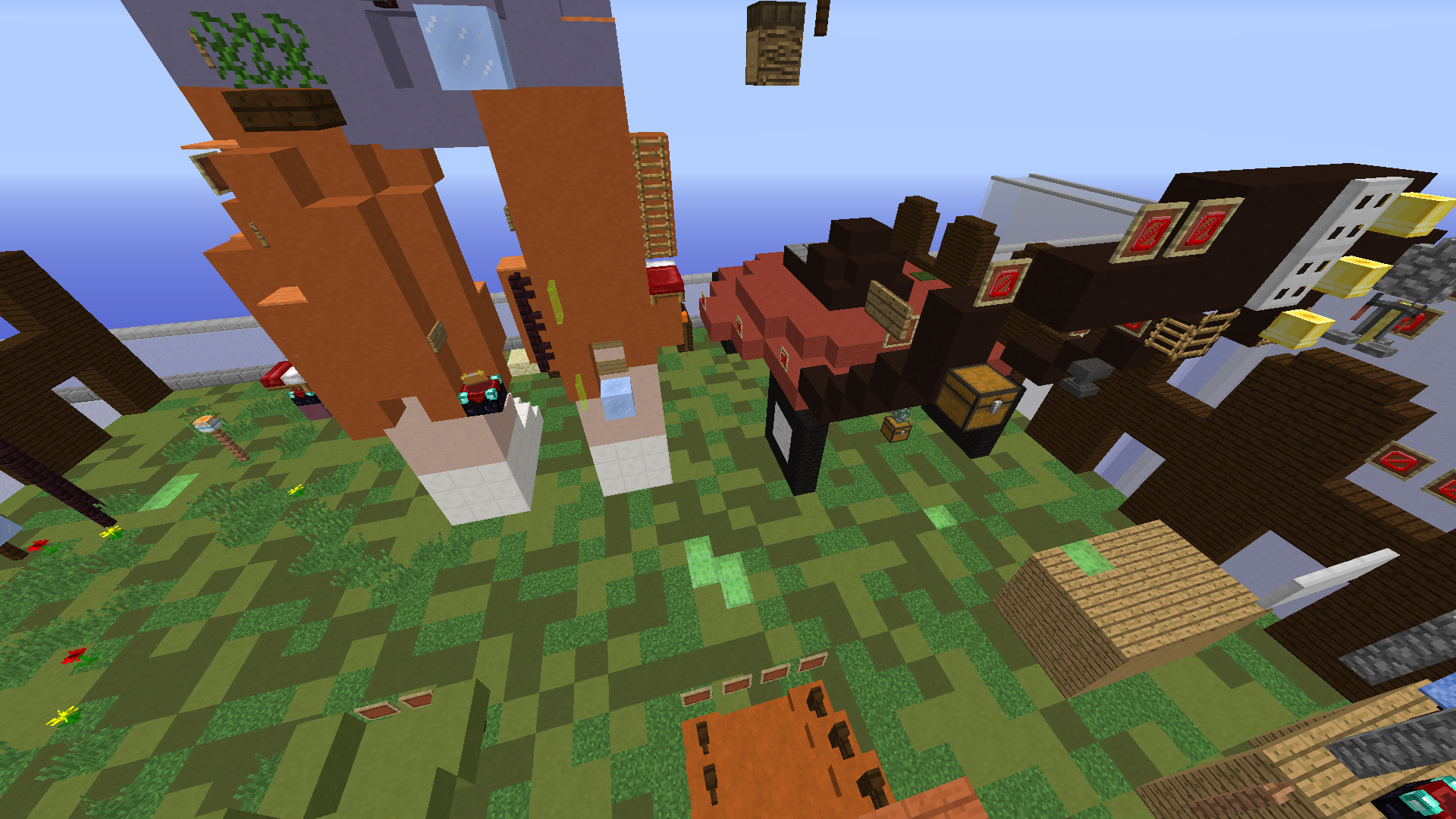
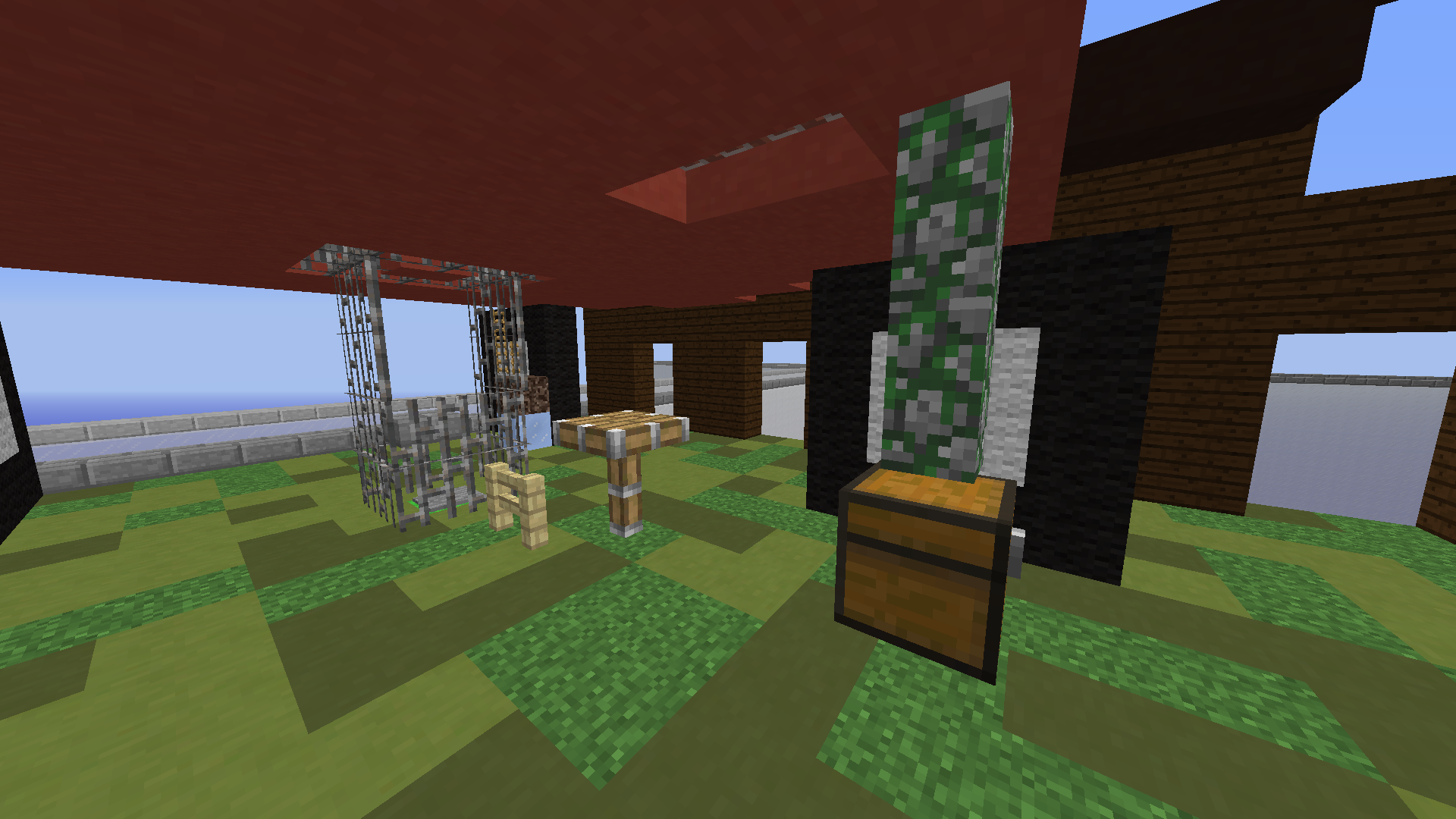
As far as the build, I would say that the scale of this build is very strange. There's player scaled sheds/huts, but then the main objects in the build (person, lawn mower, and the fencing) are over sized. Try to keep objects in the same scale throughout the build :)
I would also say the lawn mower itself is a bit odd, as there's not really any motor or anything that gives it the bulkiness that i feel a mower has, and it's very high off the lawn (as in, this mower wouldn't really be doing much of its job haha) unfortunately there is parkour underneath the mower from what I can see, so the bulk would have to come from adding onto the mower sides.
In addition, there's a lack of consistency in style in this build. By this, I mean that certain parts of the build look very different compared to others. On the lawn, there's a lot of 2D texture added via different kinds of blocks used, while the fence, shed and mower are a more simple style. The person is full of 3D texture (as in his shape is much more jagged which communicates things about the texture of his clothes).
These are more advanced critiques, as you clearly have some knack for building. I just wanted to point out some of more complex things to building to help you out :) The scale of the build is what throws me off the most.
Please note that while I may be staff, I am not a map judge. I just like giving feedback on map submissions to help improve people's skills in the community. Good luck on your submission!
Hey SacredPvP!
I'm here to give you my review of the map.
I think this level needs some slight adjustments before it gets accepted.
The theme is good, I don't think there is a map about a backyard. Park is the closest thing I can think of right now but there's probably some other maps that I'm missing.
The build is decent, but like Quinny said the scale is a bit off. I think you should replace the huts with something else.
The parkour is good for Insane but I feel like there are some jumps that need tweaking. I think you could also add some more checkpoints since a lot of the parts are very long which makes the parkour rather unfun

I think this part is just annoying. You hope for the good vine bounce and if you fail you try again. I would change this part to something else.

You jump from the chest to the slimes and go on the ice. I was unable to do this a single time because you jump from a chest and can't fit between the ice and the clay block above. This makes it rather precise and maybe even impossible. I was unable to do it even once, the character would just fall past the ice every single time.

This chest to piston has the same problem as the slime jump. The character is unable to squeeze between the two block space because you jump from a chest. It makes this jump impossible.
Good luck with your submission! :D
I'm here to give you my review of the map.
I think this level needs some slight adjustments before it gets accepted.
The theme is good, I don't think there is a map about a backyard. Park is the closest thing I can think of right now but there's probably some other maps that I'm missing.
The build is decent, but like Quinny said the scale is a bit off. I think you should replace the huts with something else.
The parkour is good for Insane but I feel like there are some jumps that need tweaking. I think you could also add some more checkpoints since a lot of the parts are very long which makes the parkour rather unfun
I think this part is just annoying. You hope for the good vine bounce and if you fail you try again. I would change this part to something else.
You jump from the chest to the slimes and go on the ice. I was unable to do this a single time because you jump from a chest and can't fit between the ice and the clay block above. This makes it rather precise and maybe even impossible. I was unable to do it even once, the character would just fall past the ice every single time.
This chest to piston has the same problem as the slime jump. The character is unable to squeeze between the two block space because you jump from a chest. It makes this jump impossible.
Good luck with your submission! :D
Attachments
-
285.4 KB Views: 162
Hello xX_SacredPvP_Xx,
I'd like to begin by saying I'm sorry that your map has not been judged for so long. Anyways,
I regret to inform you that your map is being rejected.
The theme is original, as we currently don't have any maps that are solely based around a backyard, so good job on that!
The build was good; however, I feel that it is a bit small, given that this is supposed to be an insane map, and all of the structures feel cramped. I recommend expanding your build, and spreading out each of your little structures! There is quite a bit of block variety throughout, so good job on that!
The parkour is varied throughout, and it is incorporated with the theme quite nicely, so good job on that! There were some portions were I was confused on where to go during testing, so please just make sure that you have plenty of directional indicators. The length of the course and difficulty of the jumps are good for the insane difficulty!
Thank you for submitting your map, I would love to see more submissions from you!
Have a nice day,
Kristina
- Status
- Not open for further replies.
2013 - 2024 © ManaLabs Inc.
ManaLabs is an Official Minecraft Partner
ManaCube is a multiplayer network for Minecraft Java Edition. IP: play.manacube.com
The ManaCube server is not endorsed by Mojang, AB.
ManaCube is a multiplayer network for Minecraft Java Edition. IP: play.manacube.com
The ManaCube server is not endorsed by Mojang, AB.
