Rejected Hard - DimensionHopper

Status
Not open for further replies.
Joined
Mar 12, 2019
Posts
3
Ratings
1
#1
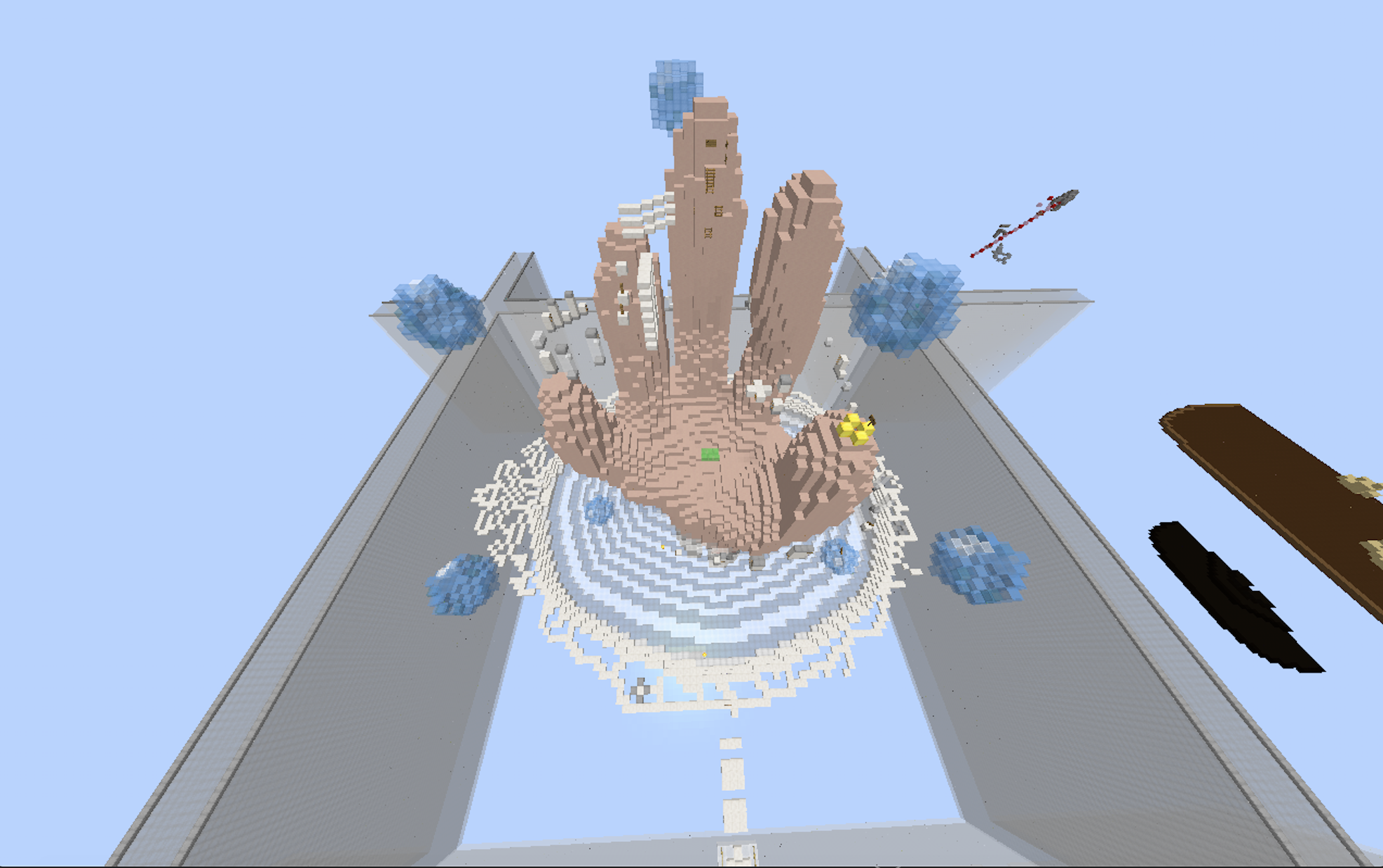
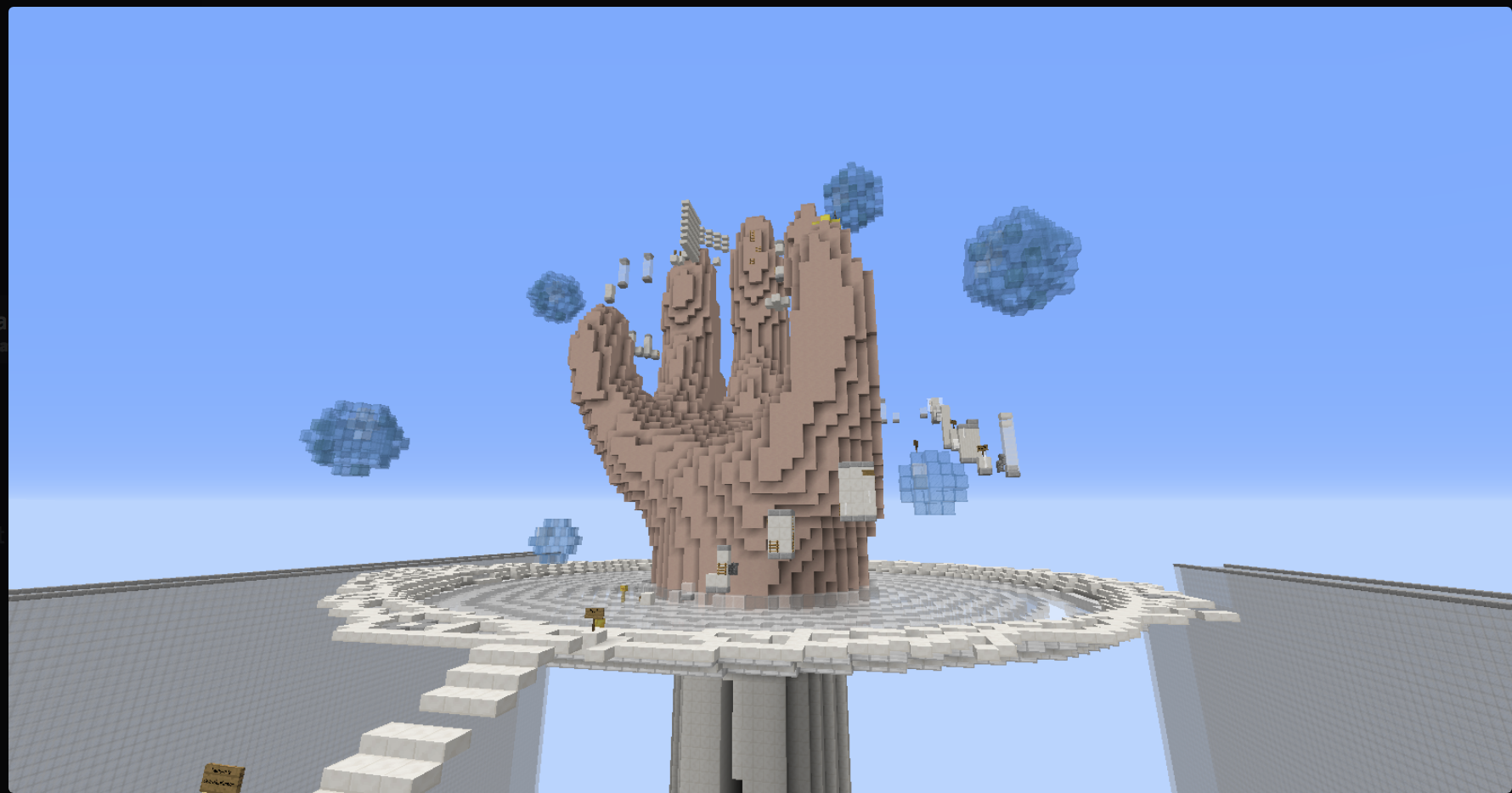
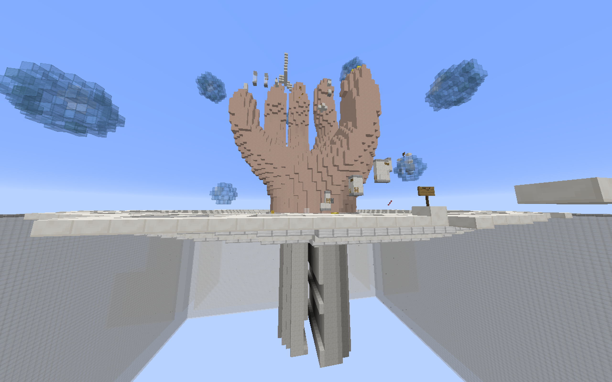
This is a map based off of the theme of dimension hopping. The topic of the build is an undead character entering the real world through a mirror. The bubbles scattered around are to imply a particle effect.

Details:

* Username - FallOutMia
* Map name - DimensionHopper
* /plot visit FallOutMia 2
* Difficulty I am aiming for is Hard
* 68 Jumps (may need a recount)

Pictures:
Screen Shot 2019-06-20 at 07.46.20.png

Screen Shot 2019-06-20 at 08.01.11.png
Screen Shot 2019-06-14 at 20.20.20.png
 

Attachments

Luci

Forum Expert
ELITE
drowfie
drowfie
ELITE
Joined
Dec 29, 2016
Posts
257
Ratings
98 3
#2
Hiya!
I'll be giving this a +0.5 for these following reasons, the theme is pretty original although there are already some "Different Dimensions" maps related to minecraft, but none like this. The build overall is pretty good, it does look a bit awkward but that can be expected when making a bigger type of build like this. For the jumps, they are well varied and they fit the difficulty you're going for accurately, my only concern is the floating jumps; they make the map look messy and slightly unattractive, I think if you try to fit the parkour more onto the build it would look better. But overall, I would love to see this added!
Best of luck!
 

k_rissy

Forum God
PATRON+
k_rissy
k_rissy
Patron+
Joined
Jan 2, 2018
Posts
2,740
Ratings
1,322 25
#3
Hello <3,

I will be giving this a 0. I believe the theme is original, although as Luci stated, the dimensions concept may be slightly unoriginal. The build is really well-done and really detailed, and it is clear that a lot of effort was put into it. However, the build could be considered a bit messy. The jumps are varied enough, but as Luci said, floating jumps are a problem. I believe it fits the hard difficulty.

I wish you the best of luck! <3
 

Faudon

Forum Expert
QA Team
Faudon
Faudon
QA Team
Joined
Dec 5, 2015
Posts
366
Ratings
352 6
#4
Heyoo FallOutMia,
Sadly, I'll be rejecting your map, for the following reasons:
The theme for your map is original, even though as Luci mentioned "Dimensions" theme could be considered unoriginal.

About your build, it is amazing and all the details that you added into your build made it look much more appealing, the usage of the blocks in the map also made it stand out. (Clay, quartz, light glass, etc).

And... main reason why the map has been rejected: Parkour
It was messy, it was pretty repetitive, I could tell it is only ladder, cobble walls and fences, the fact you made the parkour circling the build made it look a bit ugly to look at.
Anyways, I'd recommend you to add signs and carpets to make it less messy and also changing the difficulty of your map to an easier one as you might wanna use less blocks to do parkour and make it look less messy. (IMO I'd make it an easy map)

If you patch the negative points I've mentioned above, I'll happily accept you map!


Thanks for making a map, I would love to see more maps from you!
 
Status
Not open for further replies.