Rejected [Hard] LIGHTSPEED pk

Status
Not open for further replies.

dogi

Well-Known Member
Joined
Jul 12, 2015
Posts
64
Ratings
8
#1
im back!!! and i made a new parkour, and its the one whit the most decoration
information:
/warp LSPK
jumps: 64
checkpoints: 2
dificulty: hard by the edge
images:
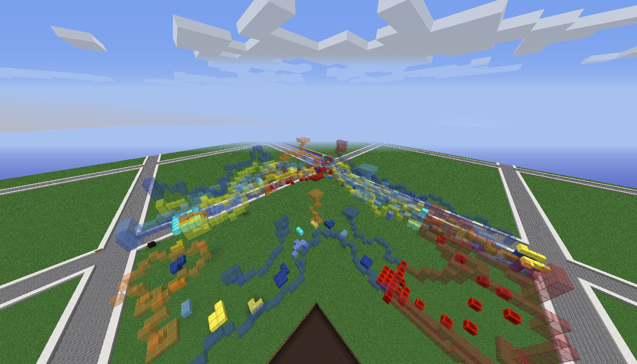
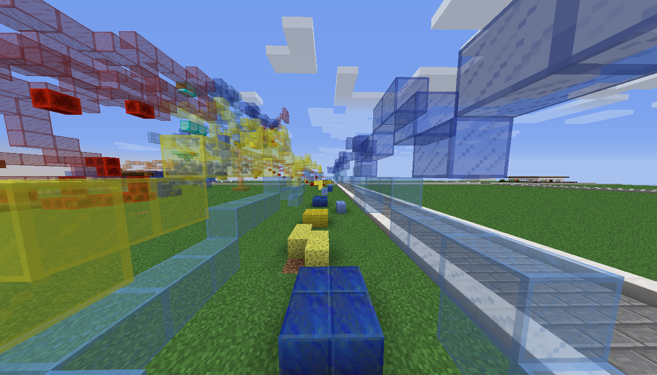
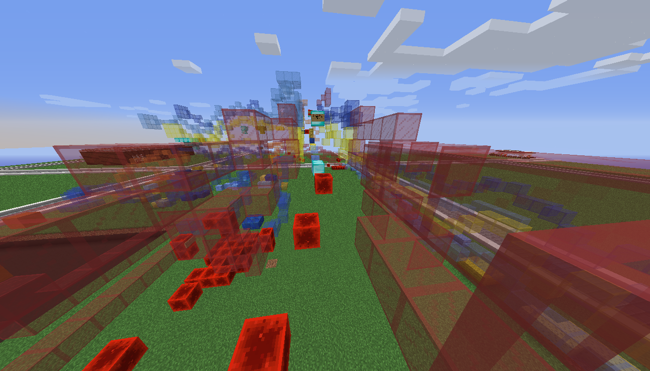
2015-10-23_19.46.51.png
2015-10-23_19.47.07.png
2015-10-23_19.47.44.png


now there are 2 things i whant to say about the pumkin pk i made like 5 months ago and the only accepted so far (which is sad)
1. this parkour is next to it but they dont touch each other so it doesnt matter
2. i request for that parkour to show up on Halloween, its perfect theme to perfect day so, please.
 
Last edited:

dogi

Well-Known Member
Joined
Jul 12, 2015
Posts
64
Ratings
8
#2
i added some netherbrick to make it easier to make a schematic.
some peaple who tested it sed it was fun and cool 4 out of 5 did it at the requested speed.
i also changed the skulls for pk because i was using my sisters skin.
 

Tenshi

Forum Legend
VIP+
Joined
Dec 23, 2014
Posts
1,335
Ratings
949 86
#3
Hello, My name is Tenshi and I am here to give you some tips and comments about your parkour map.
Firstly, Theme.
This map seems to have a unclear theme. This looks like one of those "Im out of ideas" parkour maps. No, Im not saying that this is
rejected, But is it not accepted either. I dont understand this theme at all, What is it supposed to be?

Secondly, Parkour.
View this thread here for help with jumps: http://www.minecraftforum.net/forum...tive-mode/369499-parkour-creation-tips-tricks

Thirdly, Rank.
No Comment Yet.

Thank you for taking time to create a map, Ill let @Nixi and @Pud96 give you some feedback on this course. .
Best Regards,
Tenshi.
 

Wafflethecat

Forum Expert
Mapper
Joined
Aug 13, 2015
Posts
272
Ratings
128 3
#4
Hello. I would like to say some things. as @Tenshi said this map has as unclear theme. if you did not tell me what this was I would be like "What is this? A glass wall pk?" or something like that. And even with you telling us, I do not see the theme. I would suggest a different block maybe for the light speed feeling, as the stained glass is see through and kind of ruins the effect. Also I have not entirely tested this yet, so if this has already been implemented forgive me, but if it is on the "Lightspeed" theme maybe make it all speed run-able so that the player does not have to stop, giving the more lightspeed effect. I will let the other map creators, and map judges give you more advice.

Best of luck. -Wafflethecat

Edit: Also, maybe use world edit or get someone with it if you dont have it, to delete the lower part of your plot under your parkour into the void. It will show you what it will be like if it gets put on the server.
 

gogre

Member
ELITE
gogre
gogre
ELITE
Joined
Jul 14, 2014
Posts
403
Ratings
300 37
#6
Rejected,

The map looks very very cluttered and confusing
I didnt have a very enjoyable time playing the map, I found it hard to figure out where to go, it felt very unoranised and strange.

For this reason it has been denied

Good luck on your next submission!
 
Status
Not open for further replies.