Rejected Punpun - Expert (Underwent improvements ;) )

Status
Not open for further replies.

IPattyI

Forum Legend
PATRON
IPattyI
IPattyI
Patron
Joined
May 12, 2019
Posts
1,097
Ratings
501 11
#1
Creator and Build/Parkour Maker: IPattyI
Map Name: Punpun
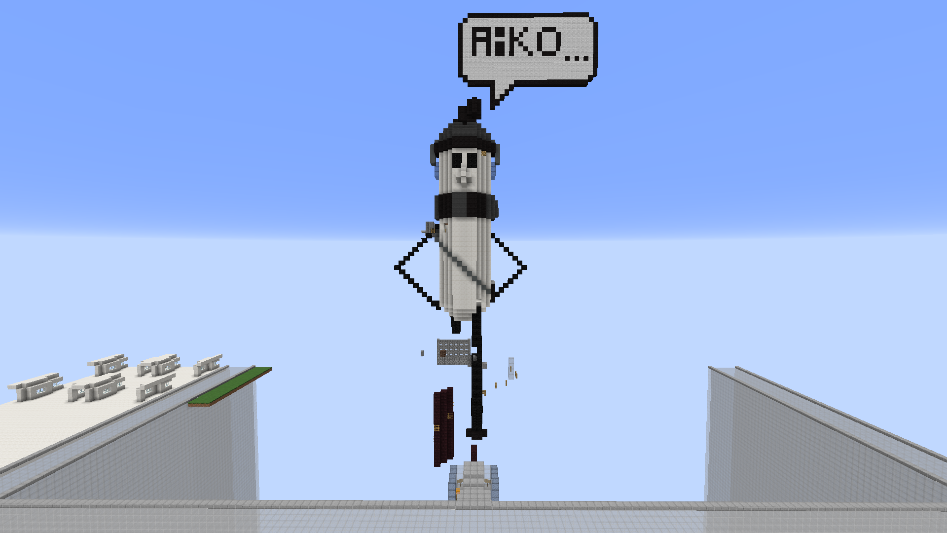
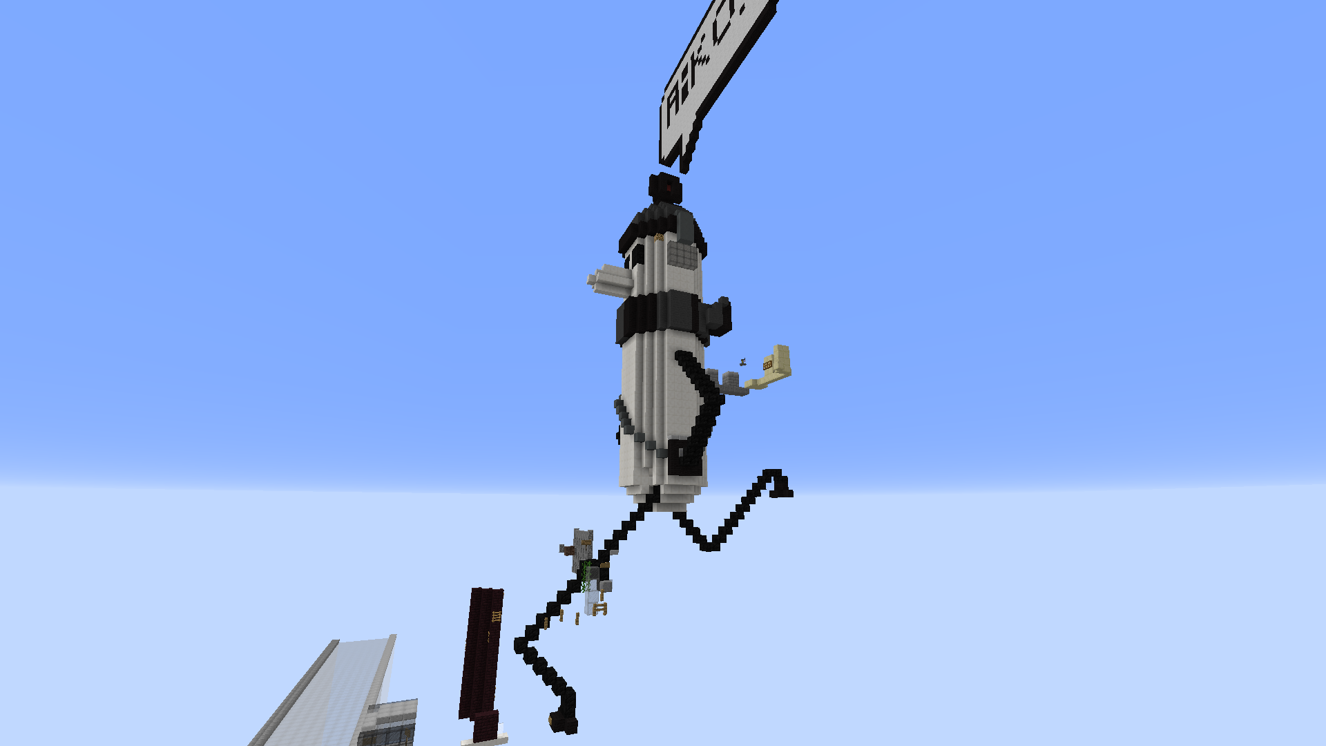
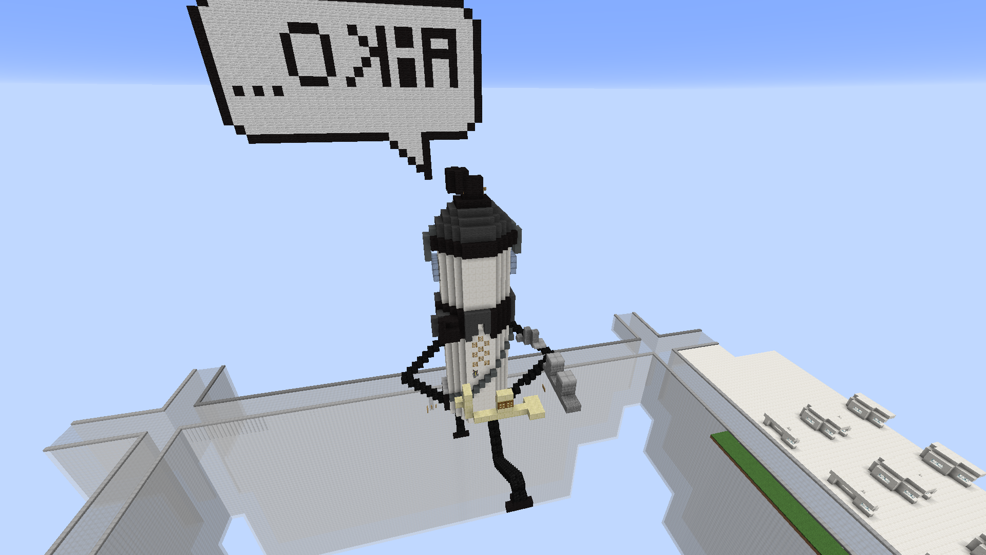
Map Preamble: Punpun is the main protagonist from a manga called Oyasumi PunPun. This is him running to meet up with his love interest while thinking about her. It’s supposed to represent a manga pannel!
Difficulty: Expert (If too hard for an expert, then I can buff it to be an insane)
Length: ~95 Jumps w 5 Checkpoints
Plot: /plot v IPattyI 2

Side note: I don’t believe this to be unoriginal because a manga really is it’s own novel/book and this hasn’t been made into an anime either, it’s just it’s own thing y’know.
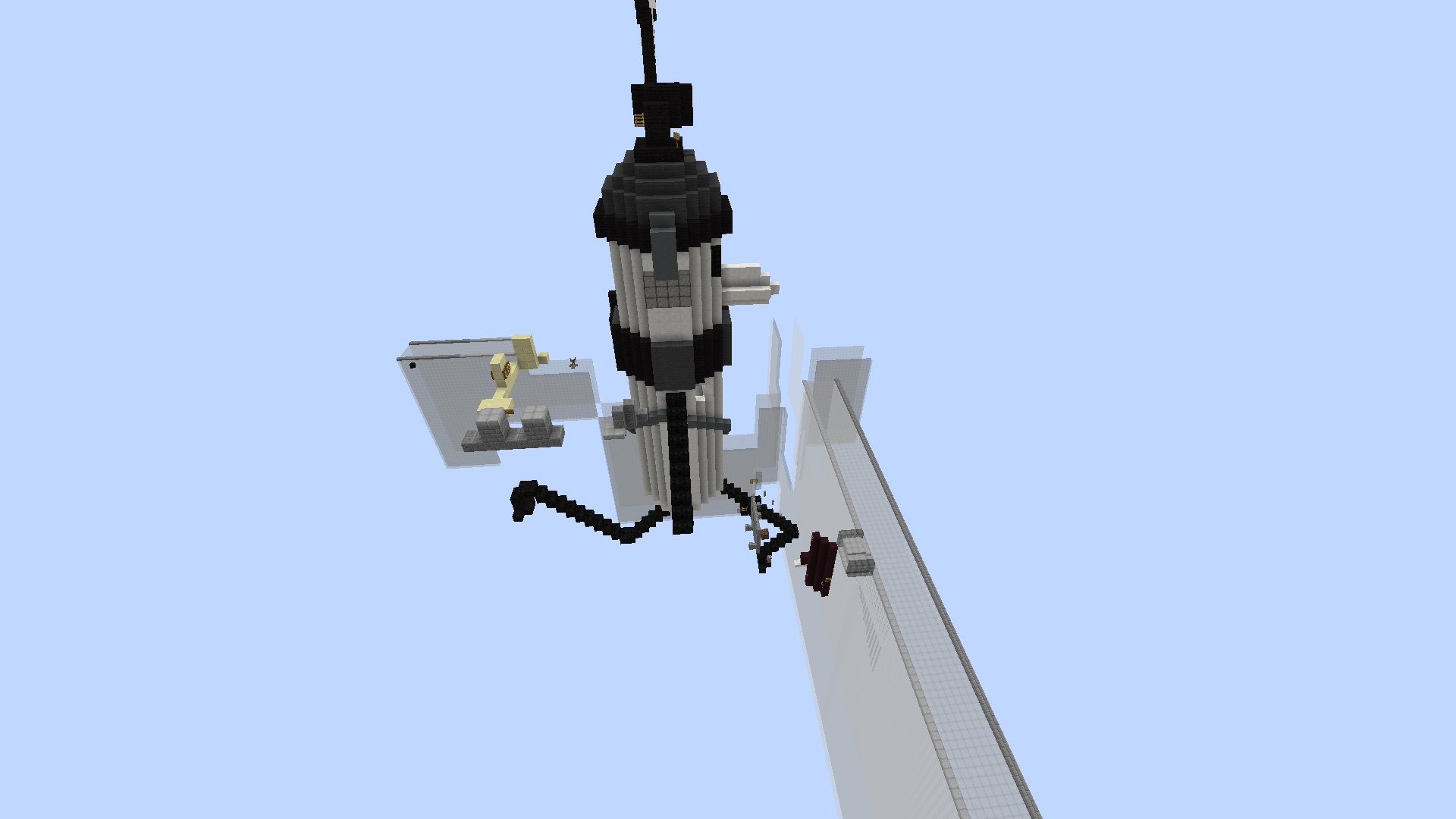
p1.png
p2.png
p3.png
p4.png
p5.png
 
Last edited:

k_rissy

Forum God
PATRON+
k_rissy
k_rissy
Patron+
Joined
Jan 2, 2018
Posts
2,740
Ratings
1,322 25
#2
Hello <3,

<NOT YOUR OFFICIAL REVIEW> I will be giving this a +1. The theme is slightly unoriginal in the manga portion, but the specific manga is original. The build is well-done and it's clear that a lot of effort was put into it. The parkour is varied and I believe it fits the expert difficulty.

I wish you the best of luck! <3
 

Tas

Member
ELITE
ManaLabs
ManaLabs
ELITE
Joined
Nov 2, 2017
Posts
1,620
Ratings
1,315 43
#3
Hey Pat, sorry to tell you your map has been rejected.

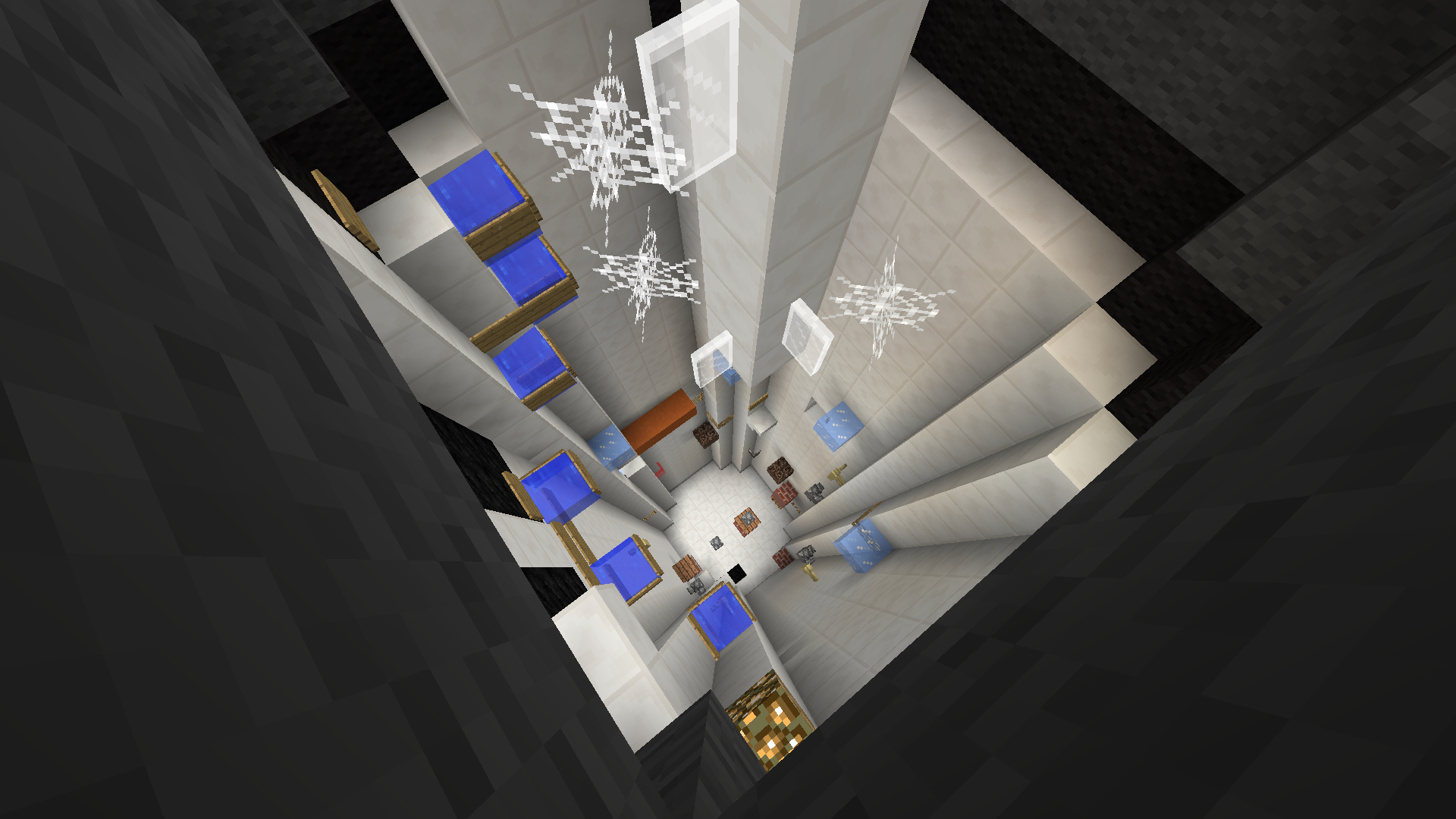
The theme is original, since we don't have any Punpun maps (and I like the manga style). I don't love the build, even though Punpun is very simple, he is also smooth, and I found that the build was very blocky and unattractive. I do like the legs, though! The parkour was also not very good in my opinion, most of it was floating and there were a lot of large, chunky jumps that really took away from the build. You should try to integrate the parkour into the build more in future maps. I also found the parkour to be slightly uneven, with easy sections like this (http://prntscr.com/oho8e4) and very hard jumps like this (http://prntscr.com/oho8if). There were also a lot of barriers, which is fine, but you should mark them with signs or item frames in the future. Finally, there was a large exploit here: http://prntscr.com/oho8vi

However, the theme is still very good so if you fix what I said above, I'd love to see your map resubmitted!
 
Status
Not open for further replies.