play.manacube.com
Loading Status...Rejected Arrival - Hard map
- Thread starter ThomasHyper
- Start date
- Status
- Not open for further replies.


Hello guyseth and ThomasHyper,
I regret to inform you that your map is being rejected.
The build is alright. Given your theme choice, there isn't a lot of room for details. The parkour of course can make up for this if executed well.
The parkour has some concerning areas:
-The pathing is quite odd, with a few spots that are just floating and now really being incorporated with the build. (pictures below):
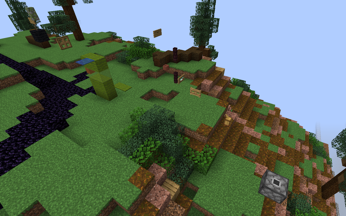
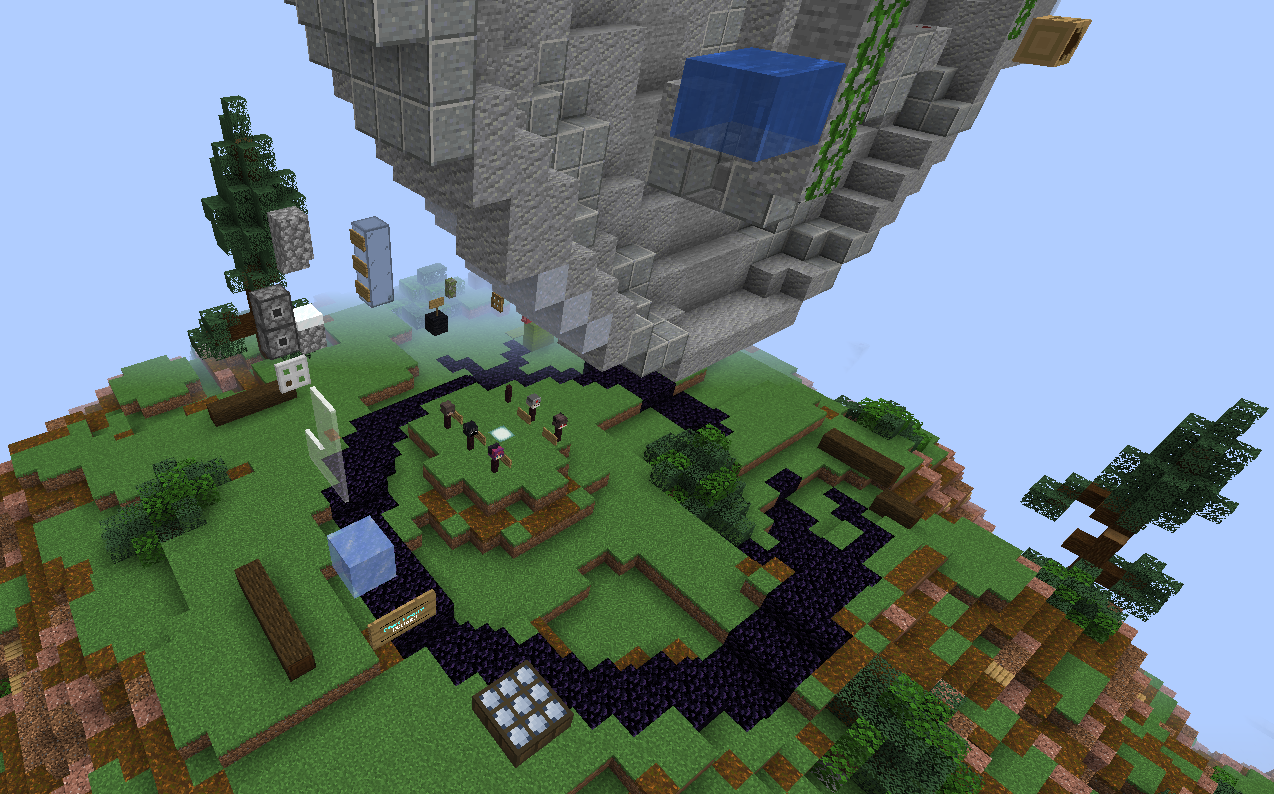 In addition to this, the first area of the map feels like jump vomit (too many unnecessary blocks.) Try to use different blocks that might reflect your theme better rather than unnecessary blocks. The two teleport blocks near the beginning of the map also felt unnecessary.
Thank you for submitting this map, I would love to see more submissions from you!
I regret to inform you that your map is being rejected.
The build is alright. Given your theme choice, there isn't a lot of room for details. The parkour of course can make up for this if executed well.
The parkour has some concerning areas:
-The pathing is quite odd, with a few spots that are just floating and now really being incorporated with the build. (pictures below):
Thank you for submitting this map, I would love to see more submissions from you!
- Status
- Not open for further replies.
2013 - 2024 © ManaLabs Inc.
ManaLabs is an Official Minecraft Partner
ManaCube is a multiplayer network for Minecraft Java Edition. IP: play.manacube.com
The ManaCube server is not endorsed by Mojang, AB.
ManaCube is a multiplayer network for Minecraft Java Edition. IP: play.manacube.com
The ManaCube server is not endorsed by Mojang, AB.