Hello, this will be a bit of a slightly controversial rant about how a lot of the time our lust for unique jumps brings a very negative impact on the quality of our maps.
To begin, it seems that using a variety of blocks is so highly praised that people are willing to sacrifice the look of their parkour for the sake of adding different blocks that may not even make that much of a gameplay difference. It is important that the parkour also has a theme, otherwise it looks out of place and ugly. I’ve seen many great looking builds which I think have been undermined by the ugly parkour that is slapped around it.
It is important to understand that more height doesn’t necessarily add more difficulty or vary the gameplay. Remember, ticks are 50ms, so there are only 5 possible ticks midair when you can land on elevation. This means that a +0.5 is the exact same as a +0.75 because you land on the same tick. A +0.125 is the same as a +0.4375. This is important to understand, as this means there serves very little use for strange blocks with unusual heights such as beds and daylight sensors.
Varying a block doesn’t necessary add any variety to the gameplay itself. For example, I’ve seen many levels use half beds, which usually look really out of place. There is absolutely no reason why these blocks should be used when there exists non-atrocious looking blocks such as SLABS. Another example of a common tier 1 / 2 block that should not be used is a cake. The only extra difficulty this offers is 1 pixel or 0.0625 blocks. Unless it’s a well-made curve jump of sorts, it provides no NOTICEABLE difference in difficulty. Another example of this is the use of daylight sensors. These blocks are generally quite ugly in most builds, so instead they should be replaced with other blocks such as trapdoors, or slabs. Most of the time they are not necessary. Another example of ugly blocks being used are cacti. 90% of the time, these are exactly the same as a chest. The only time this would be different would be if you were jumping from a chest or cactus to the other block. I have even seen someone use a completely out of place piston head when a normal block could have perfectly substituted. Another example is how some people feel the need to use repeaters on barriers. Not only does this look absolutely horrible, this can easily be substituted with some carpet or snow, once again providing NO CHANGE in difficulty. The list can go on and on. People are trying too hard to produce uniqueness that they are sacrificing the actual theme itself. Spamming random blocks only make the parkour look messier and ruins the theme.
Furthermore, one should understand that some blocks have the same hitbox, and this should be considered when choosing what block to use. For example, cake, cacti and chest all have the same hitbox length wise. Flower pot is the same as a tier 2 cocoa bean. Heads are the same hitbox as cobble walls. In some versions ladder is the same tangible hitbox as trapdoor, which is the same as a door. Tier 1 cocoa, end rod, piston head and fence have the same width. Cobweb and water have the same hitbox. Upper brewing stand and pane have the same width. While some of these examples are more applicable than others, it perfectly demonstrates that once again, adding strange, messy and unusual blocks does nothing.
I think that this habit of using the most exotic blocks available stem from, in my opinion, laziness. In lots of maps, all I see are either pretty linear jumps, annoying low ceilings or basic jumps where you curve around a corner. As a result, the only real way to make these interesting are to add weird blocks and give the illusion of interesting gameplay. However, the result of this is simply repetitive boring gameplay churned out and overused to a point when not only are these maps incredibly unappealing, but boring and repetitive. In a way this mentality of “UniQuE jUmpS” had backfired and as a result created many messy, boring levels, half of which I forget the theme halfway through because the parkour is not in any way sticking with the theme. Instead of using ugly and out of place brewing stands and piston heads, try to add some other features like some interesting curving instead of just 1 corner to jump around. Instead of spamming brewing stands to try and spice up the parkour, add some unique blockages.
Ultimately, I’ve seen so many maps where a really well made build gets ruined by a messy, sloppy and out of place parkour that is repetitive and bland. Most of maps that I play I forget, because they all feel the same. Vines, pistons, brewing stands…. Etc. This is NOT the way to make good parkour. Instead of using boring linear jumps with strange blocks, people should try experiment with their jumps, make it interesting, add some tricky blockage, have some precise neos, add a squeeze, maybe include some less basic curving. No amounts of cocoa beans, lava, cake, brewing stand, daylight sensor, piston, head, enchantment table, etc will make a unique parkour if they aren’t used well.
RANDOM BLOCKS DON’T MAKE GOOD PAKROUR.
Now for an example
I literally went on a random medium map and found exactly what I mean.
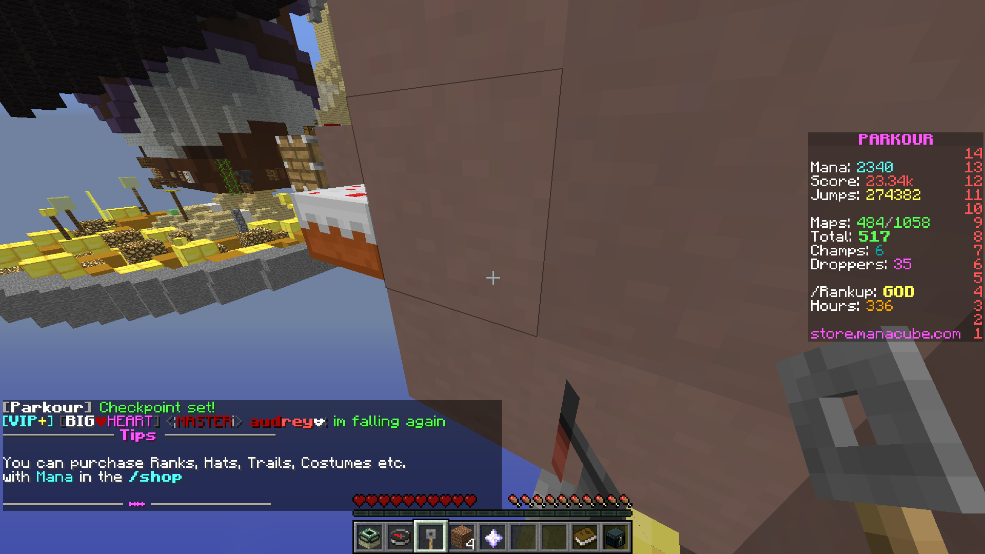
Starting off, brewing stand, cake, piston. The cake, as ive stated, provides no noticeable difference with a jump like this, but i'll let it pass as the theme is muffin.
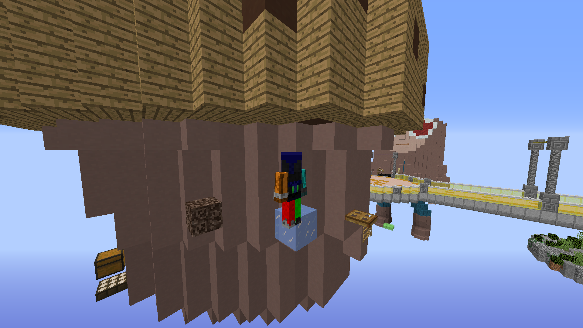
This is what I mean. Linear, repetitive curve jumps. The only way to make this part 'unique' was to add different blocks.
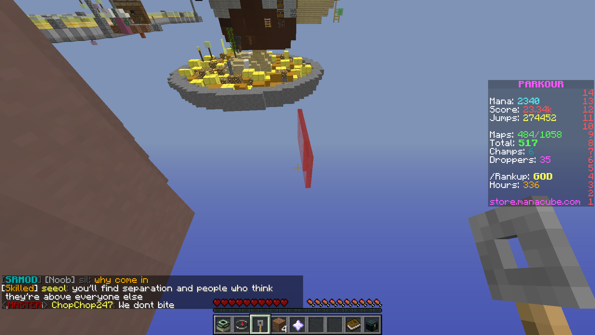
Why this red pane? The color doesn't match with the theme at all.
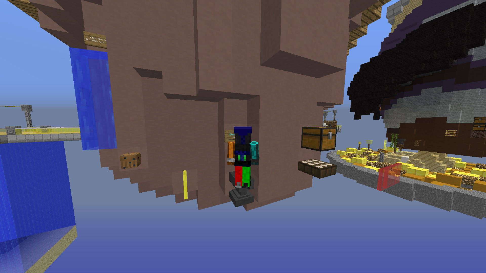
Once again, there are simple corner jumps where the only uniqueness is obtained from adding different blocks.
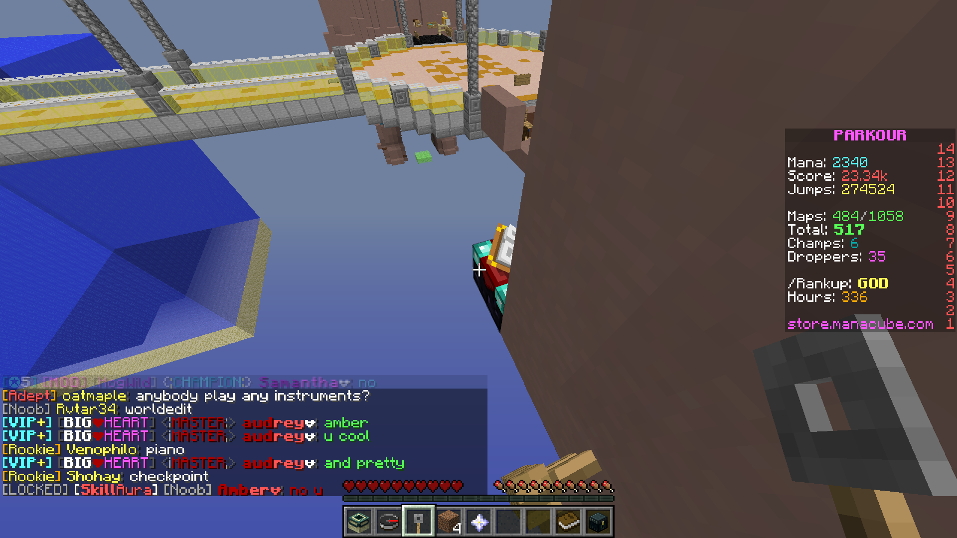
The enchantment table is not fitting at all. An upper slab would have provided the EXACT same jump.
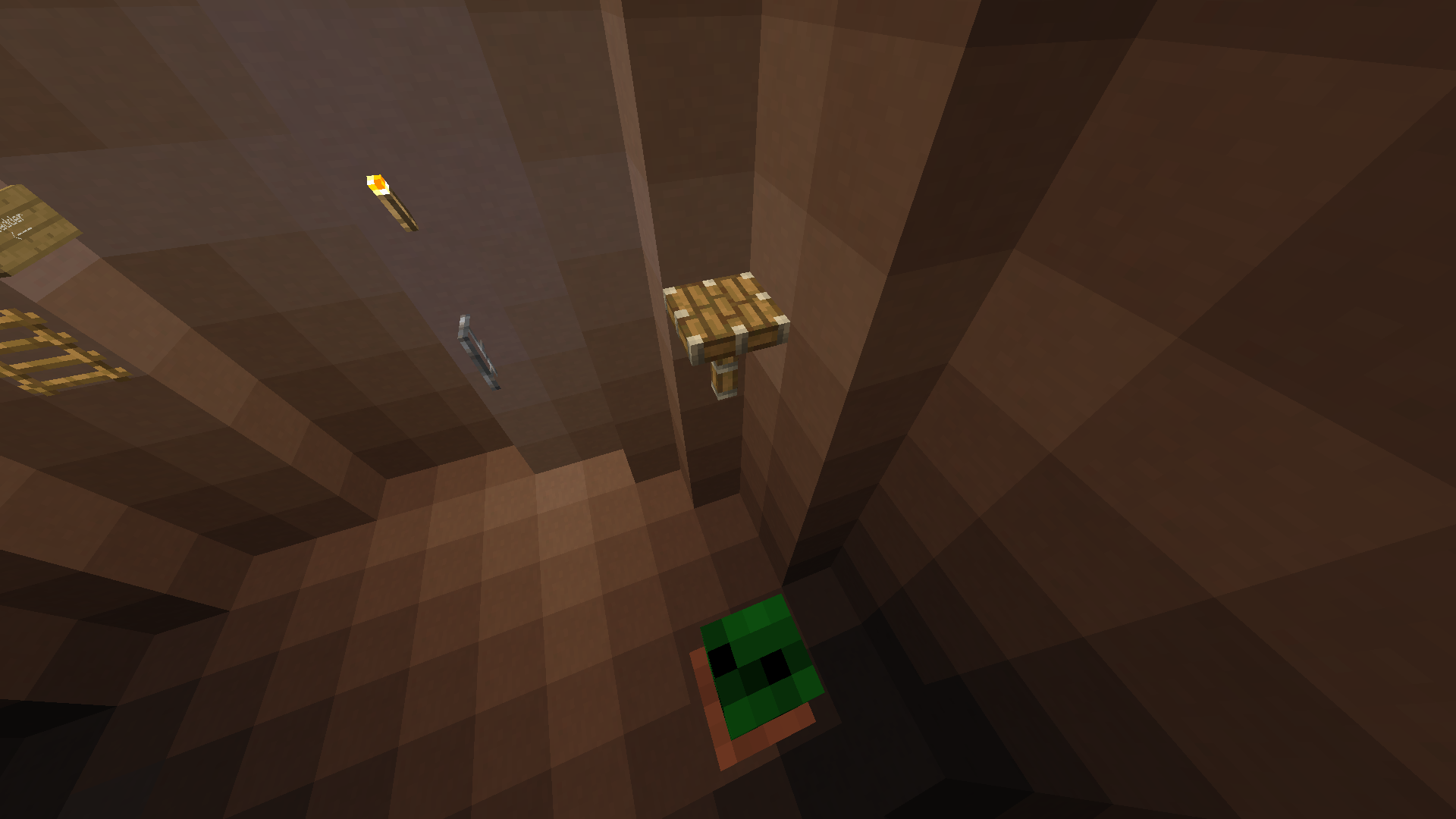
Did there really need to be a cactus? That hint of green makes this look like a vegetable muffin. Also, the piston here is the exact same thing as a whole block.
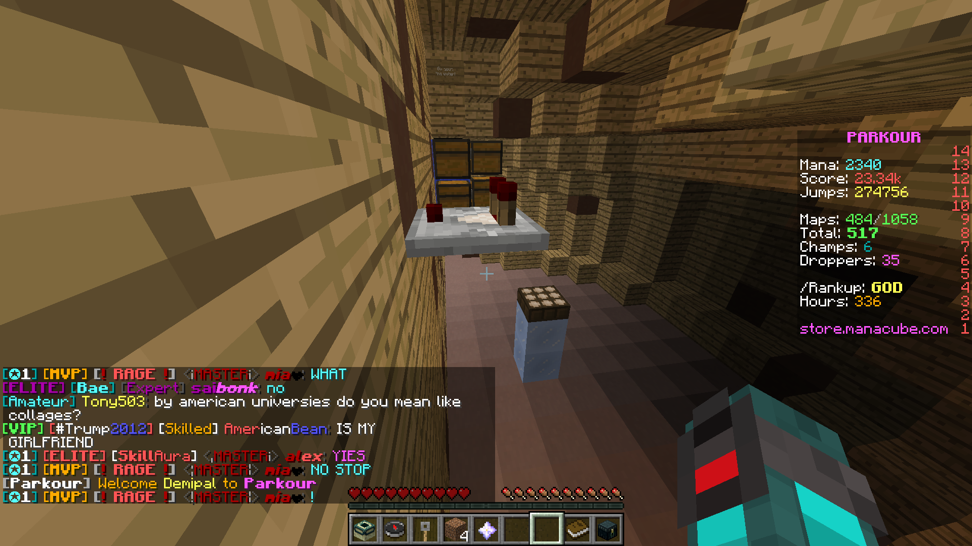
Why is there any need for a comparator? Just add a carpet and you get the exact same jump but without the out of theme look.
TL/DR design your jumps better rather than changing the blocks. Half of the time it doesn't even change the gameplay.
To begin, it seems that using a variety of blocks is so highly praised that people are willing to sacrifice the look of their parkour for the sake of adding different blocks that may not even make that much of a gameplay difference. It is important that the parkour also has a theme, otherwise it looks out of place and ugly. I’ve seen many great looking builds which I think have been undermined by the ugly parkour that is slapped around it.
It is important to understand that more height doesn’t necessarily add more difficulty or vary the gameplay. Remember, ticks are 50ms, so there are only 5 possible ticks midair when you can land on elevation. This means that a +0.5 is the exact same as a +0.75 because you land on the same tick. A +0.125 is the same as a +0.4375. This is important to understand, as this means there serves very little use for strange blocks with unusual heights such as beds and daylight sensors.
Varying a block doesn’t necessary add any variety to the gameplay itself. For example, I’ve seen many levels use half beds, which usually look really out of place. There is absolutely no reason why these blocks should be used when there exists non-atrocious looking blocks such as SLABS. Another example of a common tier 1 / 2 block that should not be used is a cake. The only extra difficulty this offers is 1 pixel or 0.0625 blocks. Unless it’s a well-made curve jump of sorts, it provides no NOTICEABLE difference in difficulty. Another example of this is the use of daylight sensors. These blocks are generally quite ugly in most builds, so instead they should be replaced with other blocks such as trapdoors, or slabs. Most of the time they are not necessary. Another example of ugly blocks being used are cacti. 90% of the time, these are exactly the same as a chest. The only time this would be different would be if you were jumping from a chest or cactus to the other block. I have even seen someone use a completely out of place piston head when a normal block could have perfectly substituted. Another example is how some people feel the need to use repeaters on barriers. Not only does this look absolutely horrible, this can easily be substituted with some carpet or snow, once again providing NO CHANGE in difficulty. The list can go on and on. People are trying too hard to produce uniqueness that they are sacrificing the actual theme itself. Spamming random blocks only make the parkour look messier and ruins the theme.
Furthermore, one should understand that some blocks have the same hitbox, and this should be considered when choosing what block to use. For example, cake, cacti and chest all have the same hitbox length wise. Flower pot is the same as a tier 2 cocoa bean. Heads are the same hitbox as cobble walls. In some versions ladder is the same tangible hitbox as trapdoor, which is the same as a door. Tier 1 cocoa, end rod, piston head and fence have the same width. Cobweb and water have the same hitbox. Upper brewing stand and pane have the same width. While some of these examples are more applicable than others, it perfectly demonstrates that once again, adding strange, messy and unusual blocks does nothing.
I think that this habit of using the most exotic blocks available stem from, in my opinion, laziness. In lots of maps, all I see are either pretty linear jumps, annoying low ceilings or basic jumps where you curve around a corner. As a result, the only real way to make these interesting are to add weird blocks and give the illusion of interesting gameplay. However, the result of this is simply repetitive boring gameplay churned out and overused to a point when not only are these maps incredibly unappealing, but boring and repetitive. In a way this mentality of “UniQuE jUmpS” had backfired and as a result created many messy, boring levels, half of which I forget the theme halfway through because the parkour is not in any way sticking with the theme. Instead of using ugly and out of place brewing stands and piston heads, try to add some other features like some interesting curving instead of just 1 corner to jump around. Instead of spamming brewing stands to try and spice up the parkour, add some unique blockages.
Ultimately, I’ve seen so many maps where a really well made build gets ruined by a messy, sloppy and out of place parkour that is repetitive and bland. Most of maps that I play I forget, because they all feel the same. Vines, pistons, brewing stands…. Etc. This is NOT the way to make good parkour. Instead of using boring linear jumps with strange blocks, people should try experiment with their jumps, make it interesting, add some tricky blockage, have some precise neos, add a squeeze, maybe include some less basic curving. No amounts of cocoa beans, lava, cake, brewing stand, daylight sensor, piston, head, enchantment table, etc will make a unique parkour if they aren’t used well.
RANDOM BLOCKS DON’T MAKE GOOD PAKROUR.
Now for an example
I literally went on a random medium map and found exactly what I mean.
Starting off, brewing stand, cake, piston. The cake, as ive stated, provides no noticeable difference with a jump like this, but i'll let it pass as the theme is muffin.
This is what I mean. Linear, repetitive curve jumps. The only way to make this part 'unique' was to add different blocks.
Why this red pane? The color doesn't match with the theme at all.
Once again, there are simple corner jumps where the only uniqueness is obtained from adding different blocks.
The enchantment table is not fitting at all. An upper slab would have provided the EXACT same jump.
Did there really need to be a cactus? That hint of green makes this look like a vegetable muffin. Also, the piston here is the exact same thing as a whole block.
Why is there any need for a comparator? Just add a carpet and you get the exact same jump but without the out of theme look.
TL/DR design your jumps better rather than changing the blocks. Half of the time it doesn't even change the gameplay.