play.manacube.com
Loading Status...Rejected Chicken - Easy
- Thread starter Spiralio
- Start date
- Status
- Not open for further replies.
Allo - pink here with a bit of feedback. Mainly on the pk (not a map judge, but etc. etc.)
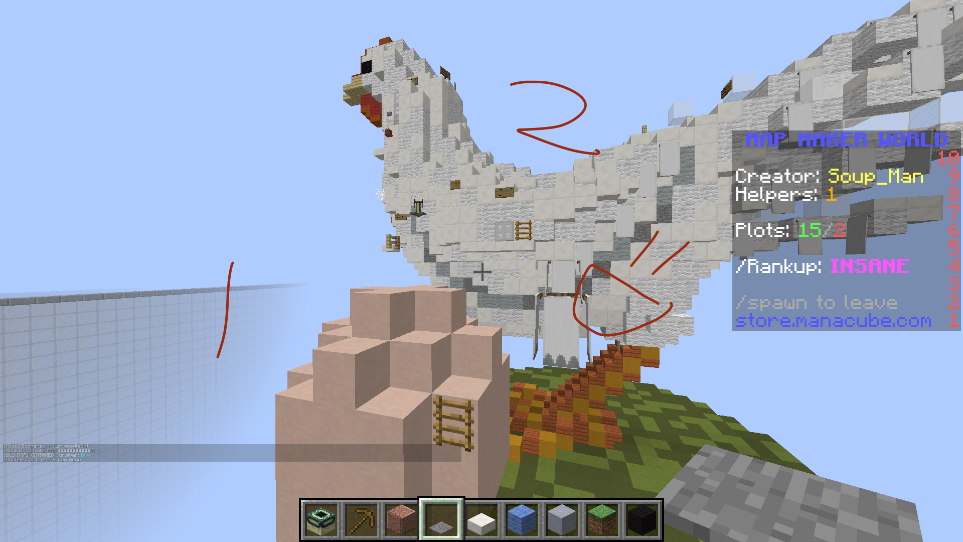
Love the organic. The best effort I've seen put into map submissions for it's type, block variation is stellar and the tail shows that too.
Small suggestion with the starting banners, why don't you change it to become seeds on invisible blocks instead? It'd fit with the 'chicken' theme
In terms of the pk, there were just a little final shaping things to note in my opinion:

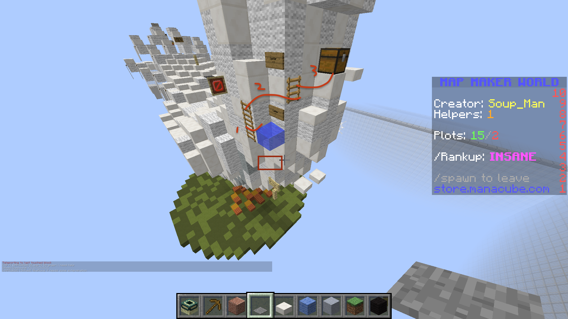
Red rectangle denotes a possible sign direction to tell me to go up
- Jumps 1 and 2 are pretty difficult for an easy (see below)
- Jump 3 is a great example of how to execute a potential tricky jump for an easy map i.e. make it fail safe with that slab, allowing new players to try it more than once
Suggestion - keep jumps 1/2, place a slab where the water is, and move the water one block out - makes jump 1 risky, but jump 2 'semi' failsafe! It's a compromise :P
Regardless, I think putting it all together, I love the look and feel of the map. A solid 9. Missing that slight bit on the pk.
I guess you can also say the egg came before the chicken?

Thanks for reading, good luck!
Pink
Love the organic. The best effort I've seen put into map submissions for it's type, block variation is stellar and the tail shows that too.
Small suggestion with the starting banners, why don't you change it to become seeds on invisible blocks instead? It'd fit with the 'chicken' theme
In terms of the pk, there were just a little final shaping things to note in my opinion:
Red rectangle denotes a possible sign direction to tell me to go up
- Jumps 1 and 2 are pretty difficult for an easy (see below)
- Jump 3 is a great example of how to execute a potential tricky jump for an easy map i.e. make it fail safe with that slab, allowing new players to try it more than once
Suggestion - keep jumps 1/2, place a slab where the water is, and move the water one block out - makes jump 1 risky, but jump 2 'semi' failsafe! It's a compromise :P
Regardless, I think putting it all together, I love the look and feel of the map. A solid 9. Missing that slight bit on the pk.
I guess you can also say the egg came before the chicken?
Thanks for reading, good luck!
Pink
Allo - pink here with a bit of feedback. Mainly on the pk (not a map judge, but etc. etc.)
Love the organic. The best effort I've seen put into map submissions for it's type, block variation is stellar and the tail shows that too.
Small suggestion with the starting banners, why don't you change it to become seeds on invisible blocks instead? It'd fit with the 'chicken' theme
In terms of the pk, there were just a little final shaping things to note in my opinion:
View attachment 40889
Red rectangle denotes a possible sign direction to tell me to go up
- Jumps 1 and 2 are pretty difficult for an easy (see below)
- Jump 3 is a great example of how to execute a potential tricky jump for an easy map i.e. make it fail safe with that slab, allowing new players to try it more than once
Suggestion - keep jumps 1/2, place a slab where the water is, and move the water one block out - makes jump 1 risky, but jump 2 'semi' failsafe! It's a compromise :p
Regardless, I think putting it all together, I love the look and feel of the map. A solid 9. Missing that slight bit on the pk.
I guess you can also say the egg came before the chicken?
View attachment 40890
Thanks for reading, good luck!
Pink
Ah. An unintentional skip arose from changing that slab haha
View attachment 40910
Can probably easily rectified by lowering either the slab i'm on or raising the other to make it a 1.5 - or maybe some other ingenious method I haven't thought of :)
View attachment 40910
Can probably easily rectified by lowering either the slab i'm on or raising the other to make it a 1.5 - or maybe some other ingenious method I haven't thought of :)
Hello Spiralio & Soup_Man,
Unfortunately, your map has been Rejected.
The theme isn't original, as there is already a chicken map (Chicken - Medium) Please refer to the document in this thread - https://manacube.com/threads/parkour-list-with-theme.20194/ to make sure your map idea is original. I do understand though that the build in this map is quite different from the other chicken map.
The build is good, it's detailed, accurate and overall well built, so well done.
The parkour has some variation which is good, the jumps are original and enjoyable.
The difficulty did feel a bit inconsistent though, some of it was fine for an easy map, but there were a few jumps that were too difficult.
The length is good for an easy map.
Thanks for submitting your map! I hope to see more maps from you in the future.
- Status
- Not open for further replies.
2013 - 2024 © ManaLabs Inc.
ManaLabs is an Official Minecraft Partner
ManaCube is a multiplayer network for Minecraft Java Edition. IP: play.manacube.com
The ManaCube server is not endorsed by Mojang, AB.
ManaCube is a multiplayer network for Minecraft Java Edition. IP: play.manacube.com
The ManaCube server is not endorsed by Mojang, AB.
