play.manacube.com
Loading Status...Accepted CrossOfHonour - hard map [Resubmission]
- Thread starter Mika
- Start date
- Status
- Not open for further replies.
Hullo Mika.. or should I call you jnns :)
Just here to give my review after testing your map! - Do bear in mind, I'm not a map judge so this doesn't affect whether it'll be accepted or not. Though I think there're some improvements that you could make!
Theme looks great, I did a quick search and the only other medal related map is Goalring, but I believe it's different enough!
Build works functionally and shapewise resembles the original.
Taking a quick look at the actual cross of honour, the center looks like a bird, but I do appreciate it's difficult shaping detail at that size. The only thing I might experiment and change is the choice of gold blocks. It's a bit jarring to the eye. Perhaps doing a quick /replace and experiment with some other block choices (try doublestoneslabs:9) would be better!
Parkour - I think the improvements to be made would be here
- The principle of making good pk between CPs in my opinion is putting hard jumps at the beginning of a cp to test 'technicality' of the player, and then less hard ones as the CP stretches to test 'endurance/consistency'. I've noted a couple of instances below where the pk would be technically demanding to a medium-skilled level player (I do understand these jumps are probably like ezpz for you :))
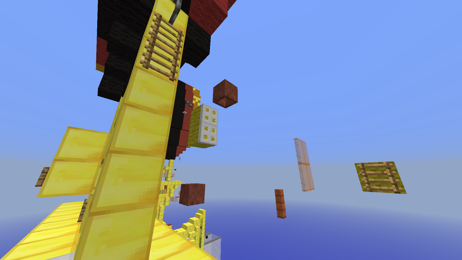
1st trapdoor to flowerpot is good technical skill to test and play, however the following sequence is daunting to do in 1 go. Finishing with this luck ladder just feels like ass to play

Personal gripe is against water parkour

This jump is super tight and I'm not a huge fan of it, your call if you want to change/nerf it
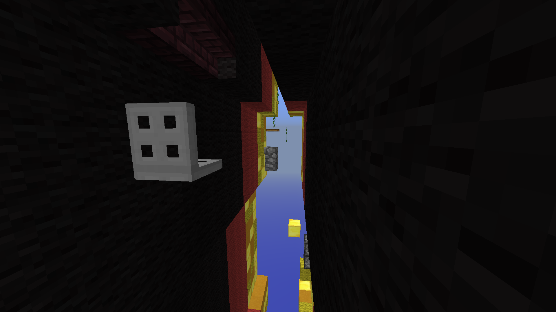
The final CP is an example of the principle mentioned earlier. Trapdoor jump good, wall jump good, then the luck vines at the end slap you in the face
An example of a great sequence would be the jumps below!
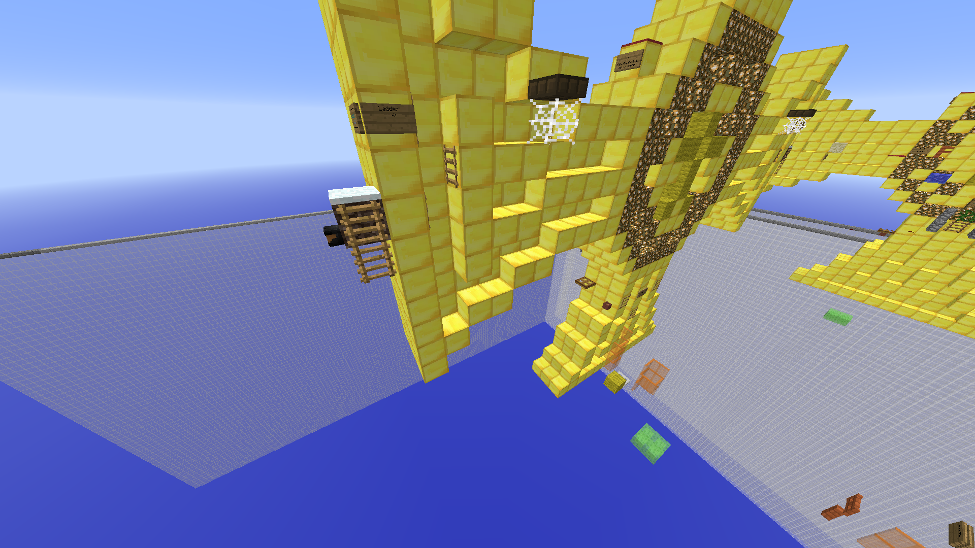
From testing a -1 neo from before to a manageable head jump to save it with a CP is an example of a perfect CP placement! The sequence following that is also decent. p.s. I've got a couple more notes on a design/jump tips, so dm me if you want more feedback
I think overall the pk just requires a little more rework, but overall is a solidly worked map.
+0.5 from me, (reworked pk would bump it up to a +1), good luck!
Just here to give my review after testing your map! - Do bear in mind, I'm not a map judge so this doesn't affect whether it'll be accepted or not. Though I think there're some improvements that you could make!
Theme looks great, I did a quick search and the only other medal related map is Goalring, but I believe it's different enough!
Build works functionally and shapewise resembles the original.
Taking a quick look at the actual cross of honour, the center looks like a bird, but I do appreciate it's difficult shaping detail at that size. The only thing I might experiment and change is the choice of gold blocks. It's a bit jarring to the eye. Perhaps doing a quick /replace and experiment with some other block choices (try doublestoneslabs:9) would be better!
Parkour - I think the improvements to be made would be here
- The principle of making good pk between CPs in my opinion is putting hard jumps at the beginning of a cp to test 'technicality' of the player, and then less hard ones as the CP stretches to test 'endurance/consistency'. I've noted a couple of instances below where the pk would be technically demanding to a medium-skilled level player (I do understand these jumps are probably like ezpz for you :))
1st trapdoor to flowerpot is good technical skill to test and play, however the following sequence is daunting to do in 1 go. Finishing with this luck ladder just feels like ass to play

Personal gripe is against water parkour

This jump is super tight and I'm not a huge fan of it, your call if you want to change/nerf it
The final CP is an example of the principle mentioned earlier. Trapdoor jump good, wall jump good, then the luck vines at the end slap you in the face
An example of a great sequence would be the jumps below!
From testing a -1 neo from before to a manageable head jump to save it with a CP is an example of a perfect CP placement! The sequence following that is also decent. p.s. I've got a couple more notes on a design/jump tips, so dm me if you want more feedback
I think overall the pk just requires a little more rework, but overall is a solidly worked map.
+0.5 from me, (reworked pk would bump it up to a +1), good luck!
Heya Mika!
I'm loving this map, I love the details of the medal and the aesthetics are just perfect!
(Cow has gone over a load of points above, I shall try to add to those and also create my own!)
Just to preface, I am just giving my insight into your map and, in my opinion, the pros and cons!
» First off, let's go over the entire build, how it looks, the theme and originality; the build itself, as I said above is great, the details are precise and the aesthetics fit the theme and purpose of the map, to look like a medal haha! The build is also adapted to blend the parkour around it, so the parkour is smooth and flowing, I love how this works! The theme is original, only one other medal map as stated above by Cow, so all seems fine there! The amount of gold you used in the map is a little excessive in my opinion, as Cow said above try using 44:9 (double sandstone slabs) to even out the colors a little, you could also try 5:2 (birch planks) to shade/contrast the medal; other than this, I don't have anything else to add!
» Next, onto the parkour itself; all jumps fit the difficulty and there are the right amount of jumps to fit the difficulty, but there are some jumps, as Cow said, that should be closer/more consistent to the checkpoints. This is a big example:

To some players, this might be a headache but if they know the trick it's fine. It's right next to a checkpoint as well, which could be annoying, this is just my opinion.
Here's another jump that is fine, but I don't know why this piston block is here:

I mean, the jump from the ladder to the trapdoor isn't obstructed by this in any nature, so I don't know why it was put there, isn't needed in my opinion.
I agree with what Cow says above, some jumps need reworking, some of the parkour will need some editing to allow it to flow more smoothly!
» Overall the map gets an 0.5 from me. The build is wonderful and the parkour is great in some areas, only reason why I did not give the map a full +1 is due to the inconsistencies within the parkour, my points and Cow's included for this decision to be made. The theme is original and matches references perfectly, the color is a tad blinding, but again this is more aesthetical than anything else.
Great map Mika, I can't wait to see what changes you make to this map to allow it to flourish; it truly deserves it!!
All the best,
Jashhy
I'm loving this map, I love the details of the medal and the aesthetics are just perfect!
(Cow has gone over a load of points above, I shall try to add to those and also create my own!)
Just to preface, I am just giving my insight into your map and, in my opinion, the pros and cons!
» First off, let's go over the entire build, how it looks, the theme and originality; the build itself, as I said above is great, the details are precise and the aesthetics fit the theme and purpose of the map, to look like a medal haha! The build is also adapted to blend the parkour around it, so the parkour is smooth and flowing, I love how this works! The theme is original, only one other medal map as stated above by Cow, so all seems fine there! The amount of gold you used in the map is a little excessive in my opinion, as Cow said above try using 44:9 (double sandstone slabs) to even out the colors a little, you could also try 5:2 (birch planks) to shade/contrast the medal; other than this, I don't have anything else to add!
» Next, onto the parkour itself; all jumps fit the difficulty and there are the right amount of jumps to fit the difficulty, but there are some jumps, as Cow said, that should be closer/more consistent to the checkpoints. This is a big example:

To some players, this might be a headache but if they know the trick it's fine. It's right next to a checkpoint as well, which could be annoying, this is just my opinion.
Here's another jump that is fine, but I don't know why this piston block is here:

I mean, the jump from the ladder to the trapdoor isn't obstructed by this in any nature, so I don't know why it was put there, isn't needed in my opinion.
I agree with what Cow says above, some jumps need reworking, some of the parkour will need some editing to allow it to flow more smoothly!
» Overall the map gets an 0.5 from me. The build is wonderful and the parkour is great in some areas, only reason why I did not give the map a full +1 is due to the inconsistencies within the parkour, my points and Cow's included for this decision to be made. The theme is original and matches references perfectly, the color is a tad blinding, but again this is more aesthetical than anything else.
Great map Mika, I can't wait to see what changes you make to this map to allow it to flourish; it truly deserves it!!
All the best,
Jashhy
Hullo Mika.. or should I call you jnns :)
Just here to give my review after testing your map! - Do bear in mind, I'm not a map judge so this doesn't affect whether it'll be accepted or not. Though I think there're some improvements that you could make!
Theme looks great, I did a quick search and the only other medal related map is Goalring, but I believe it's different enough!
Build works functionally and shapewise resembles the original.
Taking a quick look at the actual cross of honour, the center looks like a bird, but I do appreciate it's difficult shaping detail at that size. The only thing I might experiment and change is the choice of gold blocks. It's a bit jarring to the eye. Perhaps doing a quick /replace and experiment with some other block choices (try doublestoneslabs:9) would be better!
Parkour - I think the improvements to be made would be here
- The principle of making good pk between CPs in my opinion is putting hard jumps at the beginning of a cp to test 'technicality' of the player, and then less hard ones as the CP stretches to test 'endurance/consistency'. I've noted a couple of instances below where the pk would be technically demanding to a medium-skilled level player (I do understand these jumps are probably like ezpz for you :))
View attachment 40829
1st trapdoor to flowerpot is good technical skill to test and play, however the following sequence is daunting to do in 1 go. Finishing with this luck ladder just feels like ass to play
View attachment 40830
Personal gripe is against water parkour
View attachment 40832
This jump is super tight and I'm not a huge fan of it, your call if you want to change/nerf it
View attachment 40836
The final CP is an example of the principle mentioned earlier. Trapdoor jump good, wall jump good, then the luck vines at the end slap you in the face
An example of a great sequence would be the jumps below! View attachment 40840
From testing a -1 neo from before to a manageable head jump to save it with a CP is an example of a perfect CP placement! The sequence following that is also decent. p.s. I've got a couple more notes on a design/jump tips, so dm me if you want more feedback
I think overall the pk just requires a little more rework, but overall is a solidly worked map.
+0.5 from me, (reworked pk would bump it up to a +1), good luck!
Heya Mika!
I'm loving this map, I love the details of the medal and the aesthetics are just perfect!
(Cow has gone over a load of points above, I shall try to add to those and also create my own!)
Just to preface, I am just giving my insight into your map and, in my opinion, the pros and cons!
» First off, let's go over the entire build, how it looks, the theme and originality; the build itself, as I said above is great, the details are precise and the aesthetics fit the theme and purpose of the map, to look like a medal haha! The build is also adapted to blend the parkour around it, so the parkour is smooth and flowing, I love how this works! The theme is original, only one other medal map as stated above by Cow, so all seems fine there! The amount of gold you used in the map is a little excessive in my opinion, as Cow said above try using 44:9 (double sandstone slabs) to even out the colors a little, you could also try 5:2 (birch planks) to shade/contrast the medal; other than this, I don't have anything else to add!
» Next, onto the parkour itself; all jumps fit the difficulty and there are the right amount of jumps to fit the difficulty, but there are some jumps, as Cow said, that should be closer/more consistent to the checkpoints. This is a big example:
View attachment 40850
To some players, this might be a headache but if they know the trick it's fine. It's right next to a checkpoint as well, which could be annoying, this is just my opinion.
Here's another jump that is fine, but I don't know why this piston block is here:
View attachment 40852
I mean, the jump from the ladder to the trapdoor isn't obstructed by this in any nature, so I don't know why it was put there, isn't needed in my opinion.
I agree with what Cow says above, some jumps need reworking, some of the parkour will need some editing to allow it to flow more smoothly!
» Overall the map gets an 0.5 from me. The build is wonderful and the parkour is great in some areas, only reason why I did not give the map a full +1 is due to the inconsistencies within the parkour, my points and Cow's included for this decision to be made. The theme is original and matches references perfectly, the color is a tad blinding, but again this is more aesthetical than anything else.
Great map Mika, I can't wait to see what changes you make to this map to allow it to flourish; it truly deserves it!!
All the best,
Jashhy
(Typing this on my phone was pain lOl)
Hi Mika,
This map is now being put in Ongoing. This means your map has undergone a primary review by a map judge, and is ready to be discussed among the map judging team. Please be patient with us in this process, as it may take a few days before we come to a final decision about your map.
If you have questions in the meantime, feel free to message me on Discord.
Hello qMika,
Your map will now be in reviewing; this means it is neither accepted or rejected just yet.
The theme is original, well done.
The build has improved from your previous submission; the medal looks way better.
The parkour is why this is entering the reviewing stage. It is varied throughout, so well done. However, some of the jumps are quite difficult/annoying for the difficulty, as well as a certain checkpoint that should be adjusted. I will label them below:
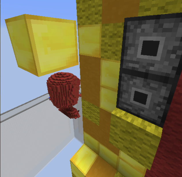
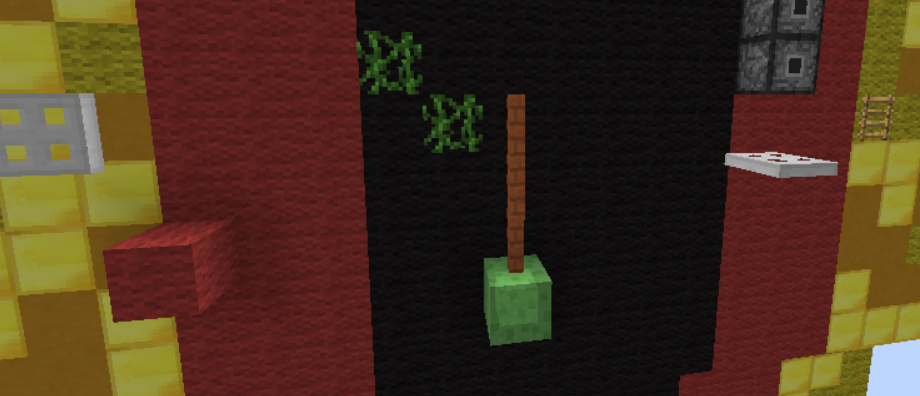
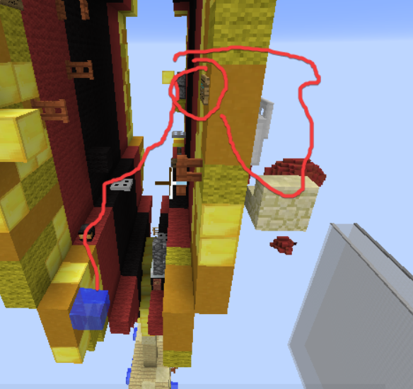
In order for your map to be accepted, these issues will have to be corrected. You have until one month from today (January 27th, 2021) to make these changes; otherwise, your map will be automatically rejected. As this thread is closed from public responses, you will have to message me either here on the forums, in-game, or on discord (Krissy#0008.)
Have a nice day,
Kristina
Your map will now be in reviewing; this means it is neither accepted or rejected just yet.
The theme is original, well done.
The build has improved from your previous submission; the medal looks way better.
The parkour is why this is entering the reviewing stage. It is varied throughout, so well done. However, some of the jumps are quite difficult/annoying for the difficulty, as well as a certain checkpoint that should be adjusted. I will label them below:
In order for your map to be accepted, these issues will have to be corrected. You have until one month from today (January 27th, 2021) to make these changes; otherwise, your map will be automatically rejected. As this thread is closed from public responses, you will have to message me either here on the forums, in-game, or on discord (Krissy#0008.)
Have a nice day,
Kristina
- Status
- Not open for further replies.
2013 - 2024 © ManaLabs Inc.
ManaLabs is an Official Minecraft Partner
ManaCube is a multiplayer network for Minecraft Java Edition. IP: play.manacube.com
The ManaCube server is not endorsed by Mojang, AB.
ManaCube is a multiplayer network for Minecraft Java Edition. IP: play.manacube.com
The ManaCube server is not endorsed by Mojang, AB.

