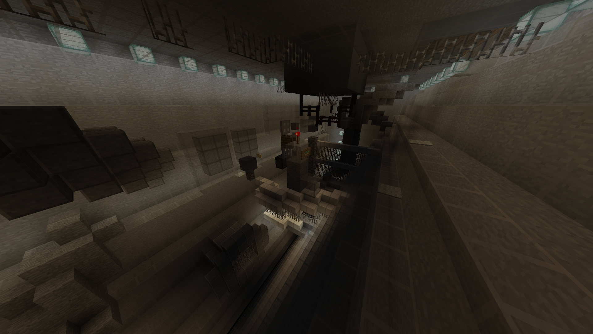
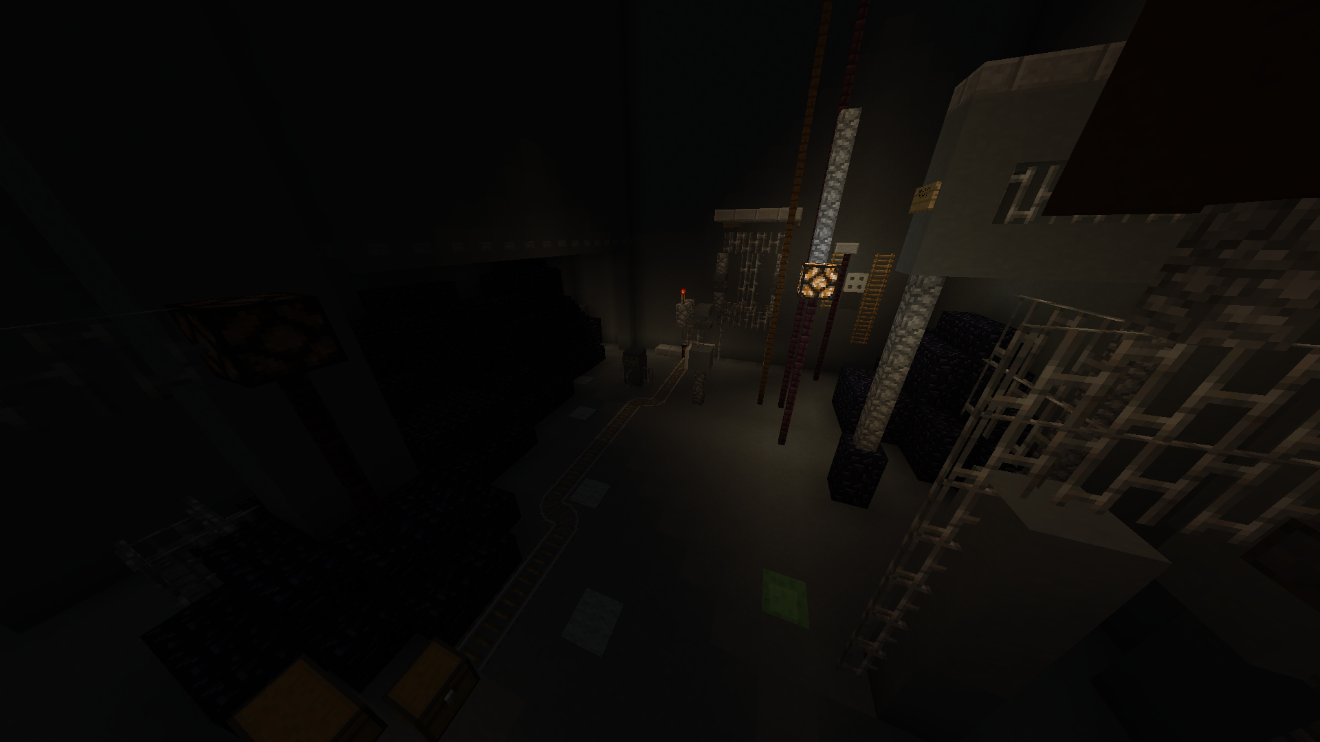
Rejected Inside Ver 2 (Insane)

Test

  • a

    Votes: 2 18.2%
  • b

    Votes: 2 18.2%
  • c

    Votes: 1 9.1%
  • d

    Votes: 2 18.2%
  • sorry for this i was just kind of intrigued by the poll option

    Votes: 4 36.4%

  • Total voters
    11
Status
Not open for further replies.

DaWomboss

Active Member
Joined
Sep 30, 2021
Posts
48
Ratings
32 1
#1
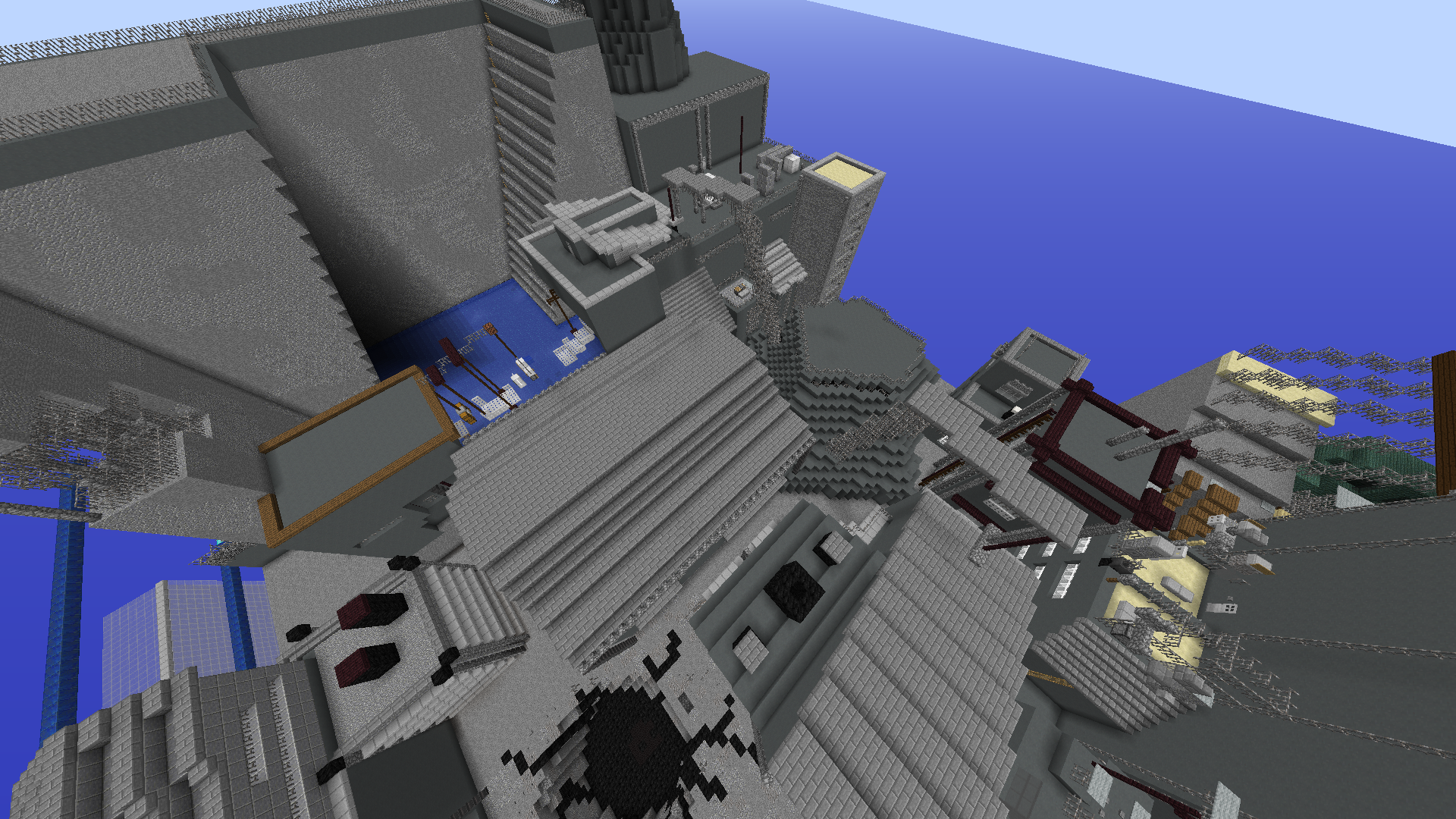
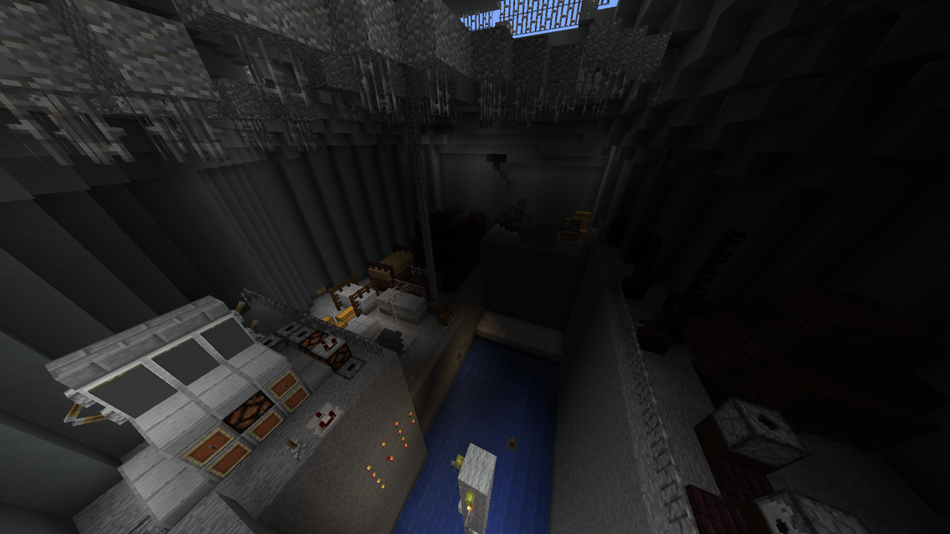
Hey Guys! Following the last submission me and my friends have gone through the parkour with the judge and added to both interiors and exteriors to the build, I personally think it should be up to standard now.

I was told the redstone section might be sketchy, I would like to make a case for it. It is heavily inspired from the actual scene in the game itself, where there are explosions that go off and the player needs to time their movements behind different machinery and objects so that they are shielded everytime an explosion happens. The redstone is a great way of replicating the precision and timing element of it which is why I think it should be kept. I understand it may be hard for people with higher ping, but however me personally I have pretty crappy internet (theres like a good half-second delay for redstone) yet I tested it so that I myself was able to do it, so I think that I have accounted for the ping.

I just want to say thanks to all my friends for this massive collaborative effort and I'm very proud of it.

digging through i have found the info for the map
Creators: Dawomby, Daaronaaronax, Kvoidcoconut, Pax_australis
/Plot v Dawomby 2
INSANE DIFFICULTY WOOOO
124土5 Jumps

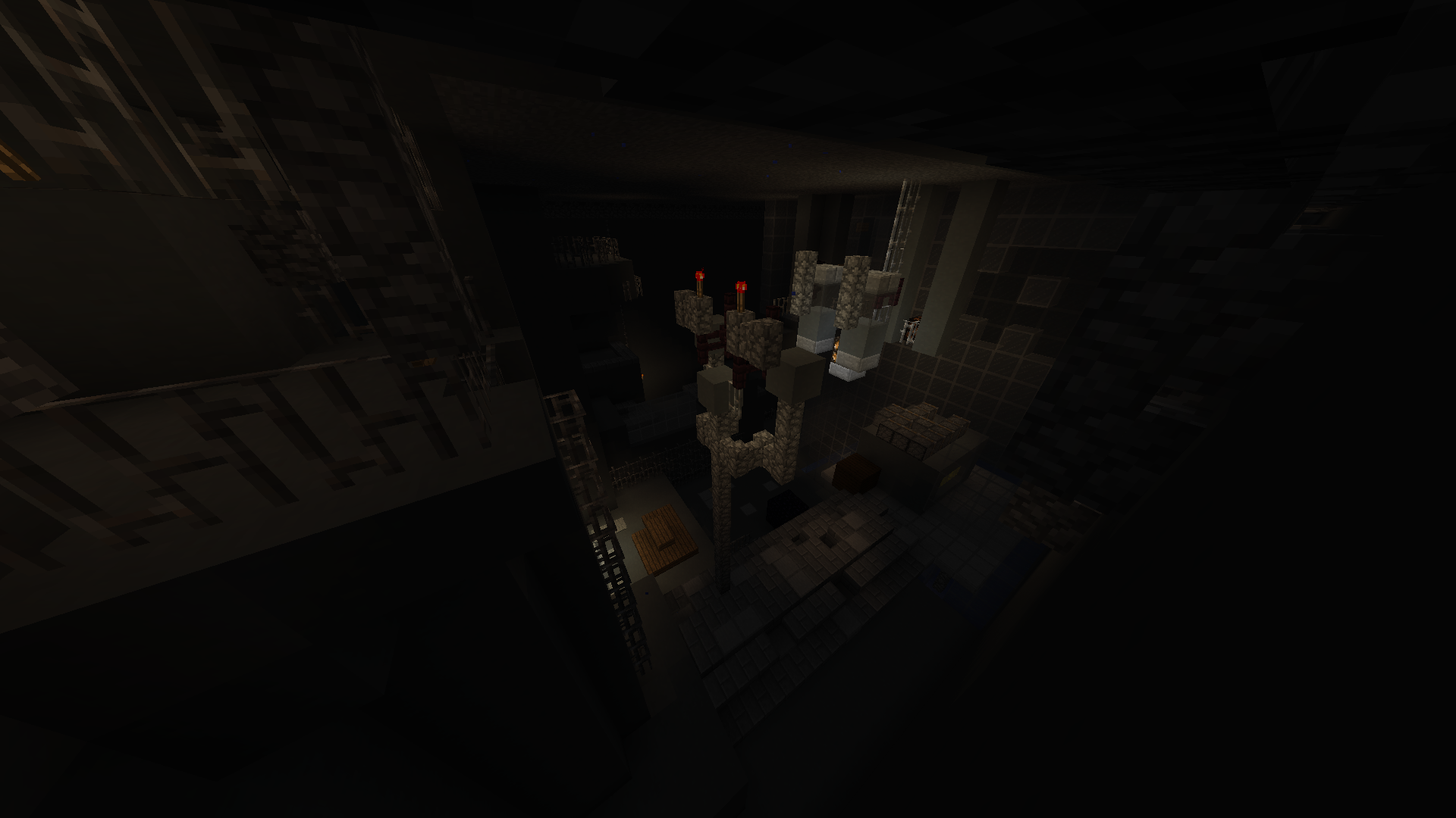
Now I will send some updated pics of it with some fancy smooth lighting
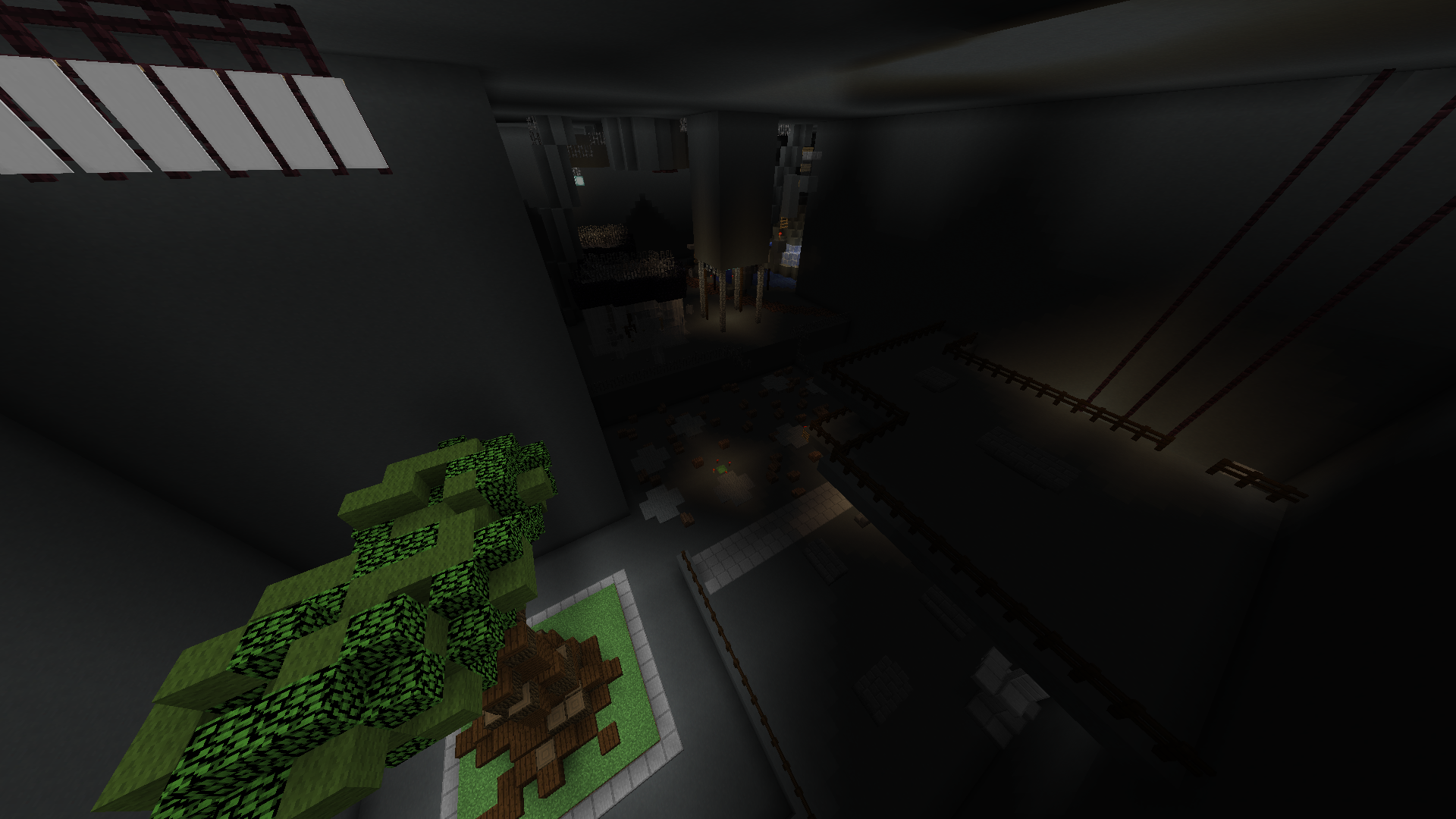
2021-11-19_22.56.58.png

2021-11-19_22.58.44.png

2021-11-19_22.59.23.png

2021-11-19_22.59.08.png

2021-11-19_22.59.36.png

2021-11-19_22.59.59.png

2021-11-19_23.00.19.png
 

carvhes

Dedicated Member
ELITE
carvhes
carvhes
ELITE
Joined
Sep 13, 2021
Posts
142
Ratings
78 3
#2
i have 0 idea what this map is, but its scary and feels like a fever dream. for that, +1
 

Blurpyfied

Forum God
ELITE
Blurpyfied
Blurpyfied
ELITE
Joined
Jan 1, 2017
Posts
1,857
Ratings
985 875
#4
Although I do like your build, i'm not sure about the pk since I havent tested it yet, i'll give a 0 for now, as the only reason is because the build still feels empty, and you could've used a lot more space in it, you also need to put some more lighting in the build so we can have better eyesight.
 

jacobsfunparty

Forum Expert
ELITE
jacobsfunparty
jacobsfunparty
ELITE
Joined
Apr 15, 2020
Posts
465
Ratings
337 6
#5
Hello,

I will be putting your map into ONGOING. Please be patient as I discuss your map with the map judging team. If you have any questions or concerns feel free to message me on discord jacobsfunparty#0486.

Thanks,
Jacob
 

Blurpyfied

Forum God
ELITE
Blurpyfied
Blurpyfied
ELITE
Joined
Jan 1, 2017
Posts
1,857
Ratings
985 875
#6
Even though this map is in ongoing, I'm going to restate my post.

I do think your map has potential to be insane, but it was just too repetitive and the jumps weren't fun, the parkour was super confusing, and since the build is mostly dark, I still think you should add sea lanterns in dark area's to know the pathway a little better. on top of that, I feel the beginning was super confusing and not many signs on telling the player where to go.

I do get you're trying to go for what the game is, but lighting up everything actually helps the player know where to go.

-1
 

WolfAndRyan

Active Member
ELITE
WolfAndRyan
WolfAndRyan
ELITE
Joined
Dec 16, 2017
Posts
38
Ratings
16
#7
I am not a judge, but your map will be 100% rejected!

You CANNOT have parkour that is more than 35 blocks below your starting platform. That is a very strict rule and your map will get rejected no matter how good your build/parkour is! Your start is at Y=72, but you have parkour at Y=31. (Image 1, 2) So it's violating the requirement.

Make sure to check out the requirement of the map before start building a map: https://manacube.com/threads/must-read-map-submission-information-format.649/

Also, I can see the amount of effort you put into the map. But just like Blurpyfied said, the jumps weren't fun! I feel like I am playing a rankup parkour instead of a course parkour. I would recommend you to do the following:
- Avoid too many floating block parkour. Making sure that your parkour is blending into your build.
- Use more blocks like Slime, Ice, Soul sand, Stairs, etc.
- Don't build that many sections. Instead, build more parkour in one sections.

Hope to see more map from you in the future!

2021-11-22_15.25.32.png
2021-11-22_15.26.14.png
 

DaWomboss

Active Member
Joined
Sep 30, 2021
Posts
48
Ratings
32 1
#8
I am not a judge, but your map will be 100% rejected!

You CANNOT have parkour that is more than 35 blocks below your starting platform. That is a very strict rule and your map will get rejected no matter how good your build/parkour is! Your start is at Y=72, but you have parkour at Y=31. (Image 1, 2) So it's violating the requirement.

Make sure to check out the requirement of the map before start building a map: https://manacube.com/threads/must-read-map-submission-information-format.649/

Also, I can see the amount of effort you put into the map. But just like Blurpyfied said, the jumps weren't fun! I feel like I am playing a rankup parkour instead of a course parkour. I would recommend you to do the following:
- Avoid too many floating block parkour. Making sure that your parkour is blending into your build.
- Use more blocks like Slime, Ice, Soul sand, Stairs, etc.
- Don't build that many sections. Instead, build more parkour in one sections.

Hope to see more map from you in the future!

View attachment 55006 View attachment 55007
Oh my god thank you for telling me that! I'll fix it asap (or maybe the map judge could)

As for everything else, Ill take the advice in consideration, though I don't see my self lighting up the level because I feel it would ruin the aesthetic. I think the lighting is already good enough if you're able to see the parkour.

I personally didnt use many stairs and soulsand and ice because I found them difficult to make interesting jumps out of ie. Soulsand kind of inevitably sucks the player in to a crappy tick timing jump, and ice feels like it's more suited to massive major jumps.
 

Blurpyfied

Forum God
ELITE
Blurpyfied
Blurpyfied
ELITE
Joined
Jan 1, 2017
Posts
1,857
Ratings
985 875
#9
Oh my god thank you for telling me that! I'll fix it asap (or maybe the map judge could)

As for everything else, Ill take the advice in consideration, though I don't see my self lighting up the level because I feel it would ruin the aesthetic. I think the lighting is already good enough if you're able to see the parkour.

I personally didnt use many stairs and soulsand and ice because I found them difficult to make interesting jumps out of ie. Soulsand kind of inevitably sucks the player in to a crappy tick timing jump, and ice feels like it's more suited to massive major jumps.
after going through this course again, I must say, PLEASE LIGHT UP THE LEVEL!

It is super hard for me to figure out where to go, and you need to add signs, also I don't really like that water section where you swim up, it's not really interesting either + you can't even die in the water!

Also I still state that the parkour is too hard, like the jump before the blip I found that impossible to do without speed on.

Also map judge's don't fix that type of stuff, it is the player who has to do that.

I also recommend getting someone like caseyclosed,presidenten,xniper03,des,pris, me, carvhes,bootzmc, a few staff members that staff pk, to look at it and have them tell you what to change / fix before submitting.
 

Buffy

Forum Master
QA Team
BuffySwag
BuffySwag
QA Team
Joined
Mar 2, 2021
Posts
535
Ratings
335 7
#10
you would not believe the argument that this map caused in a vc. about a dozen mappers, half of whom said it was good, half of whom said it was poor, were at each others throats. was funny to listen to. anyway, i think it looks interesting from the above when youre flying around at it, but plain walls werent the most appealing thing to be surrounded by for ages
 
Last edited:

trashthetic

Well-Known Member
ELITE
trashthetic
trashthetic
ELITE
Joined
Apr 17, 2021
Posts
90
Ratings
81 6
#11
you would not believe the argument that this map caused in a vc. about a dozen mappers, half of whom said it was good, half of whom said it was poor, were at each others throats. was funny to listen to. anyway, i think it looks interesting from the above when youre flying around at it, but plain walls rent the most appealing thing to be surrounded by for ages
^ As Buffy said, this map did unfortunately spark a pretty big debate. I agree with Buffy as well, the over view of the map is a lot more enjoyable than actually playing through the parkour. The first half of the map was really proficient with keeping up with textures in the dirt, and even on the barn. As you fly towards the back, there is lots of plain gray walls present and extremely spacious interiors, with parkour only utilizing about 1/3 of the space.

This map for sure has potential. As a suggestion, I'd say to add some depth into the walls. Using stairs, walls, different stone textures, andesite, whatever gray palettes that come to your mind. There could definitely be some improvement with the industrial type-feel with the interior as well. I understand the point of the game is to have deep, dark and spacious buildings. I get it. But making the build a little more appealing with your own twist is ideal for people who may not know the point of the game, or what it looks like.

I don't normally review maps in this sort of depth, but the debate it sparked really intrigued me. Good luck :)
 

DaWomboss

Active Member
Joined
Sep 30, 2021
Posts
48
Ratings
32 1
#12
after going through this course again, I must say, PLEASE LIGHT UP THE LEVEL!

It is super hard for me to figure out where to go, and you need to add signs, also I don't really like that water section where you swim up, it's not really interesting either + you can't even die in the water!

Also I still state that the parkour is too hard, like the jump before the blip I found that impossible to do without speed on.

Also map judge's don't fix that type of stuff, it is the player who has to do that.

I also recommend getting someone like caseyclosed,presidenten,xniper03,des,pris, me, carvhes,bootzmc, a few staff members that staff pk, to look at it and have them tell you what to change / fix before submitting.
which blip is it? iirc i added 2 blip jumps
 

DaWomboss

Active Member
Joined
Sep 30, 2021
Posts
48
Ratings
32 1
#13
you would not believe the argument that this map caused in a vc. about a dozen mappers, half of whom said it was good, half of whom said it was poor, were at each others throats. was funny to listen to. anyway, i think it looks interesting from the above when youre flying around at it, but plain walls werent the most appealing thing to be surrounded by for ages
 

Attachments

polarben

Active Member
ELITE
polarben
polarben
ELITE
Joined
Jul 2, 2020
Posts
32
Ratings
27
#15
i love this map i lvoe it all except for the blip neo u might have been on drugs when you came up with that im not sure. but of the parkour is so coolio i dont know how to build so i cant judge ur build
 

Blurpyfied

Forum God
ELITE
Blurpyfied
Blurpyfied
ELITE
Joined
Jan 1, 2017
Posts
1,857
Ratings
985 875
#16
i love this map i lvoe it all except for the blip neo u might have been on drugs when you came up with that im not sure. but of the parkour is so coolio i dont know how to build so i cant judge ur build
ben ur on crack again, go play wolyung and realize that, wolyung is better than this
 

DaWomboss

Active Member
Joined
Sep 30, 2021
Posts
48
Ratings
32 1
#17
i love this map i lvoe it all except for the blip neo u might have been on drugs when you came up with that im not sure. but of the parkour is so coolio i dont know how to build so i cant judge ur build
I think i built that at like 12:30am
 

jacobsfunparty

Forum Expert
ELITE
jacobsfunparty
jacobsfunparty
ELITE
Joined
Apr 15, 2020
Posts
465
Ratings
337 6
#18
Hello,

Your map has been REJECTED

The theme is original so GG!

The build could still use more improvement. I like how you added more interior design to get the rooms less empty. The build is just too much of one block. I understand you're going for a dull vibe but because there is so little block variation and so little color it makes the build look bland and unfinished. One thing you might want to consider doing is doing a more vibrant build but encouraging people at the beginning of the map to switch to nighttime (/ptime night) to get that dull feeling you're looking for.

The parkour could also still use some improvement. You nerfed some of the parkour and balanced the checkpoints a little more so good job with that. The one redstone section was a cool concept but the number of piston jumps made it feel a little repetitive, maybe stick to only 1 or 2 piston jumps and think of some other creative jumps that would match the vibe. Also there are still a few checkpoints that are still a little unbalanced.

Overall the map has a lot of potential and I urge you to keep working on it. Thank you for submitting a map. Good luck with future submissions. If you have any questions or concerns feel free to message me on discord jacobsfunparty#0486.

Thanks,
Jacob
 
Last edited:
Status
Not open for further replies.