Rejected Invisopolis - Easy Or Medium

Status
Not open for further replies.

AriesNinja

Forum Master
VIP
AriesNinja
AriesNinja
VIP
Joined
Sep 20, 2020
Posts
502
Ratings
185 223
#1
Username: AriesNinja

Map name: Invisopolis

Photos of your Parkour

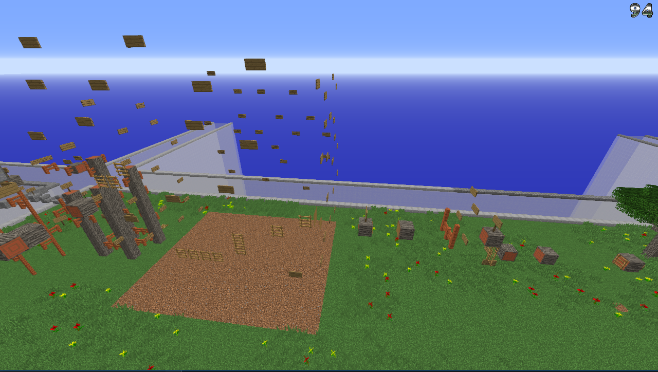
Screenshot_63.png
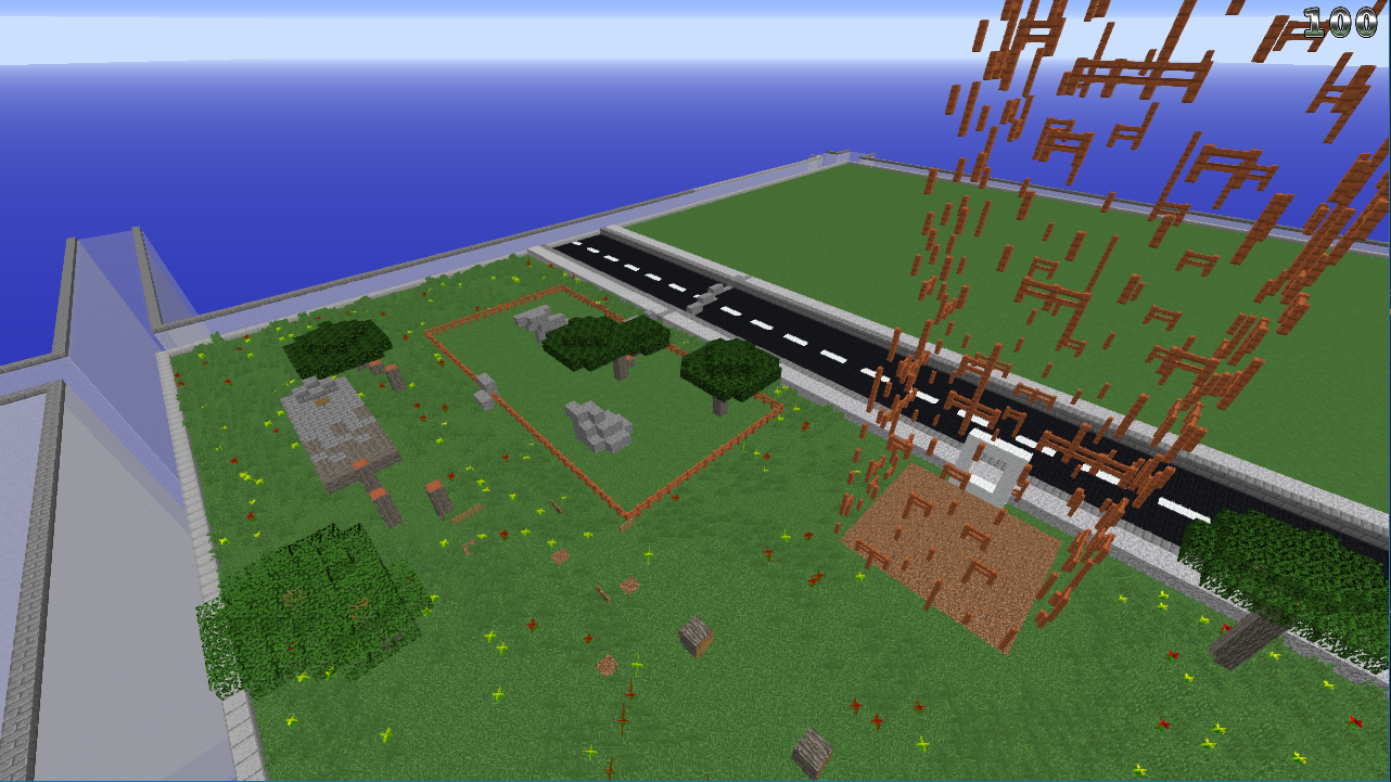
Screenshot_64.png
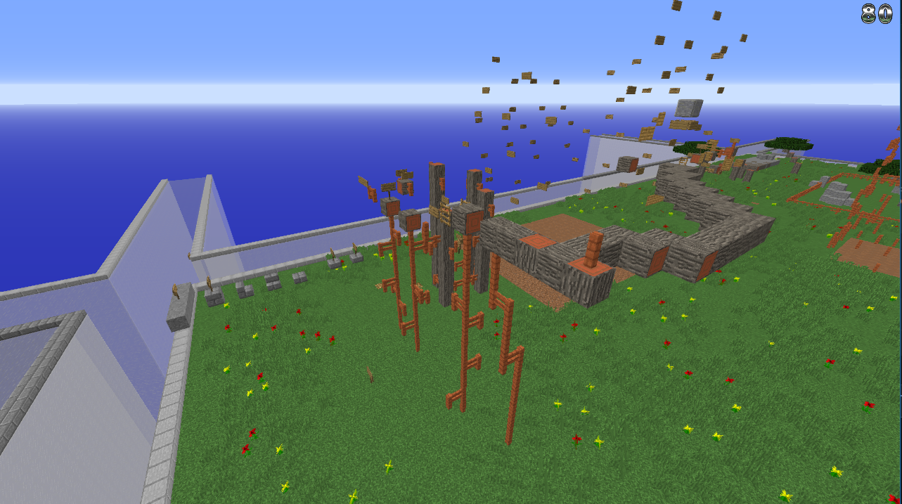
Screenshot_65.png

The # of your Plot / or warp name to it: /p v AriesNinja

Difficulty (Easy, Medium, Hard, Expert, Insane): Easy Or Medium

Number of jumps (Optional):
45 Significant
58 Total

Please note that everything beyond the road should be cutoff.
 

Blurpyfied

Forum God
ELITE
Blurpyfied
Blurpyfied
ELITE
Joined
Jan 1, 2017
Posts
1,857
Ratings
985 875
#3
Sorry but ur getting a -1

There really isnt a main build, I believe

from what I can tell the Parkour, is repetitive via the images

The theme is original?
 

Acrellux

Forum God
ELITE
Acrellux
Acrellux
ELITE
Joined
Jul 28, 2020
Posts
5,049
Ratings
1,364 147
#4
Okay, Aries, I like you, but, uh, I don't like this map.

First of all, invisible parkour isn't supposed to be visible. Every button shows the visibility of a block. You didn't include the number of jumps but from what I can tell the difficulty wouldn't be easy or medium — probably expert from how many jumps there are.
It's pretty messy, and some maps I have seen the mods don't remove signs or areas when they copy a map over, which means the grass on the other side of the road will still be there. The ground itself should contain some terrain to make it more appealing, and invisible parkour hasn't been accepted before.

I wish you good luck and I hope it gets accepted — but it's a slight chance.

Acid
 

Blurpyfied

Forum God
ELITE
Blurpyfied
Blurpyfied
ELITE
Joined
Jan 1, 2017
Posts
1,857
Ratings
985 875
#6
I guess this map just got forgotten :eek:

And thanks for all ur reviews <3
Actually, it wasn't forgotten, Map Judges live in different time zones from you and they judge maps when they can/want to judge them.
 

AriesNinja

Forum Master
VIP
AriesNinja
AriesNinja
VIP
Joined
Sep 20, 2020
Posts
502
Ratings
185 223
#7
Actually, it wasn't forgotten, Map Judges live in different time zones from you and they judge maps when they can/want to judge them.
I understand, it just seemed that way because the 2 maps below and above mine have been rated <3
 

Tas

Member
ELITE
ManaLabs
ManaLabs
ELITE
Joined
Nov 2, 2017
Posts
1,620
Ratings
1,315 43
#8
I understand, it just seemed that way because the 2 maps below and above mine have been rated <3
if you're referring to the ones reviewed at 11:30am and 1:00pm today, they were submitted one week and three weeks prior to yours, respectively.
 

ampsterdam

Dedicated Member
ELITE
ampsterdam
ampsterdam
ELITE
Joined
Jul 18, 2020
Posts
234
Ratings
109
#9
Uh yea sorry bro but

1. Absolutely no main build and it doesn't look great.
2. Pretty much all floating pk
3. All just random block placement and there seems to be no proper theme from what I can tell


I recommend you look on the parkour category of the forums and look for the post 'what makes good pk' or something along those lines
 

BDOsborne

Forum Expert
Joined
Sep 3, 2020
Posts
257
Ratings
266 1
#10
The idea is cool but its kinda like submitting a map saying massive incredibly detailed invisble staute..... it just doesnt thave substance. on a serious note though, this theme is virtually impossible to do as it just physically cant have a main build if the build is supposed to be invisible. also the city/building theme is quite overdone.
 

PyroTortilla

Forum Master
MVP+
PyroTortilla
PyroTortilla
MVP+
Joined
Aug 23, 2019
Posts
536
Ratings
387 10
#11
Hello,

Unfortunately, I will be REJECTING your map submission. Here is my input:

Theme: The theme is original as we do not have any strictly-invisible themed maps - however, this is not because you are the first to think of it but rather because invisible maps are just very annoying to play, so we try to limit the amount of invisible or trick jumps on a map (even barrier mazes are annoying).
Build: The build was pretty mediocre. I couldn't tell that the barriers covered in fences were supposed to be buildings at all, and the ground decoration is pretty boring and limited. Try to have a visible main build to your map and have good decoration around the whole plot instead of using bonemeal on grass blocks. The vast amount of barriers was also very problematic - they dropped my FPS from around 87 to 17 - try to limit the number of barriers used as many of theme were unnecessary and using //set air (especially for the other building with the fences on it) would achieve the same goal. You can also change the barriers to only be on the outside (covering a perimeter) instead of filling in the whole thing, and using alternating rows of barriers achieves the same goal with half the mess.
Parkour: The parkour was pretty boring and repetitive - try to use more blocks than just barrier to barrier jumps like heads, vines, water, ice, soul sand, slabs, lily pads, flower pots, etc. to make your parkour more fun to play. The length and difficulty corresponded to that of a MEDIUM map, so nice job there. This jump was impossible to do on 1.8.9 without speed, so make sure all your jumps fit those two guidelines.

I'd love to see more map submissions from you in the future, and have a great day!

(P.S. - almost all the barriers on your plot have been changed to glass just to reduce the lag while judging).
 
Status
Not open for further replies.