Rejected Marble column: Medium(unsure)

Status
Not open for further replies.
Joined
May 8, 2018
Posts
2
#1
Made by LokiLaevatein at -37; -43
6 checkpoints
75 jumps
Difficulty: Medium
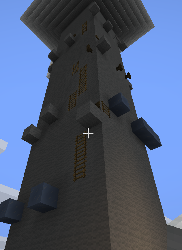
Pictures:
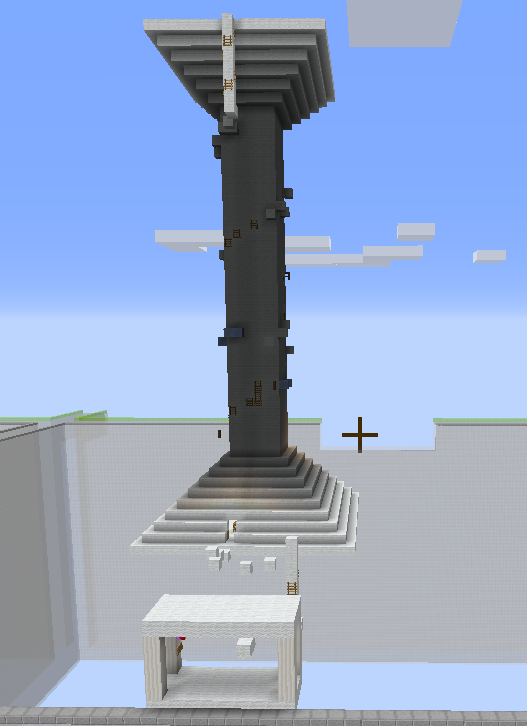
upload_2018-5-9_2-13-28.png

upload_2018-5-9_2-16-7.png

upload_2018-5-9_2-17-9.png

This is my first submission, so feel free to correct me if I've done anything wrong~
Edit: I've changed the blocks so it suits the theme better and added some glowstone so that the shadow's less annoying. Thank you all very much for helping me!! Images are here:
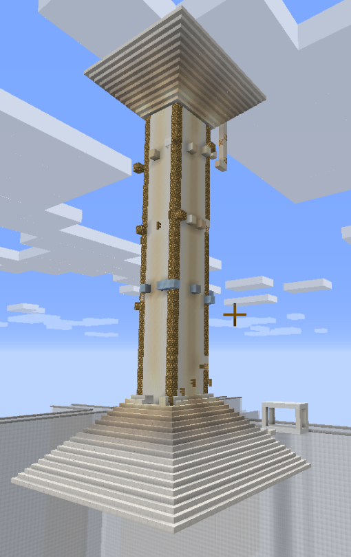
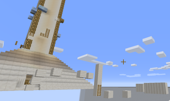
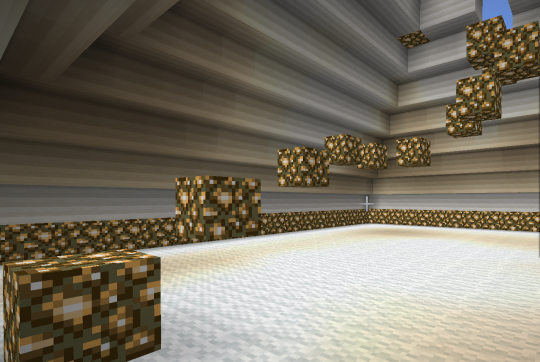
Thank you!!!
 

Attachments

Last edited:

Dark88

Dedicated Member
Joined
Feb 27, 2018
Posts
117
Ratings
29 18
#2
Hi, I haven’t tried this map out, would you mind putting the difficulty in the description? as that is part of the map submission format ;)
 

Drakonixal

Dedicated Member
Mapper
Joined
Nov 11, 2015
Posts
151
Ratings
38 11
#3
+1 the theme is original and the jumps are varied and great. Throughout doing this (I have done it many times because it is so fun for me to do) I have had a lot of fun and each jump represents a new genre of parkour. I think the parkour perfectly meets the difficulty standard and the theme is so great. I have never seen a quartz pillar map and I think the idea is amazing. Plus, the way you executed it is PERFECT. The parkour isnt very distracting from the build either, and thats another great reason why this should be accepted!
 

JakeNoot

Dedicated Member
Mapper
JakeNoot
JakeNoot
Joined
Apr 15, 2018
Posts
132
Ratings
42 8
#4
I'll be leaving a -1 on this map. Surely the theme is original and the build represents it's theme, but it could definitely be represented a lot better. To start, the only block used in the build portion of your map is white wool. This makes the build extremely unattractive and distracting from the parkour. Other than this, the parkour aspect of your map was very bland and could be significantly improved. Most of your jumps don't have a lot of variety, making the map not fun to do.

Cheers,
JakeNoot
 

EPGaming

Dedicated Member
VIP
Joined
May 1, 2018
Posts
107
Ratings
24
#5
I'm quite stuck on my decision but here's why. Surely an original theme. But you just built it a way that it doesn't represent very good. The shadow of the pillar itself is very distracting and could be worked on. Overal build only made out of white wool. I'm giving this a -1
 

Drakonixal

Dedicated Member
Mapper
Joined
Nov 11, 2015
Posts
151
Ratings
38 11
#6
I'll be leaving a -1 on this map. Surely the theme is original and the build represents it's theme, but it could definitely be represented a lot better. To start, the only block used in the build portion of your map is white wool. This makes the build extremely unattractive and distracting from the parkour. Other than this, the parkour aspect of your map was very bland and could be significantly improved. Most of your jumps don't have a lot of variety, making the map not fun to do.

Cheers,
JakeNoot
WOW I disagree completely!
 
Joined
Apr 12, 2018
Posts
23
Ratings
13
#8
There are pros and cons.
Pros:
Original idea.
Nice, fun parkour.
Cons:
White wool is used to much. Mix it up a bit.
That shadow!
Therefore I will give a 0 Making the best of both worlds.
 

AlfieJay

Parkour Mod+ | Survival Mod
Moderator+
AlfieJay
AlfieJay
Mod+
Joined
Apr 13, 2018
Posts
377
Ratings
350 10
#9
Vote: -1

Response: The pillar itself looked incredibly unattractive and it looked sort of rushed. Secondly, you can skip out the first bit in the pillar by just going around and up the bottom of the pillar. White wool was a bad choice for a building material for it. On the other hand, lots of cool and different parkour! (Sorry if I came off a bit harsh :/)
 

Prodigae

Active Member
Joined
Mar 25, 2018
Posts
36
Ratings
8 17
#10
-1
first off, animal, stop posting incorrect feedback as it doesn't help anyone. Secondly, for the map itself you could improve on the exterior of the pillar as it looks quite unattractive and it doesn't really have much of depth to it. And one minor thing, if the name is called marble column, maybe quartz would better fit marble than white wool. Just what i think (: Even though there is a lot of room for improvement, the parkour was incredibly fun to do and i loved the way you used different types of jumps and styles of parkour! Thanks for reading this, gl on your map!
 

Shinxray

SrMod | Parkour Manager
Senior Mod
Shinxray
Shinxray
Senior Mod
Joined
Sep 6, 2017
Posts
1,115
Ratings
695 11
#11
Hoi LokiLaevatein,
Sorry to tell you that your map have been rejected.
The theme is original, it's true, but it's not really an interesting and attractive theme, the build is not the best point too, it's pretty plain and simple, the parkour is pretty bad too, It's too long for a medium, but too easy for a hard. Your parkour is also quite repetitive sometimes, and there is some exploit on it.
However, even if the theme is not really attractive, it's still an original one, and there is some cool jumps in your parkour (Using ice, fence, glass panes is a good point !)

Thanks for submitting your, would be really good to see more maps from you ! :D
 
Status
Not open for further replies.