play.manacube.com
Loading Status...Rejected Pilgrim - Expert
- Thread starter Blurpyfied
- Start date
- Status
- Not open for further replies.


Heya Blurpy, I decided to take a look at your map, and I just wanted to share my thoughts. Even though I'm not the best parkourist, the difficulty seems fitting for the jumps you've made, but there are areas that confuse me. The first area inside the pilgrim is too dark to see in, and would probably cause people to get lost in there. My biggest concern however is the build itself... I recall you tried making a pilgrim hat map not too long ago, as the hat from this build looks very similar to it, almost too similar. It still looks too stout. The face of the Pilgrim also feels off-putting... I feel it's due to how unnaturally spherical it is. The wood around the mouth is also a concern. It's definitely a unique concept, but I feel that it's current state isn't map worthy just yet. I hope you do continue working on this map, as it does have potential! -1

I would give this +0.5!
I kinda disagree with Yoshi's opinion. I personally think that the build is fine, seeing it as a cartoon-ish build style. And overall I think the build is pretty decent and I can see what you are trying to build.
However, my biggest concern is the parkour. Just like Yoshi said, the first part is too dark and it's really hard to parkour inside it. And I don't like the parkour is mostly inside the person. You are suppose to build the parkour on top of the build itself, not the opposite. You are just making the parkour room by room, and not matching the build/theme itself! Your parkour's inside : outside ratio is 9:1, so it is definitely unbalanced!
But overall, it's a map with potential! Good luck with it being accepted!
However, I do not feel like the parkour is unbalanced, yes it doesnt have much outside, but for some reason I wanted to keep a little bit of a failsafe type vibe with the map.
Heya Blurpy, I decided to take a look at your map, and I just wanted to share my thoughts. Even though I'm not the best parkourist, the difficulty seems fitting for the jumps you've made, but there are areas that confuse me. The first area inside the pilgrim is too dark to see in, and would probably cause people to get lost in there. My biggest concern however is the build itself... I recall you tried making a pilgrim hat map not too long ago, as the hat from this build looks very similar to it, almost too similar. It still looks too stout. The face of the Pilgrim also feels off-putting... I feel it's due to how unnaturally spherical it is. The wood around the mouth is also a concern. It's definitely a unique concept, but I feel that it's current state isn't map worthy just yet. I hope you do continue working on this map, as it does have potential! -1
I build the "Pilgrim Hat" map a while ago, hence the similarity, and from what i've heard from some mappers in the past that don't play much *cough* ashley *cough* that legs shouldve been added on to a map, and I was like "why not just remove all the pk from the original hat map, and make a body so it feels a little more attractive.
I don't feel like changing the head much unless map judges ask me to, if this post goes into reviewing, I really like the style of the head looking like a cartoon and want to try and keep it that way!
Hey, I went back in, and tried my best to do some relighting, do you mind going to it and seeing it again?
However, I do not feel like the parkour is unbalanced, yes it doesnt have much outside, but for some reason I wanted to keep a little bit of a failsafe type vibe with the map.
First, I don't understand the "failsafe type vibe" you are talking about. It's a course parkour, not a rankup parkour. Why do people need failsafe? That's because there's no checkpoint and they have to go all the way back if they fail. But you can create checkpoint as many as you want to create failsafe in this server. It's just the matter where to put the checkpoint, and that's testing your parkour build skills. So no, wanting the "failsafe type vibe" isn't an excuse!
Second, why do you think that building outside is important? You have missed my whole point! That's because your parkour is mostly floating blocks!!! Your parkour isn't merge with the build/theme, but instead it's floating inside the person's body, and it's room by room. The parkour is unbalanced or not isn't the main point. If you can build the parkour inside and have more decorations in it, making it less floating block parkour, then I won't complain anything!
So still, it's a +0.5 for me! Good Luck!


Hello Blurpyfied,
I regret to inform you that your map is being rejected.
The theme is original, well done.
The build is a concern. The face looks like a simple sphere and the arms are shaped very weird and they look stiff. These definitely need to be improved.
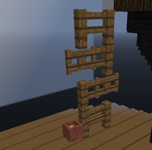
The parkour is also a concern. It is varied throughout, so well done there. However, the difficulty of the jumps is a concern. For starters, this jump below is confusing at the start:
 A lot of the jumps further on are inconsistent with some being too easy for an expert map. Make sure your jumps match the expert difficulty. In addition to this, unless I miscalculated, your parkour is slightly more than 35 blocks below your starting platform (like a 2-3 block difference.)
Thank you for submitting this map, I would love to see more submissions from you!
I regret to inform you that your map is being rejected.
The theme is original, well done.
The build is a concern. The face looks like a simple sphere and the arms are shaped very weird and they look stiff. These definitely need to be improved.
The parkour is also a concern. It is varied throughout, so well done there. However, the difficulty of the jumps is a concern. For starters, this jump below is confusing at the start:
Thank you for submitting this map, I would love to see more submissions from you!
- Status
- Not open for further replies.
2013 - 2024 © ManaLabs Inc.
ManaLabs is an Official Minecraft Partner
ManaCube is a multiplayer network for Minecraft Java Edition. IP: play.manacube.com
The ManaCube server is not endorsed by Mojang, AB.
ManaCube is a multiplayer network for Minecraft Java Edition. IP: play.manacube.com
The ManaCube server is not endorsed by Mojang, AB.