play.manacube.com
Loading Status...Accepted Suitcase - Medium
- Thread starter chiara
- Start date
- Status
- Not open for further replies.
Hiya there Elly, nice map! - I'm not a map judge yadi yada spchepil
I have some feedback for le parkour!
Let's get on with it, shall we? :D
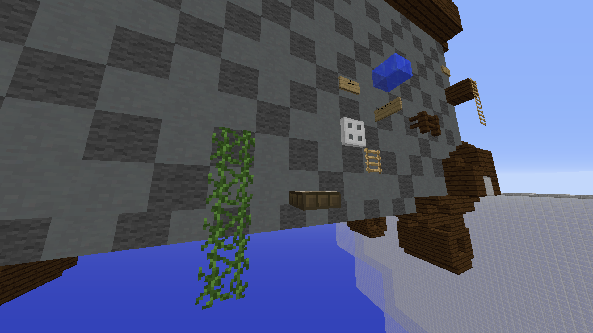
For a medium, this vine jump ruins the flow of the nice chain to the start - it feels like "have a nice water slime chain" and then try this tricky vine jump
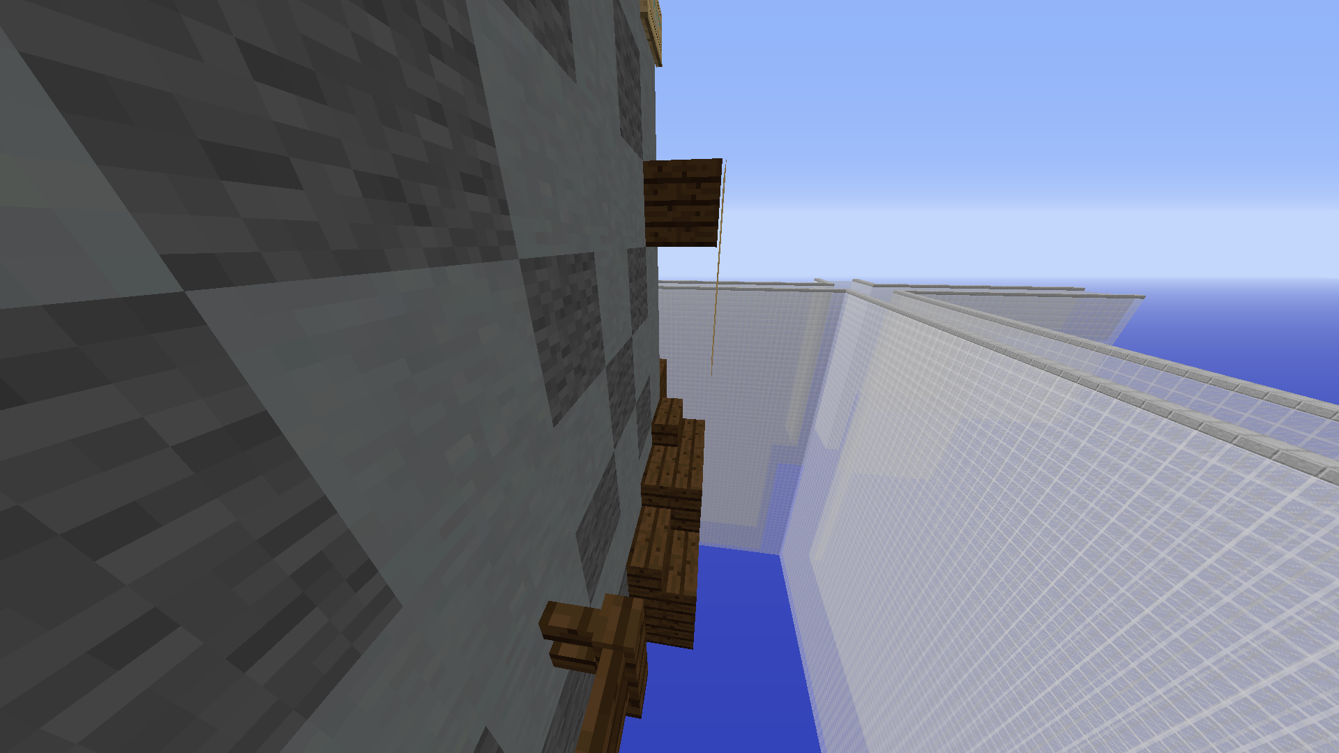
Might be slightly misleading here for the wooden blocks on the floor. Perhaps an arrow to the ladder would do?
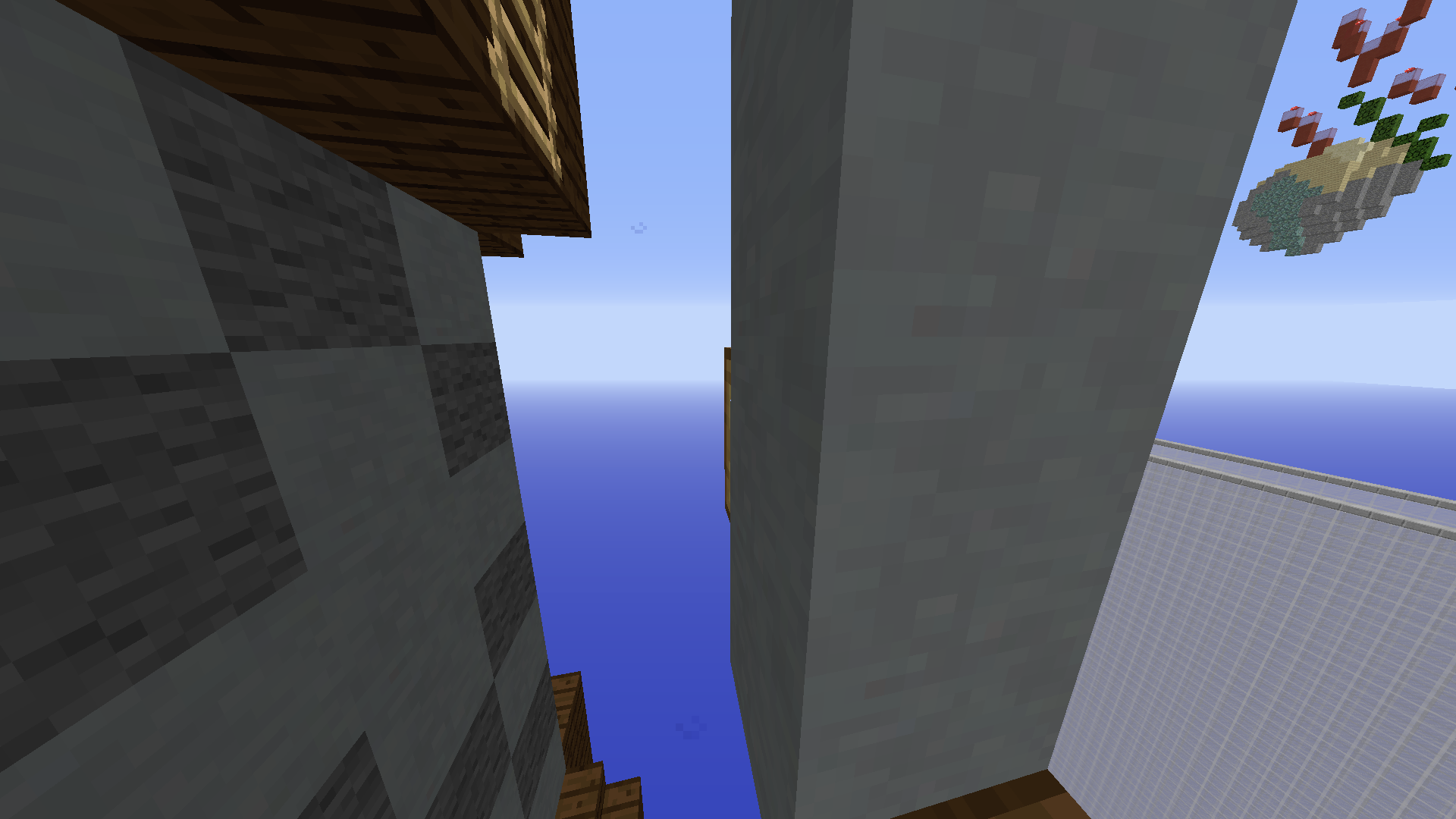
A neup in a medium map? D:
I'd say the difficulty of the 1st exterior section is vastly more difficult than the interior area. Consider nerfing the iron bar to td jump as well, and potentially buffing in the inside
Ext 2 is well done
Impressions: It's a good map- the parkour feels good for flow, but may require some balancing for consistency in difficulty
Good luck with the submission!
Pink
I have some feedback for le parkour!
Let's get on with it, shall we? :D
For a medium, this vine jump ruins the flow of the nice chain to the start - it feels like "have a nice water slime chain" and then try this tricky vine jump
Might be slightly misleading here for the wooden blocks on the floor. Perhaps an arrow to the ladder would do?
A neup in a medium map? D:
I'd say the difficulty of the 1st exterior section is vastly more difficult than the interior area. Consider nerfing the iron bar to td jump as well, and potentially buffing in the inside
Ext 2 is well done
Impressions: It's a good map- the parkour feels good for flow, but may require some balancing for consistency in difficulty
Good luck with the submission!
Pink
Last edited:
Hiya there Elly, nice map! - I'm not a map judge yadi yada spchepil
I have some feedback for le parkour!
Let's get on with it, shall we? :D
Impressions: It's a good map- the parkour feels good for flow, but may require some balancing for consistency in difficulty
Good luck with the submission!
Pink
I have some feedback for le parkour!
Let's get on with it, shall we? :D
View attachment 49140
For a medium, this vine jump ruins the flow of the nice chain to the start - it feels like "have a nice water slime chain" and then try this tricky vine jump
For a medium, this vine jump ruins the flow of the nice chain to the start - it feels like "have a nice water slime chain" and then try this tricky vine jump
View attachment 49141
Might be slightly misleading here for the wooden blocks on the floor. Perhaps an arrow to the ladder would do?
Might be slightly misleading here for the wooden blocks on the floor. Perhaps an arrow to the ladder would do?
View attachment 49142
A neup in a medium map? D:
I'd say the difficulty of the 1st exterior section is vastly more difficult than the interior area. Consider nerfing the iron bar to td jump as well, and potentially buffing in the inside
Ext 2 is well done
A neup in a medium map? D:
I'd say the difficulty of the 1st exterior section is vastly more difficult than the interior area. Consider nerfing the iron bar to td jump as well, and potentially buffing in the inside
Ext 2 is well done
Impressions: It's a good map- the parkour feels good for flow, but may require some balancing for consistency in difficulty
Good luck with the submission!
Pink
the first time i played the pk i found it quite bland and boring but as i replayed it quite a few times and knew the flow it grew on me so well done in that respect. i think my intial opinion formed from a few inappropriate blockchoices and a few jumps that were somewhat jerky.
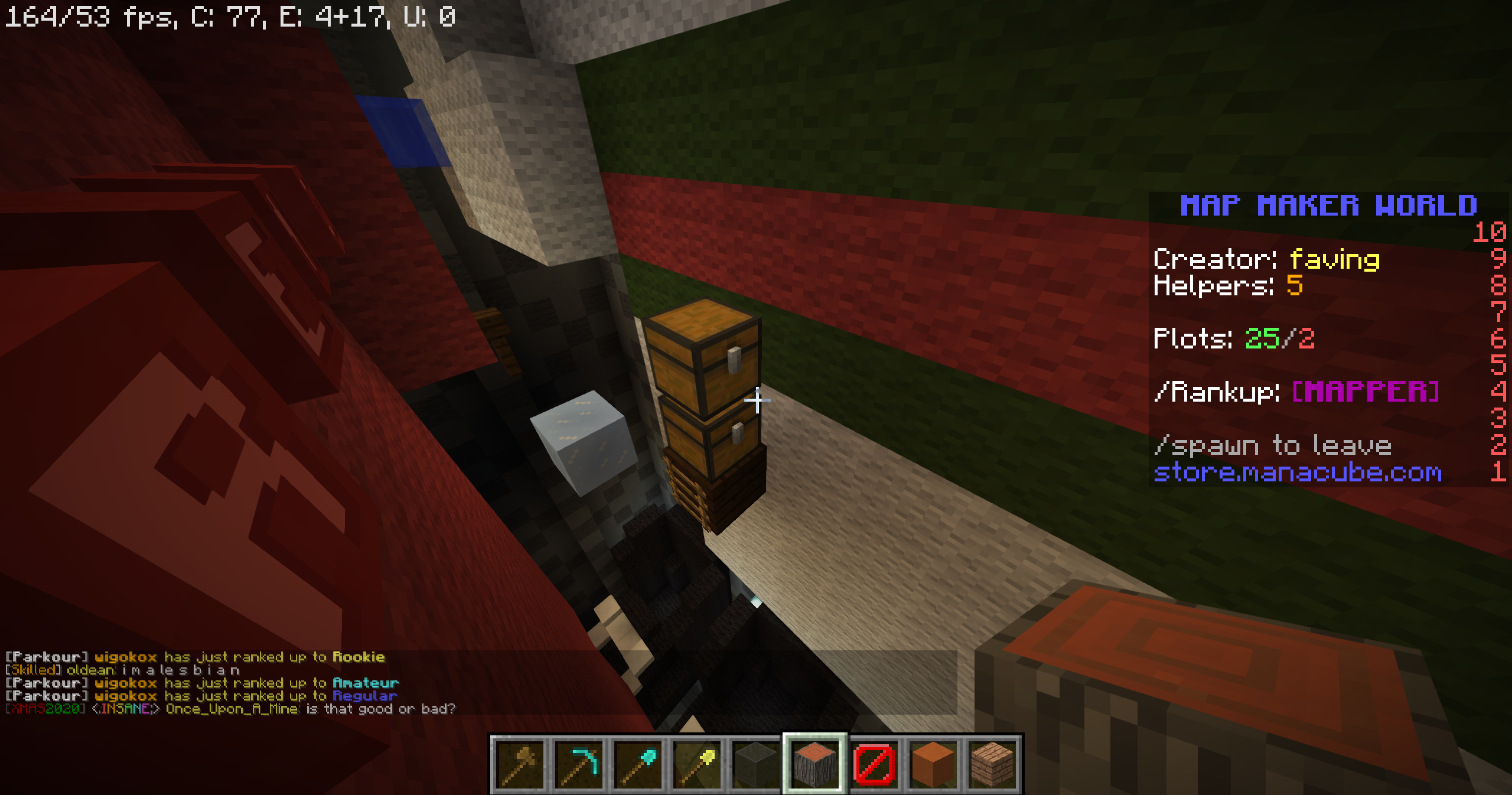
just a personal issue of mine with chest used like this XD, idk i just find it looks ugly and adds nothing to the pk.
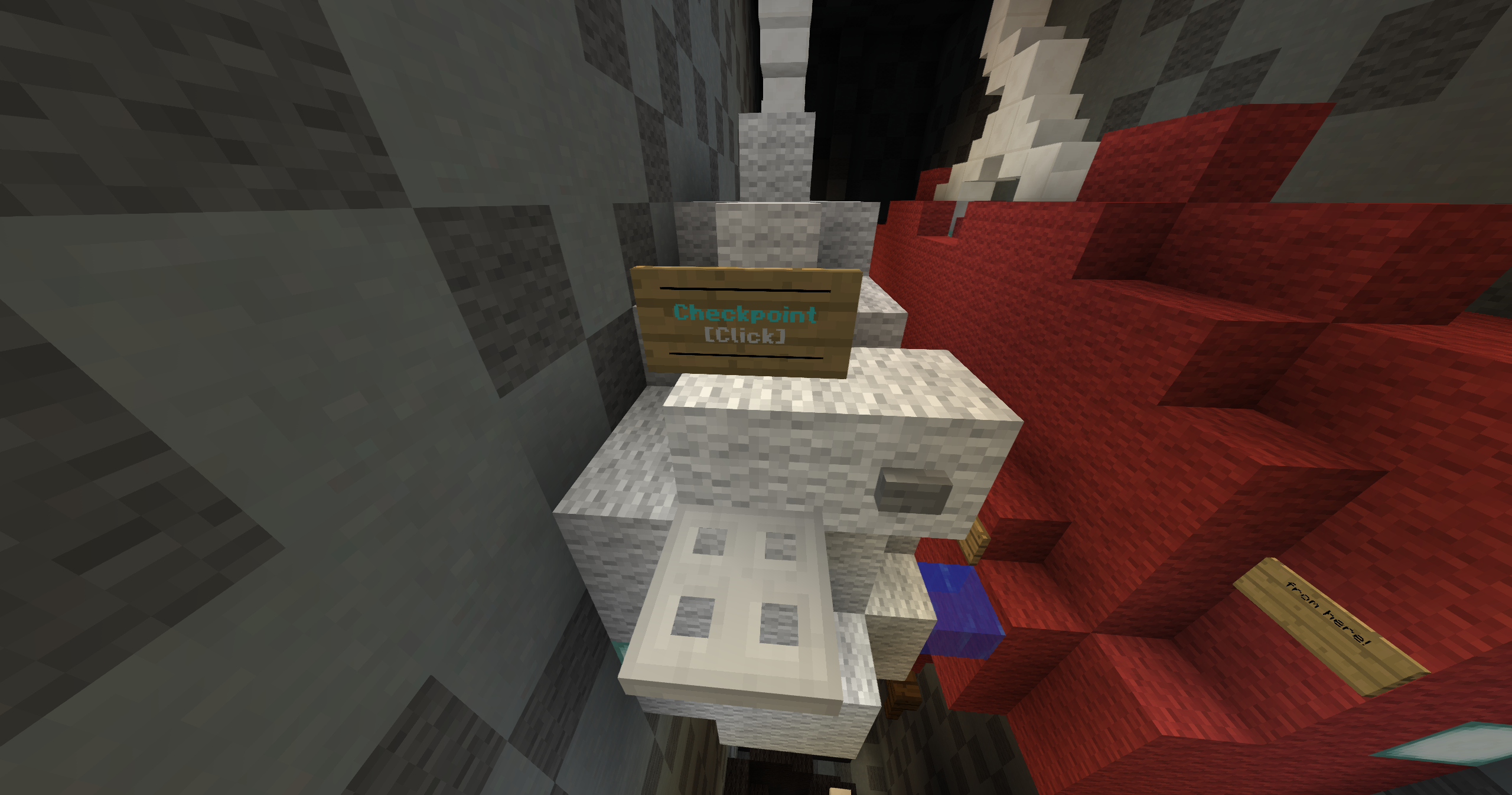
maybe add a marker of some description maybge a few buttons on top of the barriers to show they are there.
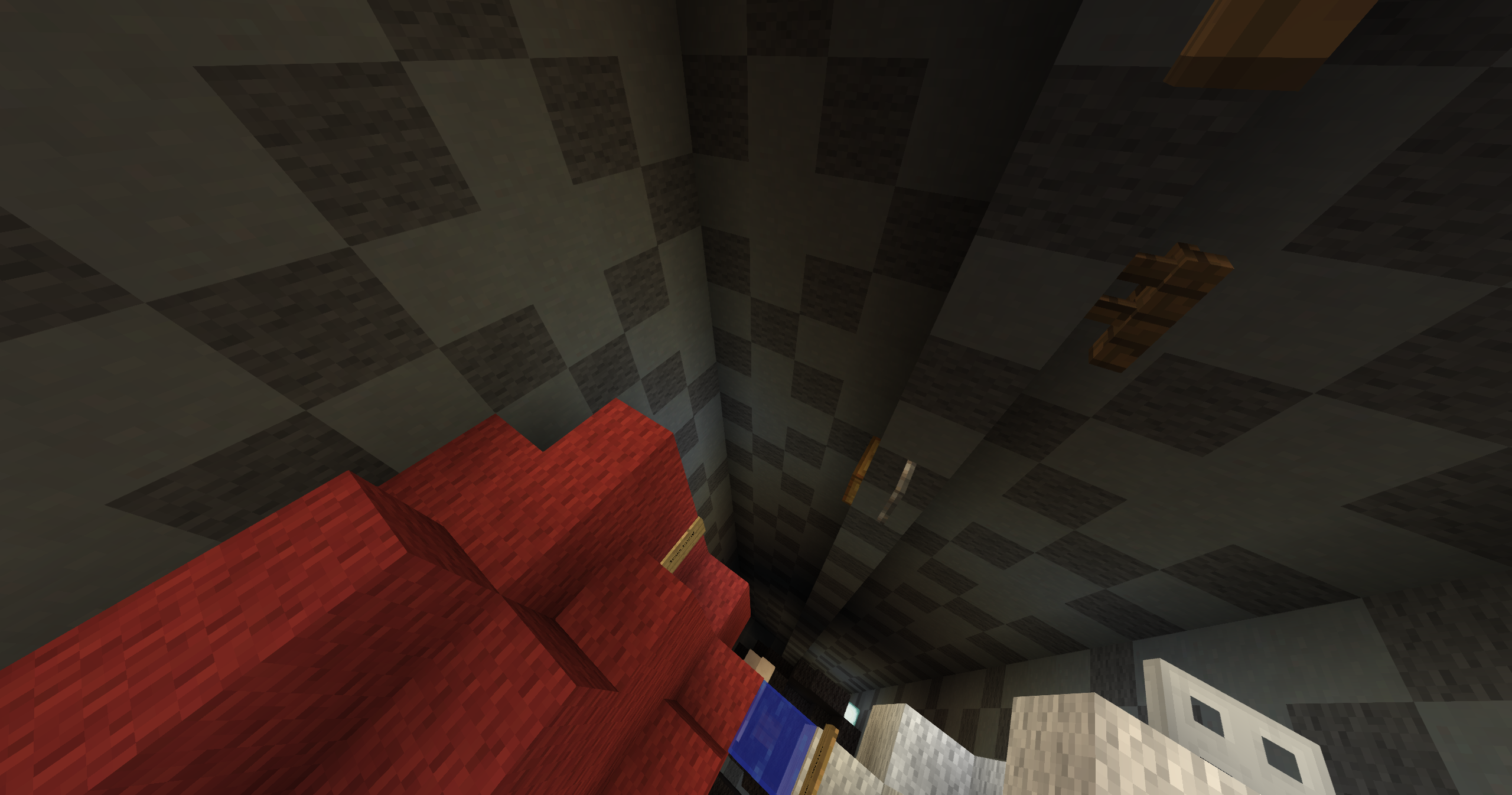
idk how the tp pad is supoosed to be accesible but u can pretty much reach it from any of the pk past the trapdoor. maybe rethink how this section works so it will work properly wihtout to many barriers!
any ways the pk was pretty fun in the end of the day well done.
onto the build which id say is the weakest part of the map.
it is quite accurate and i fully see how its hard to add details to an objet which is inherently pretyt bland and i think what you have done with the buckles etc is a really nice touch. that being said i do agree with bin somewhat and the build is still in the end of the day relatively boxy and inanimate. i usually find with objects that are hard to make look really snazzy is jsut to animate them in some way whether its being opened or on a conveyer belt or anything you would do with a suitcase just to boost it that further step! i actually find the build its self acceptable atm and i think uve done a great job with the position you have chosen for it but i dont believe the position lends to your building ability and restricts your chances of getting featured which you guys could well do!
idk bout theme and im to lazy to check but id hazard a guess and say its original and iof not its probably way better than other suitcase builds XD
anyway take my feedback with a grain of salt as usual and dont take it to heart im just tryna improve things for next time!
PS i like da kicks
just a personal issue of mine with chest used like this XD, idk i just find it looks ugly and adds nothing to the pk.
maybe add a marker of some description maybge a few buttons on top of the barriers to show they are there.
idk how the tp pad is supoosed to be accesible but u can pretty much reach it from any of the pk past the trapdoor. maybe rethink how this section works so it will work properly wihtout to many barriers!
any ways the pk was pretty fun in the end of the day well done.
onto the build which id say is the weakest part of the map.
it is quite accurate and i fully see how its hard to add details to an objet which is inherently pretyt bland and i think what you have done with the buckles etc is a really nice touch. that being said i do agree with bin somewhat and the build is still in the end of the day relatively boxy and inanimate. i usually find with objects that are hard to make look really snazzy is jsut to animate them in some way whether its being opened or on a conveyer belt or anything you would do with a suitcase just to boost it that further step! i actually find the build its self acceptable atm and i think uve done a great job with the position you have chosen for it but i dont believe the position lends to your building ability and restricts your chances of getting featured which you guys could well do!
idk bout theme and im to lazy to check but id hazard a guess and say its original and iof not its probably way better than other suitcase builds XD
anyway take my feedback with a grain of salt as usual and dont take it to heart im just tryna improve things for next time!
PS i like da kicks
Hello faving and Elly_x,
I am happy to inform you that your map is being accepted!
The theme is original, well done.
The build is accurate to what you were going for, and well done overall.
The parkour is varied throughout, and fits the medium difficulty nicely.
Thank you for submitting this map, I would love to see more submissions from you!
- Status
- Not open for further replies.
2013 - 2024 © ManaLabs Inc.
ManaLabs is an Official Minecraft Partner
ManaCube is a multiplayer network for Minecraft Java Edition. IP: play.manacube.com
The ManaCube server is not endorsed by Mojang, AB.
ManaCube is a multiplayer network for Minecraft Java Edition. IP: play.manacube.com
The ManaCube server is not endorsed by Mojang, AB.