Username: WICKEDMagma
Map name: The Maze Runner
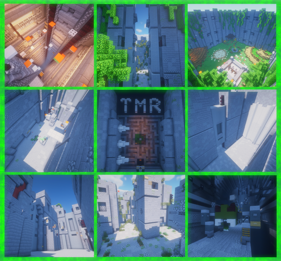
Photos:

Plot: /plot visit WICKEDMagma 2
Difficulty: Insane
Number of jumps: 180 jumps & 16 checkpoints
My first submission of this map was rejected due to the inconsistent difficulty and confusing path. I've changed 75% of the jumps to match the Insane difficulty. The main spots I changed were the elevator shaft, glade vines, and deadhead forest. I added trapdoors and fences to turn Hard neos to Insane. I also added a bit more variety to the parkour with several creative jump concepts. To make the parkour less confusing, I added a large number of directional signs. I also changed the path of the parkour a bit in order to avoid having to use extremely exotic barrier placements. I also placed barrier block signs in places where the player might be tempted to jump to; I left areas that are very clear to be out of bounds unmarked. The last thing I did was add a few checkpoints and move them around a bit. I did my best to place them near the jumps where the player is likely going to take many attempts to make, and in places where the player can reach it from different parts of the parkour. I think if this map were to be rejected again, it would be due to the slightly excessive use of ladders, neos, and ladder neos. Other than that, I think this resubmission has a pretty good chance to be accepted.
Map name: The Maze Runner
Photos:
Plot: /plot visit WICKEDMagma 2
Difficulty: Insane
Number of jumps: 180 jumps & 16 checkpoints
My first submission of this map was rejected due to the inconsistent difficulty and confusing path. I've changed 75% of the jumps to match the Insane difficulty. The main spots I changed were the elevator shaft, glade vines, and deadhead forest. I added trapdoors and fences to turn Hard neos to Insane. I also added a bit more variety to the parkour with several creative jump concepts. To make the parkour less confusing, I added a large number of directional signs. I also changed the path of the parkour a bit in order to avoid having to use extremely exotic barrier placements. I also placed barrier block signs in places where the player might be tempted to jump to; I left areas that are very clear to be out of bounds unmarked. The last thing I did was add a few checkpoints and move them around a bit. I did my best to place them near the jumps where the player is likely going to take many attempts to make, and in places where the player can reach it from different parts of the parkour. I think if this map were to be rejected again, it would be due to the slightly excessive use of ladders, neos, and ladder neos. Other than that, I think this resubmission has a pretty good chance to be accepted.
Theme 5/5: This theme is definitely original since there are no other maps based on The Maze Runner. There are a few maps with mazes in them, those mazes are a very minor attraction to those maps.
Build 6/5: I put detail into every single bit of this map, including the areas you can only see, but can't access. The layout of the glade is accurate. The maze is ideal. Everything you see in The Maze Runner film is on this map, and everything you'd imagine The Maze Runner to look like is on this map.
Parkour 4/5: There is a lot more variation in the types of jumps than last time, and the difficulty is much more consistent. I gave myself only a 4/5 because there are a few areas in the map where the jumps are slightly repetitive, although I tried to shorten those areas. There are quite a few ladders, neos, and ladder to ladder neos, but I think the creativity of some of the other jumps make up for it.
Last edited: