Username: WideNuts
Map name: Vegemite
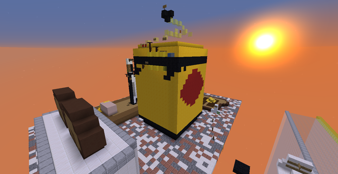
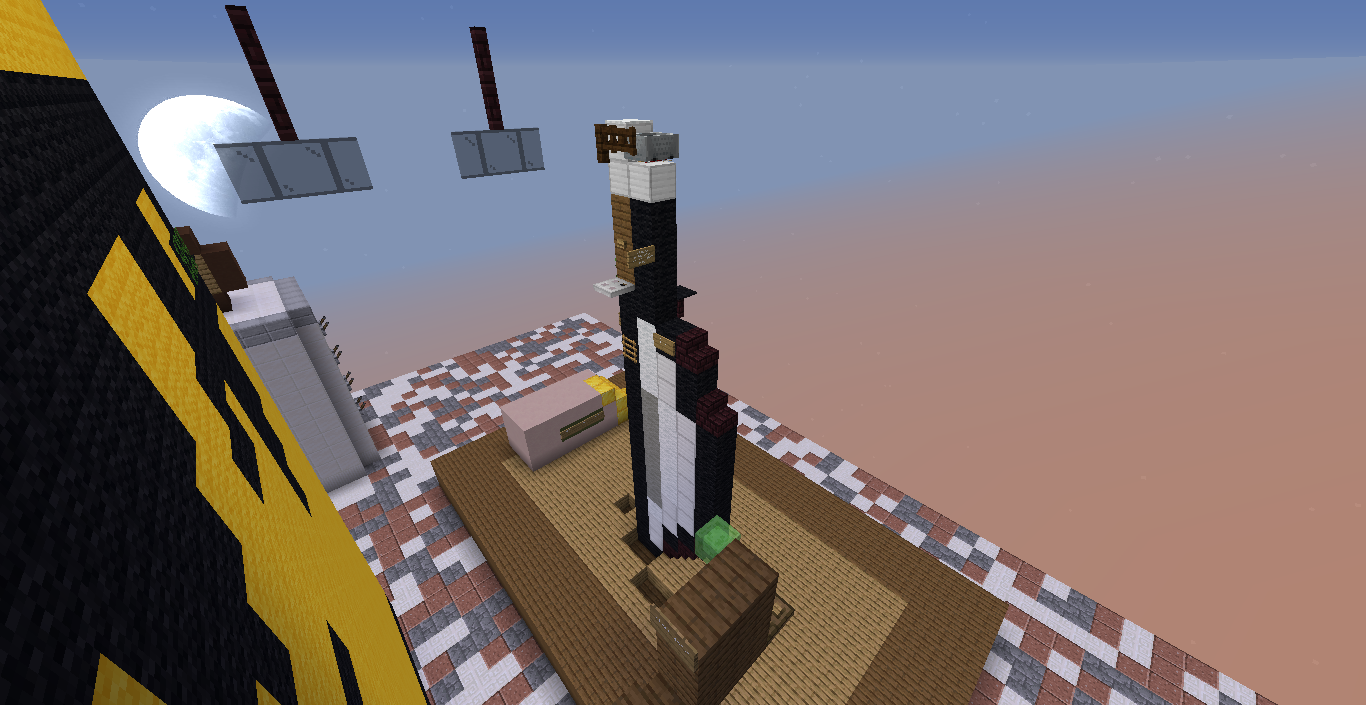
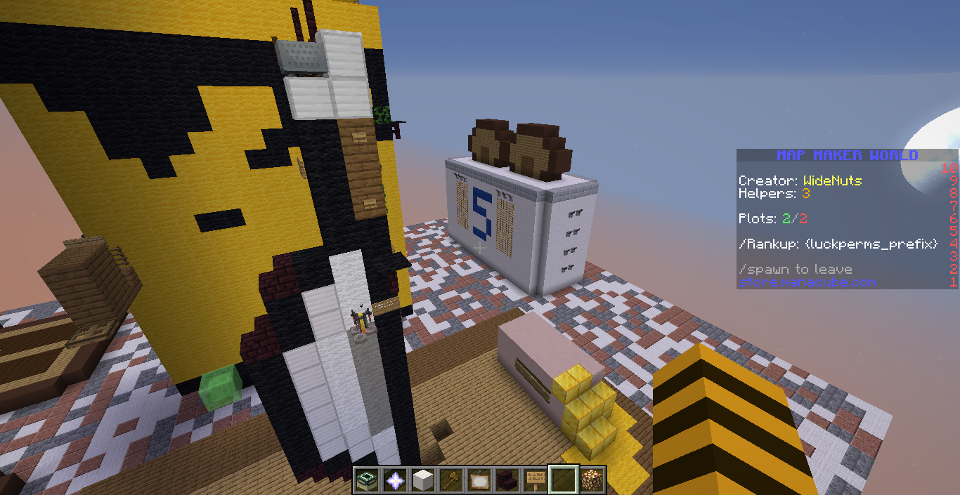
Photos of your Parkour:


The # of your Plot / or warp name to it: /plot v WideNuts
Difficulty (Easy, Medium, Hard, Expert, Insane)
Number of Checkpoints: 4
Number of jumps (Optional): 57
Although this is my first map submission, I put a fair bit of effort into it and proofed all of the jumps to make sure they were possible, while still incorporating the surrounding builds / props. I feel that it is a well rounded and challenging map that includes a variety of different types of jumps to keep the player entertained. I'm not great at taking photos so it would mean a lot if you could check it out for yourself by using the above command. I am aware that the floor is a bit ugly but I couldn't think of an appropriate colour / block scheme. I can easily change it if need be. The theme is based around the Australian spread "Vegemite". Do not be fooled by the finish, you will fall into a hole and be forced to use /cp. You must jump over the hole and drop to the real finish and pressure plate.
EDIT: I have made some changes by adding in ice, soulsand and cake jumps to limit the number of fence jumps I had in the parkour.
Map name: Vegemite
Photos of your Parkour:
The # of your Plot / or warp name to it: /plot v WideNuts
Difficulty (Easy, Medium, Hard, Expert, Insane)
Number of Checkpoints: 4
Number of jumps (Optional): 57
Although this is my first map submission, I put a fair bit of effort into it and proofed all of the jumps to make sure they were possible, while still incorporating the surrounding builds / props. I feel that it is a well rounded and challenging map that includes a variety of different types of jumps to keep the player entertained. I'm not great at taking photos so it would mean a lot if you could check it out for yourself by using the above command. I am aware that the floor is a bit ugly but I couldn't think of an appropriate colour / block scheme. I can easily change it if need be. The theme is based around the Australian spread "Vegemite". Do not be fooled by the finish, you will fall into a hole and be forced to use /cp. You must jump over the hole and drop to the real finish and pressure plate.
EDIT: I have made some changes by adding in ice, soulsand and cake jumps to limit the number of fence jumps I had in the parkour.
Last edited: