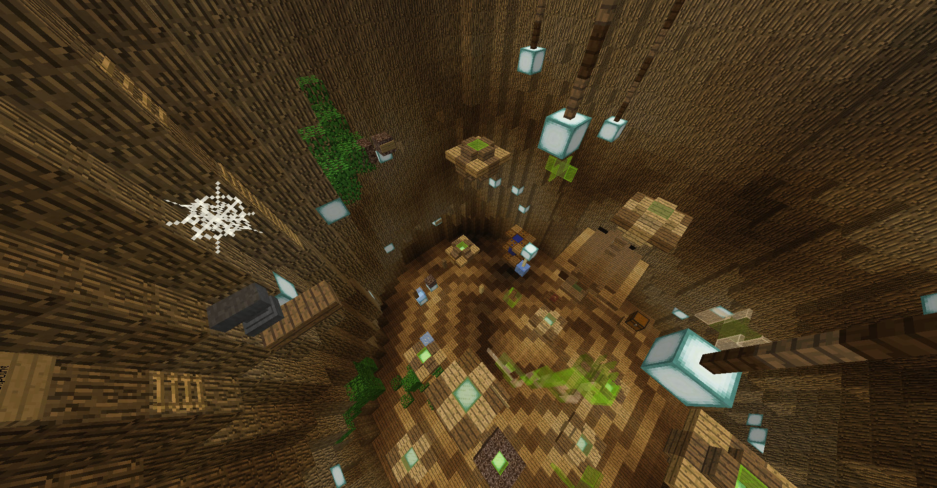
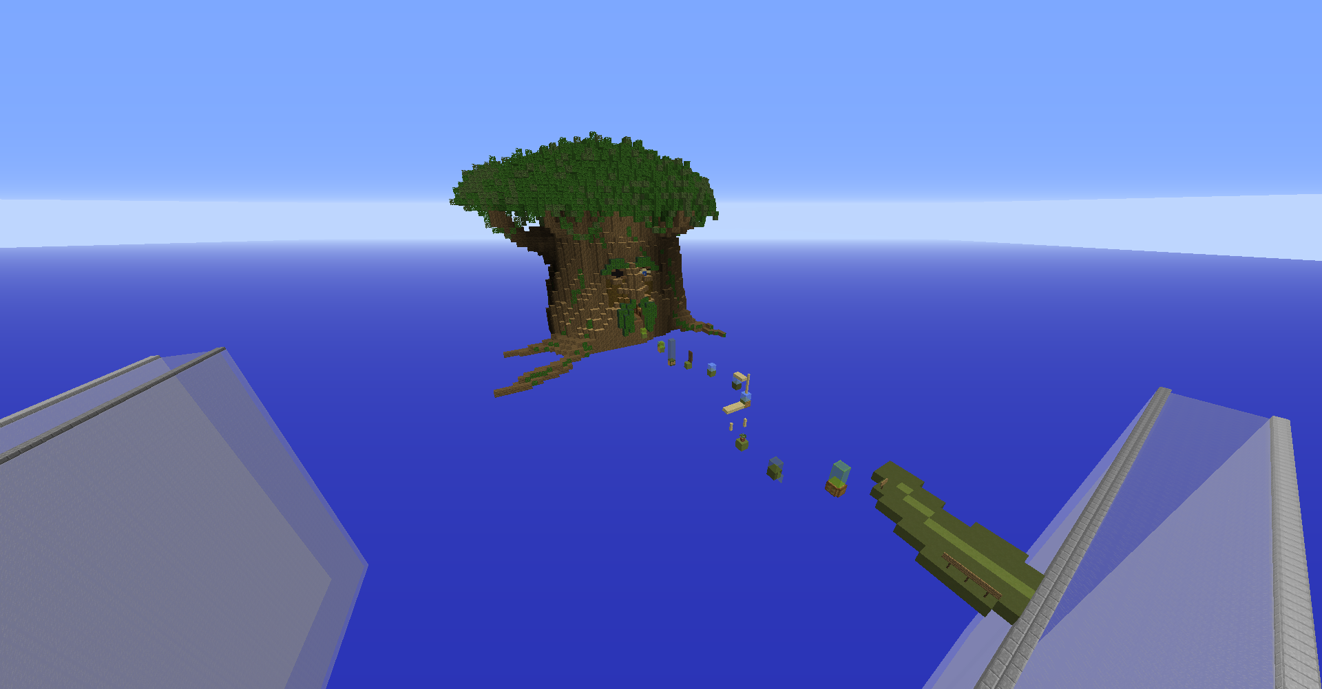
Hi, I am not sure if this is proper procedure but my map was rejected a few hours before I made a bunch of edits to it... I was hoping to fix things before someone officially made a decision on it, oops! This is my first attempt at a map submission for any server so please give me some grace if I'm doing things incorrectly x_x
If Bartelby is not up to standards overall then I will enjoy the build in private, no problem. But if there is a possibility for revisions I will build him up to be his best self so everyone can get a taste of the wizardly magic! Seriously though, thank you for your time dear moderators, and thank you to everyone who tested the map and gave advice!
Fixes as of 12/05/2021:
- Added more jump styles (blocks, techniques) to reduce repetition
- Added branches and improved shaping to tree canopy
- Added more directional signs
- Added more lighting
I see how it comes across as a basic tree but that's pretty much the cartoon character he is, I thought about roots or grass under him from the start but that's not really how I picture him from the game.
The jumps are inspired by all of the jumps my friend hates or struggles with :') practice makes perfect, right?
I figure since the original post was rejected straightaway that there was no hope that revisions could make it good enough so I will not be sad if that is the case! I do apologize if I am wasting anyone's time here.
Cheers,
Lex
From original post:
Here is my map submission:
This is a wizard101 themed map in honor of my friend miachelle. I have re-created beloved character Bartelby in a life-wizard themed parkour map with about 60 jumps. Medium difficulty
Attached are some screenshots.
The plot owner is myself, LexSocks. Plot ID: -18;-118 (Plot 3)
I received some help on the initial building from player RoyalDogmeat (last seen as _TheOutsider).
Last edited: