play.manacube.com
Loading Status...Rejected Duolingo - Medium
- Thread starter hpdra9oniz3r
- Start date
- Status
- Not open for further replies.
1. your parkour doesn't look fit for a hard, it just has a bunch of blocks
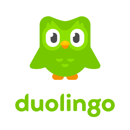
2. if you check a picture of the bird itself, it doesn't have legs and rather just has its feet floating/attached to the body. another issue with the build is the wings, they go straight out like arms rather than shaped out like wings. its arms do go straight down but the under arms (or ig under wings) have more of a curve to them.

2. if you check a picture of the bird itself, it doesn't have legs and rather just has its feet floating/attached to the body. another issue with the build is the wings, they go straight out like arms rather than shaped out like wings. its arms do go straight down but the under arms (or ig under wings) have more of a curve to them.

1. your parkour doesn't look fit for a hard, it just has a bunch of blocks
2. if you check a picture of the bird itself, it doesn't have legs and rather just has its feet floating/attached to the body. another issue with the build is the wings, they go straight out like arms rather than shaped out like wings. its arms do go straight down but the under arms (or ig under wings) have more of a curve to them.

2. if you check a picture of the bird itself, it doesn't have legs and rather just has its feet floating/attached to the body. another issue with the build is the wings, they go straight out like arms rather than shaped out like wings. its arms do go straight down but the under arms (or ig under wings) have more of a curve to them.

Last edited:
we changed it from a hard back to a medium because the judges were quite inconsistent with what they thought the map should be, so we changed back and forth a few times. also a lot of maps aren't precise and built completely naturally, in our case it was to emphasise the whole "duolingo scary" thing
Hello Hpdra9oniz3r, Leeviska & Mestarihylje,
Unfortunately, I will be Rejecting your map.
The theme is original, and the build is alright. It does look like the duolingo bird - but there are a few things that would need to be changed. As Sophia mentioned above, some of the proportions of the body are off, the wings don't look very natural, and the face is very high up compared to the actual character, so it would be great if some of that shaping could be re done.
The parkour is quite repetitive. You used a lot of different blocks in your parkour, however the utility for a lot of them were the same, an example being the quartz slabs with cocoa beans on the inside of the map, the cocoa beans make no difference to the jump, so they aren't necessary. Try to focus on the utility of the blocks you are using rather than just the appearance, as even though you used a lot of different blocks, the parkour does feel pretty repetitive.
The length and difficulty are good for a medium map.
Thanks for submitting your map! I hope to see more maps from you in the future.
- Status
- Not open for further replies.
2013 - 2024 © ManaLabs Inc.
ManaLabs is an Official Minecraft Partner
ManaCube is a multiplayer network for Minecraft Java Edition. IP: play.manacube.com
The ManaCube server is not endorsed by Mojang, AB.
ManaCube is a multiplayer network for Minecraft Java Edition. IP: play.manacube.com
The ManaCube server is not endorsed by Mojang, AB.