play.manacube.com
Loading Status...Rejected Woodserpent - Hard
- Thread starter Enderkitten
- Start date
- Status
- Not open for further replies.
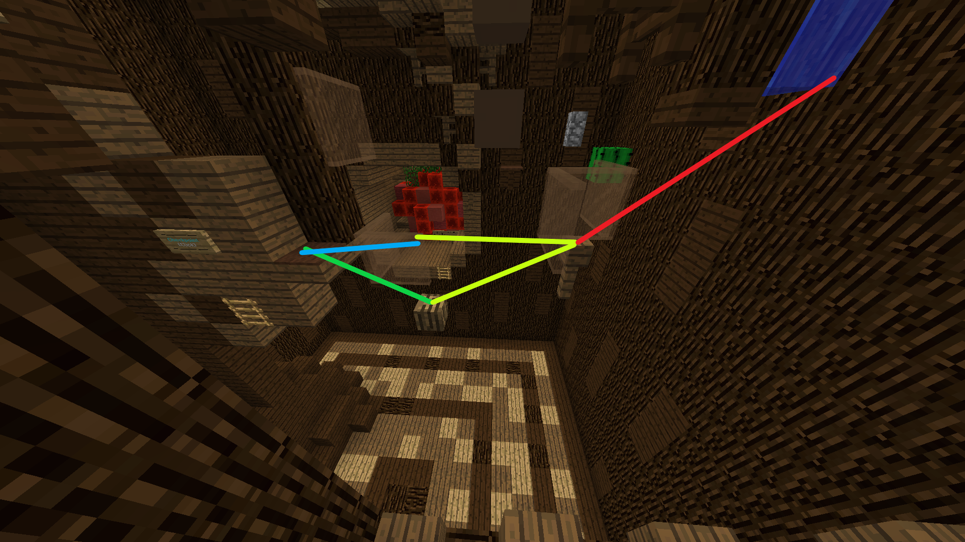
Hey! (I am not a map judge, only providing feedback). although i have literally no idea what this build is based off, it looks nice :D the parkour is really nice too with some really interesting jumps. I have a bit of feedback on this part of the parkour, where I got totally lost:

So starting from the brown carpet, am I supposed to go the first pane (which is possible)?or am i supposed to go the head and then onwards to the next head. Then if it is to that head do i go back to the first pane, or to the water? this part was very confusing. Could maybe add some panes or similar to make it more straightforward.

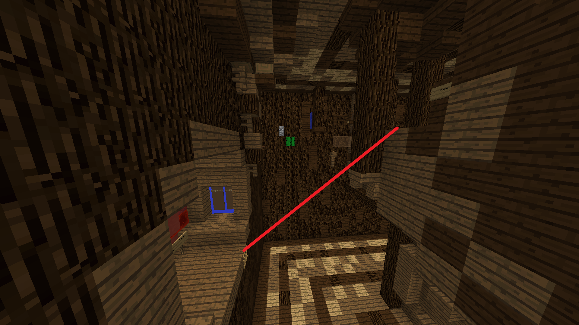
There is also a large skip here that would have to be blocked :)
What actually is the theme for this map? Not that I think its bad or anything I just don't know. Good luck with submission :)
So starting from the brown carpet, am I supposed to go the first pane (which is possible)?or am i supposed to go the head and then onwards to the next head. Then if it is to that head do i go back to the first pane, or to the water? this part was very confusing. Could maybe add some panes or similar to make it more straightforward.
There is also a large skip here that would have to be blocked :)
What actually is the theme for this map? Not that I think its bad or anything I just don't know. Good luck with submission :)
Hey! (I am not a map judge, only providing feedback). although i have literally no idea what this build is based off, it looks nice :D the parkour is really nice too with some really interesting jumps. I have a bit of feedback on this part of the parkour, where I got totally lost:
View attachment 60566
So starting from the brown carpet, am I supposed to go the first pane (which is possible)?or am i supposed to go the head and then onwards to the next head. Then if it is to that head do i go back to the first pane, or to the water? this part was very confusing. Could maybe add some panes or similar to make it more straightforward.
View attachment 60567
There is also a large skip here that would have to be blocked :)
What actually is the theme for this map? Not that I think its bad or anything I just don't know. Good luck with submission :)
here is the path, i added some signs
Last edited:
it is head to head, ill try to clean that up ty for feedback :) the theme was originally just a random wood thingy that i made for fun, not even intended to be a map, then it became a long wooden rod, and i thought the start looked like a snake's head so i made it wooden snake themed lol
here is the path, i added some signs
View attachment 60608
here is the path, i added some signs
View attachment 60608
Hello _EnderKitten_,
I regret to inform you that your map is being rejected.
The theme of your map isn't very original. While the theme could work in ManaCube, the execution of the build wasn't there so it was hard to judge the potential.
The build of your map is the main issue. It is inaccurate to the theme and it is hard to tell what exactly you were going for. Your build also lacks some depth and detail, especially on the serpent's head. In your next submission, try to steer away from the 3D pixel art aspect and make your build less blocky and a little more realistic to the theme you are going for. There are plenty of threads on the forums by other Mappers on how to build organic structures to give your builds a little more life!
The parkour is a decent length for a hard map, so good job on that! However, improvement is necessary. The parkour is somewhat messy and cramped on the inside, and is too hard for the average hard map. I recommend nerfing your parkour and making your pathing a little more clear in your next submission.[Emma]
Thank you for submitting this map, I would love to see more submissions from you!
- Status
- Not open for further replies.
2013 - 2024 © ManaLabs Inc.
ManaLabs is an Official Minecraft Partner
ManaCube is a multiplayer network for Minecraft Java Edition. IP: play.manacube.com
The ManaCube server is not endorsed by Mojang, AB.
ManaCube is a multiplayer network for Minecraft Java Edition. IP: play.manacube.com
The ManaCube server is not endorsed by Mojang, AB.