When building a map, players typically view the map building guidelines as a way to fully understand the process. Overtime, these guidelines have been muddled by a continual mistake made by newer mappers. We are currently facing a period in time where map quality is plummeting dramatically and we quickly need to address this situation. From here forward, I will first discuss map quality, which includes build quality and parkour quality. As an example, I will first show you a map I deem to be of the highest quality.
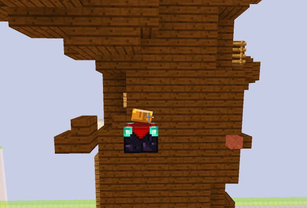
Pictured above is the map UnicycleBear (Easy). I haven’t shown the build yet but I trust you will trust my judgement when it comes to map quality. In terms of parkour quality, this map is varied and fun. It fits the difficulty so no complaints. When examining this picture though, you notice the enchantment table, it doesn’t blend in. Aesthetic wise this is wrong, but functionality wise this is good. When helping EwoutV with this course, I told him that a head hitter jump might be a little too hard for a new player, so I told him to make it shorter than an actual block. This enchantment table has a purpose where if you run from the bottom of the dark oak stair and continue running until you are off the block, you will be able to bridge the gap and land on the enchantment table without requiring you to hit your head. Now, when examining the build, the map also shines.
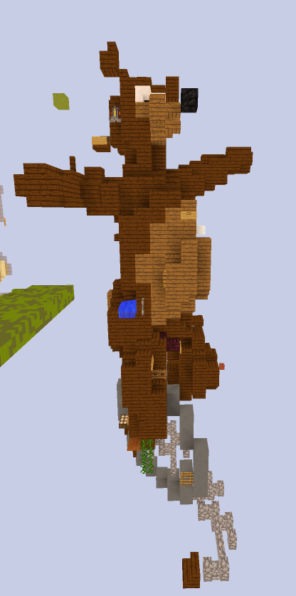
You can instantly recognize that the build pictured above is a Bear on a Unicycle, hence the map title, UnicycleBear. It looks nice and there are no scaling issues within the build. The only problem I could identify within this photo is an unpleasing brewing stand at the top, but aesthetic is subjective. This is a fantastic example of a great easy map that would be accepted without hesitation. Now, if we view an easy map that's currently submitted, we’ll notice a problem and a stark difference in quality.
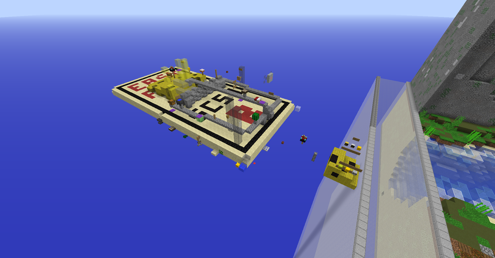 Pictured above is an accepted course titled “Mousetrap”. Build wise it’s simplistic but it’s nothing special. I don’t think too much effort went into this course as it’s just a rectangle with detailing on the top. I know a mousetrap isn’t that detailed either but you should choose a better theme if that is your problem. When examining the parkour it gets worse:
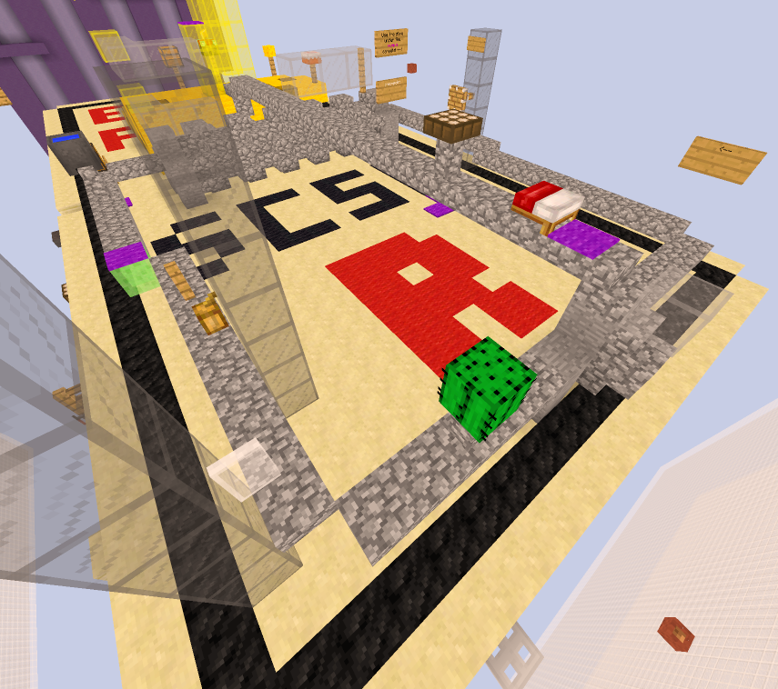
Let’s look at the parkour in terms of functionality. That cocoa bean pictured on the glass does nothing to change the jump to the white glass pane. That cactus block does nothing to change the jump to the cobble wall. That half-bed does nothing to change the jump to the daylight sensor. That filled cauldron does nothing to change the jump to the slime. Every single jump I listed above has a pointless block change that does nothing but harm the overall look of your map. When choosing blocks for certain jumps, you should consider functionality and aesthetic. The creator of this parkour didn’t consider either of those things. The only redeeming quality about this map is that the difficulty of the map somewhat fits.
Let’s take a look at difficulty now. When building parkour for your map, always have a difficulty in mind. It is also important that you have both skilled players and less skilled players test your map to gauge the difficulty of jumps. This will allow you to effectively nerf your parkour course. I will now present an example of parkour that does not fit the difficulty of the map.
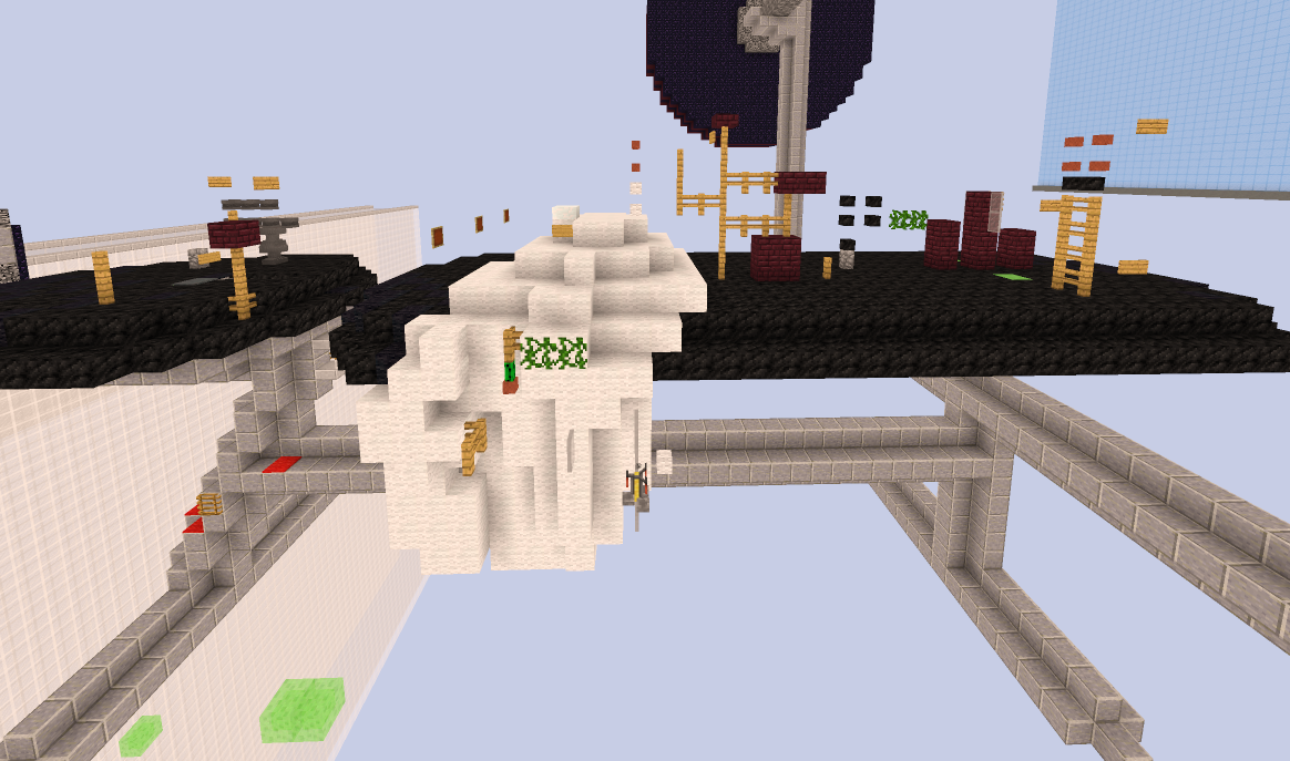
This absolute gauntlet of a course is called BenchPress (Hard). There are some rather tricky jumps here. In the front you have a fence to block 3+1 which requires a 2 tick timing I believe. Further on, there is a weird vine jump where you have to jump around two different facing heads. It’s tricky for a hard map. After that is a weird butterfly slime neo and a jump where you need to jump on the side of heads with flower pots on top. These are jumps I would see on expert maps. I will not point out the unnecessary blocks above but please tell me if you see them in this forum thread.
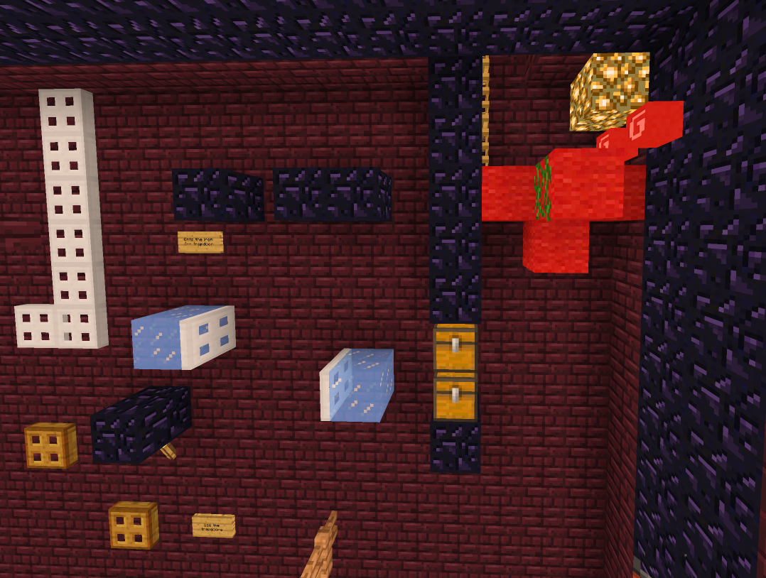
Here is another example from the same map. There is a chest head hitter jump and then an ice 3 block ceiling 3+1. After that is a simple jump to a trapdoor and then to a vine. The last jump before the end of the map is a 3 block gap head hitter to grab the vine on the red wool. The thing that makes this tough is that it is x-facing which makes you hit the obsidian pillar’s corner sooner than you’d expect.
Now let’s take a look at an expert map accepted last month.
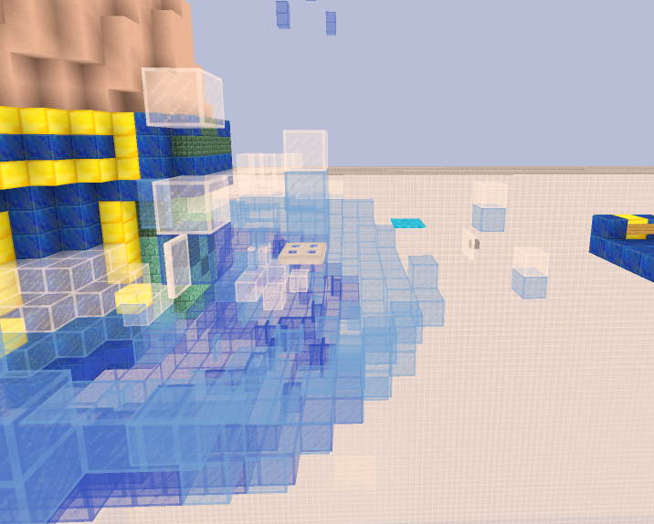
This is the start of the map Poseidon (Expert). It is far easier than the entirety of BenchPress which says something. Pictured above is an x-facing jump to a glass pane, a jump to a carpet and then to an iron trapdoor. From the iron trapdoor you go to the white pane, and then you do a pane up to the left light blue pane. This matches the difficulty of an expert unlike the latter map of BenchPress.
When examining Block Necessity / Functionality, I tend to notice that players seem to take the block variation rule at face value. They try to make every other block super unique, using brewing stands, cake, half beds, etc. These blocks typically add nothing to the course other than ruining the aesthetic which we noticed earlier with Mousetrap. Let’s take a look at two insane maps, one by a very skilled Mapmaker Kubikit, and another by one of the newer Mapmakers.
Examining Happy’s parkour, we notice a trend with this mapmaker.
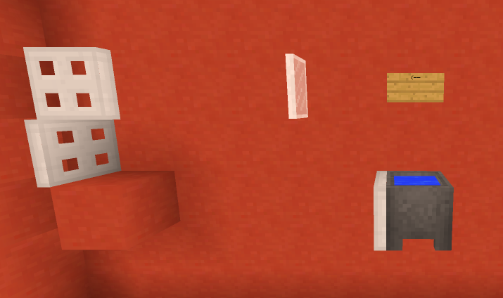
This is the creator of Mousetrap, and we notice he put another useless cauldron there which only harms the aesthetic of his map.
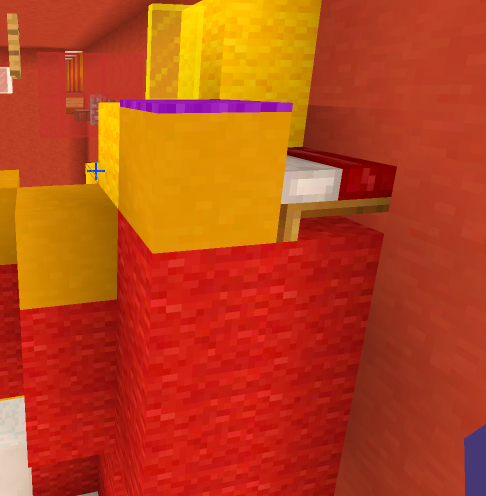
This half bed has the same functionality of a slab so it does nothing but make a map look more ugly.
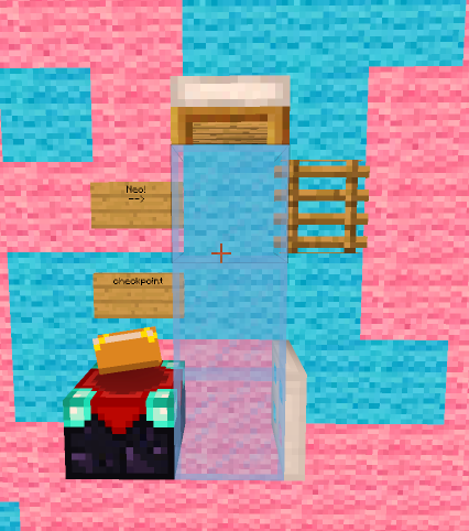
How does someone manage to make a jump look so ugly and pointless? The enchantment table changes the jump a little bit due to the different height but the half bed serves no purpose other than being an eyesore. It could simply be replaced by a slab or snow layers.
Now if we examine a map by Kubikit, you’ll notice something different
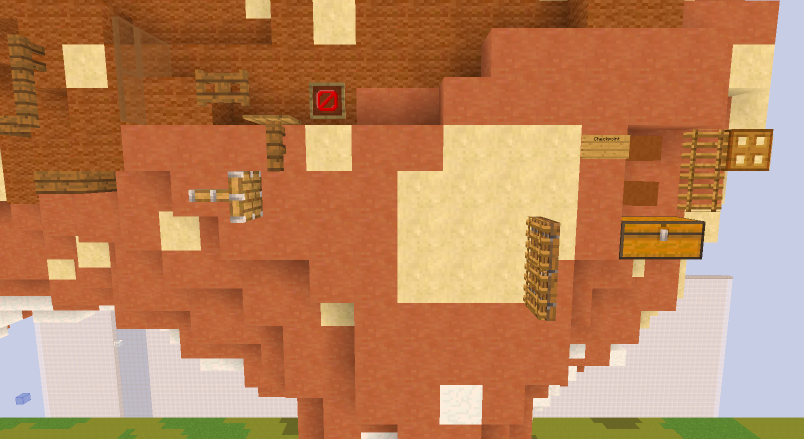
Pictured above is Symbiosis (Insane). When looking at this image, the path is clear and every block has a function. The slab to the piston head is blocked by a glass pane which serves to make the jump more difficult. The fence gate above the piston head restricts your movement and forces you to jump to the right of the piston head. The fence with a pressure plate is an anti-cheese mechanism made to make sure that if you open the fence gate and then jump, you activate the pressure plate which then closes the fence gate for the next player. After jumping from the piston head to the ladder, there is a door which you need to glitch into in order to jump to the chest. The heads above the chest force you to jump to the farther end of the chest. The ladder is nothing special but it helps you reach the trapdoor. The trapdoor allows you to jump to a cocoa bean that isn’t in frame. You can understand that I could name every purpose of each jump in that sequence in an insane map. They didn’t randomly place half-beds, cauldrons, or enchantment tables. Just to show you an actual cauldron jump, her is a picture of the map CheepCheepBeach (Insane)
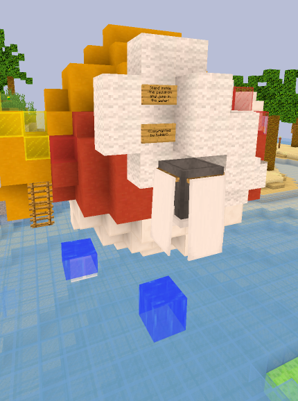
This jump can only be done by jumping from inside the cauldron. You have to jump from inside the cauldron, over the edge of the cauldron and into the water. If you were to jump from the upper rim or top of the block, you’d fall through the water. The same person who made the previous sequence made this as well seen by the sign that says Copyrighted by Kubikit.
This is just the tip of the iceberg when it comes to issues of new mappers. I hope people will read this and understand more about jump variation and difficulty issues. Always remember to have someone test your map, both skilled and unskilled.
Pictured above is the map UnicycleBear (Easy). I haven’t shown the build yet but I trust you will trust my judgement when it comes to map quality. In terms of parkour quality, this map is varied and fun. It fits the difficulty so no complaints. When examining this picture though, you notice the enchantment table, it doesn’t blend in. Aesthetic wise this is wrong, but functionality wise this is good. When helping EwoutV with this course, I told him that a head hitter jump might be a little too hard for a new player, so I told him to make it shorter than an actual block. This enchantment table has a purpose where if you run from the bottom of the dark oak stair and continue running until you are off the block, you will be able to bridge the gap and land on the enchantment table without requiring you to hit your head. Now, when examining the build, the map also shines.
You can instantly recognize that the build pictured above is a Bear on a Unicycle, hence the map title, UnicycleBear. It looks nice and there are no scaling issues within the build. The only problem I could identify within this photo is an unpleasing brewing stand at the top, but aesthetic is subjective. This is a fantastic example of a great easy map that would be accepted without hesitation. Now, if we view an easy map that's currently submitted, we’ll notice a problem and a stark difference in quality.
Let’s look at the parkour in terms of functionality. That cocoa bean pictured on the glass does nothing to change the jump to the white glass pane. That cactus block does nothing to change the jump to the cobble wall. That half-bed does nothing to change the jump to the daylight sensor. That filled cauldron does nothing to change the jump to the slime. Every single jump I listed above has a pointless block change that does nothing but harm the overall look of your map. When choosing blocks for certain jumps, you should consider functionality and aesthetic. The creator of this parkour didn’t consider either of those things. The only redeeming quality about this map is that the difficulty of the map somewhat fits.
Let’s take a look at difficulty now. When building parkour for your map, always have a difficulty in mind. It is also important that you have both skilled players and less skilled players test your map to gauge the difficulty of jumps. This will allow you to effectively nerf your parkour course. I will now present an example of parkour that does not fit the difficulty of the map.
This absolute gauntlet of a course is called BenchPress (Hard). There are some rather tricky jumps here. In the front you have a fence to block 3+1 which requires a 2 tick timing I believe. Further on, there is a weird vine jump where you have to jump around two different facing heads. It’s tricky for a hard map. After that is a weird butterfly slime neo and a jump where you need to jump on the side of heads with flower pots on top. These are jumps I would see on expert maps. I will not point out the unnecessary blocks above but please tell me if you see them in this forum thread.
Here is another example from the same map. There is a chest head hitter jump and then an ice 3 block ceiling 3+1. After that is a simple jump to a trapdoor and then to a vine. The last jump before the end of the map is a 3 block gap head hitter to grab the vine on the red wool. The thing that makes this tough is that it is x-facing which makes you hit the obsidian pillar’s corner sooner than you’d expect.
Now let’s take a look at an expert map accepted last month.
This is the start of the map Poseidon (Expert). It is far easier than the entirety of BenchPress which says something. Pictured above is an x-facing jump to a glass pane, a jump to a carpet and then to an iron trapdoor. From the iron trapdoor you go to the white pane, and then you do a pane up to the left light blue pane. This matches the difficulty of an expert unlike the latter map of BenchPress.
When examining Block Necessity / Functionality, I tend to notice that players seem to take the block variation rule at face value. They try to make every other block super unique, using brewing stands, cake, half beds, etc. These blocks typically add nothing to the course other than ruining the aesthetic which we noticed earlier with Mousetrap. Let’s take a look at two insane maps, one by a very skilled Mapmaker Kubikit, and another by one of the newer Mapmakers.
Examining Happy’s parkour, we notice a trend with this mapmaker.
This is the creator of Mousetrap, and we notice he put another useless cauldron there which only harms the aesthetic of his map.
This half bed has the same functionality of a slab so it does nothing but make a map look more ugly.
How does someone manage to make a jump look so ugly and pointless? The enchantment table changes the jump a little bit due to the different height but the half bed serves no purpose other than being an eyesore. It could simply be replaced by a slab or snow layers.
Now if we examine a map by Kubikit, you’ll notice something different
Pictured above is Symbiosis (Insane). When looking at this image, the path is clear and every block has a function. The slab to the piston head is blocked by a glass pane which serves to make the jump more difficult. The fence gate above the piston head restricts your movement and forces you to jump to the right of the piston head. The fence with a pressure plate is an anti-cheese mechanism made to make sure that if you open the fence gate and then jump, you activate the pressure plate which then closes the fence gate for the next player. After jumping from the piston head to the ladder, there is a door which you need to glitch into in order to jump to the chest. The heads above the chest force you to jump to the farther end of the chest. The ladder is nothing special but it helps you reach the trapdoor. The trapdoor allows you to jump to a cocoa bean that isn’t in frame. You can understand that I could name every purpose of each jump in that sequence in an insane map. They didn’t randomly place half-beds, cauldrons, or enchantment tables. Just to show you an actual cauldron jump, her is a picture of the map CheepCheepBeach (Insane)
This jump can only be done by jumping from inside the cauldron. You have to jump from inside the cauldron, over the edge of the cauldron and into the water. If you were to jump from the upper rim or top of the block, you’d fall through the water. The same person who made the previous sequence made this as well seen by the sign that says Copyrighted by Kubikit.
This is just the tip of the iceberg when it comes to issues of new mappers. I hope people will read this and understand more about jump variation and difficulty issues. Always remember to have someone test your map, both skilled and unskilled.
Last edited: