play.manacube.com
Loading Status...Rejected FlameMonster ¬ Easy
- Thread starter AmiraHh
- Start date
- Status
- Not open for further replies.
- Username
- Conorbg
- Map name
- FlameMonster
- Photos of your Parkour
-
View attachment 22185
View attachment 22186
View attachment 22187
- The # of your Plot / or warp name to it
- /plot tp conorbg 7
- Difficulty (Easy, Medium, Hard, Expert, Insane)
- Easy
- Number of jumps (Optional)
- 27
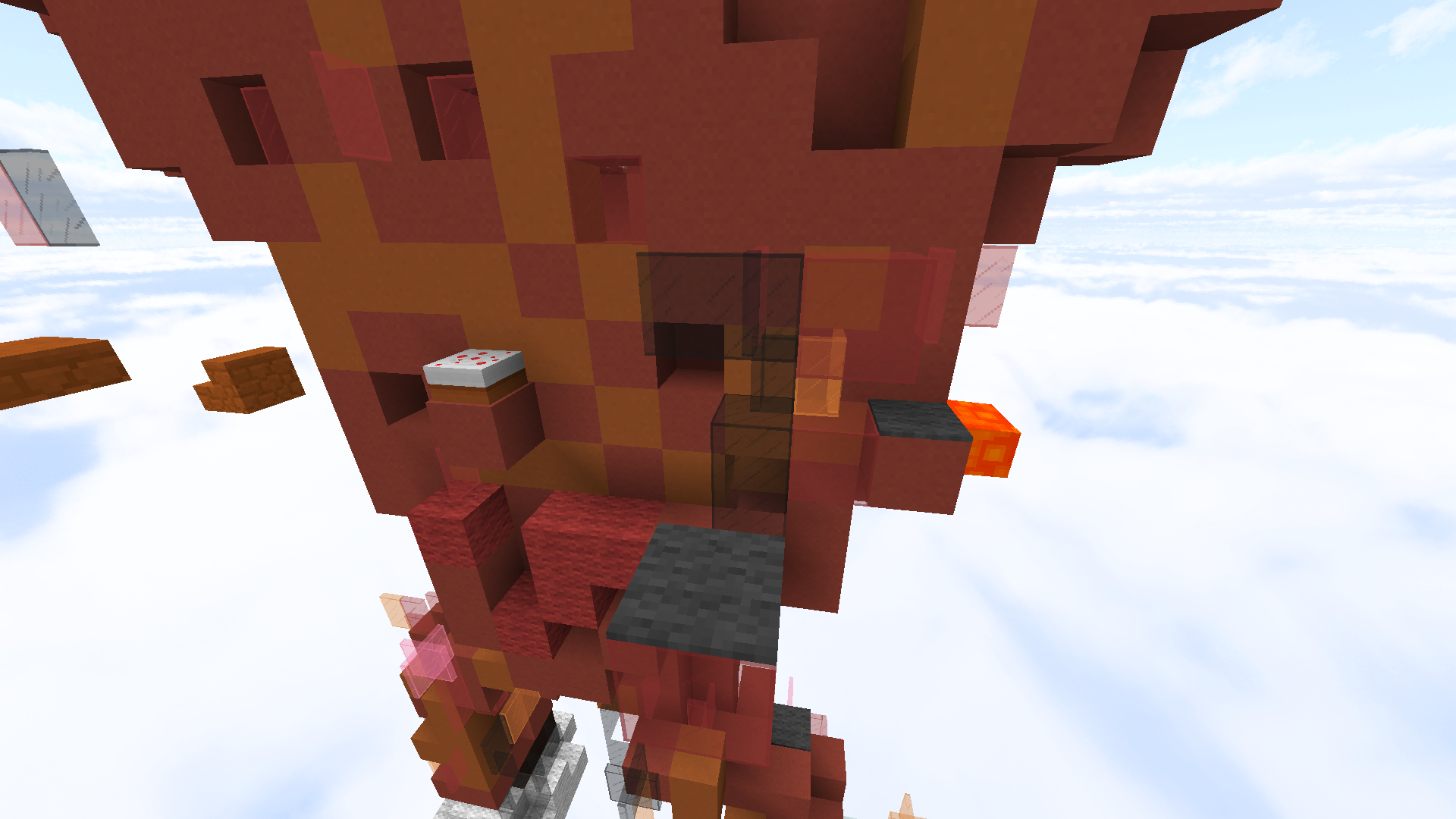
+0. I enjoyed the parkour, but I thought this part was a bit hard (carpet-carpet-cake):

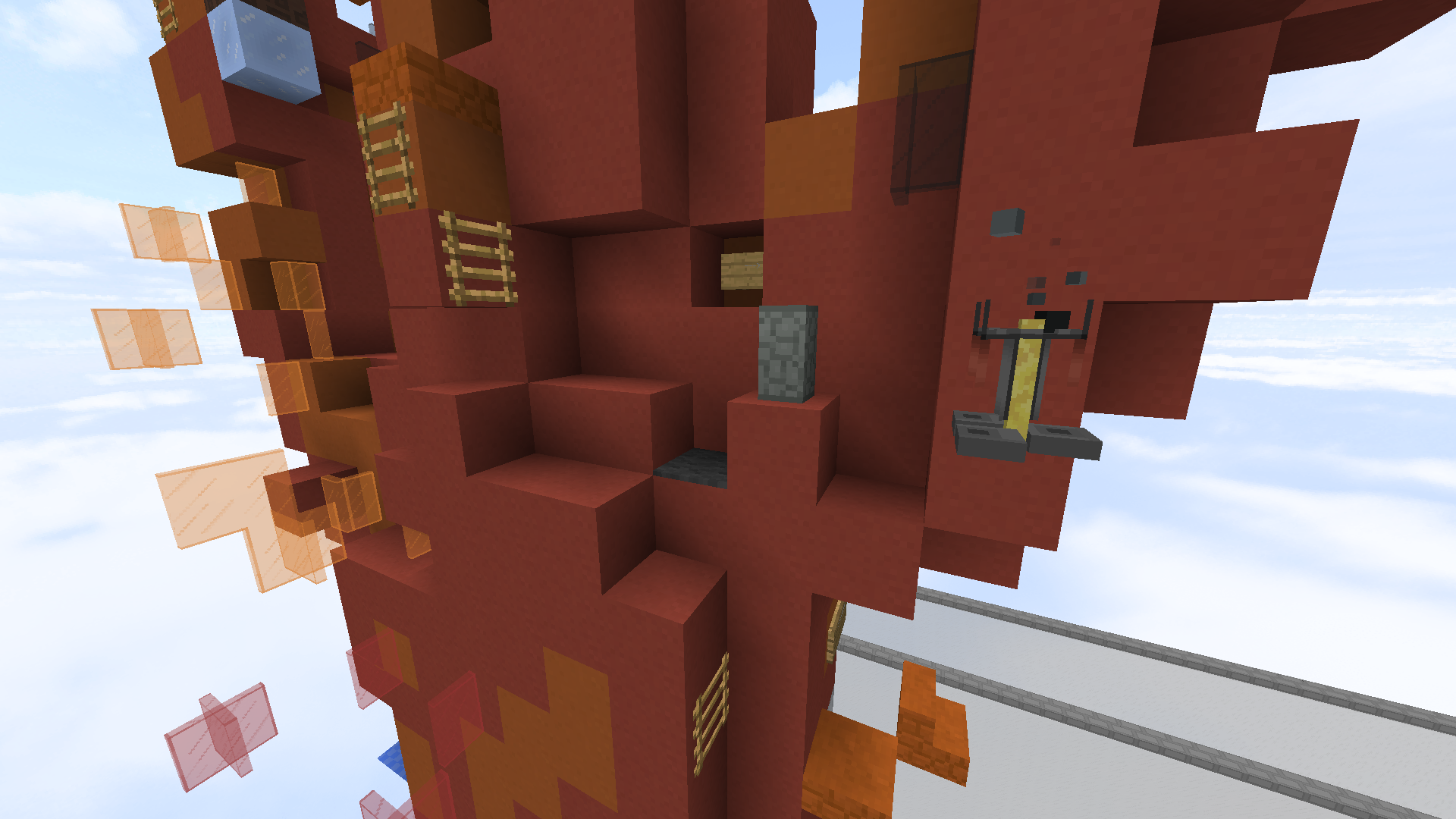
and I found a skip here (you don't need the wall or brewing stand jumps, you can go straight to the ladder):

The build is a bit flat and overall not very pleasing, in my opinion. I think it would look a lot better if it were fully 3D, and maybe with a slightly different color palette as it looks a bit dull for a "flame monster".
The theme is mostly original, we have a few monster maps and a few maps that are based on "fire beings" (e.g FirePhoenix), but none that combine the two as far as I'm aware.
Good luck! (keep in mind, I am not an official map judge; just a normal map tester :))
and I found a skip here (you don't need the wall or brewing stand jumps, you can go straight to the ladder):
The build is a bit flat and overall not very pleasing, in my opinion. I think it would look a lot better if it were fully 3D, and maybe with a slightly different color palette as it looks a bit dull for a "flame monster".
The theme is mostly original, we have a few monster maps and a few maps that are based on "fire beings" (e.g FirePhoenix), but none that combine the two as far as I'm aware.
Good luck! (keep in mind, I am not an official map judge; just a normal map tester :))
0+. Parkour is pretty solid but the build itself isn't something I like. I don't think "Flame Monster" when I see this build. It looks like someone had fun with world edit set percentages and tried to make a map out of it. I find it funny how the flame monster is wearing tennis shoes as well. It's flat and unattractive. As MCBYT said above, theme shouldn't be a problem.
you're going to need a miracle for this to get accepted.
good luck
you're going to need a miracle for this to get accepted.
good luck
- Username
- Conorbg
- Map name
- FlameMonster
- Photos of your Parkour
-
View attachment 22185
View attachment 22186
View attachment 22187
- The # of your Plot / or warp name to it
- /plot tp conorbg 7
- Difficulty (Easy, Medium, Hard, Expert, Insane)
- Easy
- Number of jumps (Optional)
- 27
Hello Conorbg,
I regret to inform you that your map is being rejected.
The theme is original; as MCBYT stated above, we do have "fire" maps and "monster" maps, but none that combine the two, so good job on that!
The build is plain, with the use of red clay throughout. I recommend using different variations of blocks throughout the entire build. It also looks a bit flat; try making a more three-dimensional monster!
The parkour is varied, and it is incorporated with the theme quite nicely, so good job on that! However, it gets quite confusing as to where you're supposed to go. Try having a clearer parkour path! It did fit the easy difficulty, so good job on that!
Thank you for submitting your map, I would love to see more submissions from you!
Have a nice day,
Kristina
- Status
- Not open for further replies.
2013 - 2024 © ManaLabs Inc.
ManaLabs is an Official Minecraft Partner
ManaCube is a multiplayer network for Minecraft Java Edition. IP: play.manacube.com
The ManaCube server is not endorsed by Mojang, AB.
ManaCube is a multiplayer network for Minecraft Java Edition. IP: play.manacube.com
The ManaCube server is not endorsed by Mojang, AB.


