play.manacube.com
Loading Status...Accepted Segway by MattTheCutie, TigerTwist & Inktest
- Thread starter FLOWRA
- Start date
- Status
- Not open for further replies.
Hello Matt, Tiger and Ink!
I am here to give you my review of the map! Please remember that I am not a Map Judge and my opinion doesn't affect whether the map gets accepted or not. If the Map Judges disagree with my opinions, they will go by their own thoughts!
Firstly the THEME of your map. To my knowledge, there is no map based off a Segway. Therefore it's an original map submission in my eyes, well done!
Secondly the BUILD of your map. It's simple, yet accurate to how a segway would look like! You have made the build accurate with proper scaling and block choices, no complaints with the build well done!
Lastly the PARKOUR of your map. To me, it was enjoyable to play through, so well done on that aspect! You also had great parkour block choices, that didn't make the map's aesthetic appearance any worse. The map is of appropriate length and has good and forgiving checkpoint placements. However, I find the parkour to be a little too difficult for an Easy map. There's a lot of tricky jumps that can be quite challenging to unexperienced players. Here's a few highlights, even though the entirety of the Parkour is a little tough for an Easy in my opinion.


(Notes: The third image isn't too bad, but it is X facing.)
(Notes: The fourth one is only annoying because of the ceiling carpet.)
I would go back and have a second look at the parkour, and work on what I could make a little bit easier on the map! You don't have to, but I think that would be a good idea! Again, if the Map Judges disagree with my opinion, they will go by what they think. REMEMBER THAT!!!
Right now, it's a +0.5 from me. :) Good luck!
I am here to give you my review of the map! Please remember that I am not a Map Judge and my opinion doesn't affect whether the map gets accepted or not. If the Map Judges disagree with my opinions, they will go by their own thoughts!
Firstly the THEME of your map. To my knowledge, there is no map based off a Segway. Therefore it's an original map submission in my eyes, well done!
Secondly the BUILD of your map. It's simple, yet accurate to how a segway would look like! You have made the build accurate with proper scaling and block choices, no complaints with the build well done!
Lastly the PARKOUR of your map. To me, it was enjoyable to play through, so well done on that aspect! You also had great parkour block choices, that didn't make the map's aesthetic appearance any worse. The map is of appropriate length and has good and forgiving checkpoint placements. However, I find the parkour to be a little too difficult for an Easy map. There's a lot of tricky jumps that can be quite challenging to unexperienced players. Here's a few highlights, even though the entirety of the Parkour is a little tough for an Easy in my opinion.
(Notes: The third image isn't too bad, but it is X facing.)
(Notes: The fourth one is only annoying because of the ceiling carpet.)
I would go back and have a second look at the parkour, and work on what I could make a little bit easier on the map! You don't have to, but I think that would be a good idea! Again, if the Map Judges disagree with my opinion, they will go by what they think. REMEMBER THAT!!!
Right now, it's a +0.5 from me. :) Good luck!
Hello Matt, Tiger and Ink!
I am here to give you my review of the map! Please remember that I am not a Map Judge and my opinion doesn't affect whether the map gets accepted or not. If the Map Judges disagree with my opinions, they will go by their own thoughts!
Firstly the THEME of your map. To my knowledge, there is no map based off a Segway. Therefore it's an original map submission in my eyes, well done!
Secondly the BUILD of your map. It's simple, yet accurate to how a segway would look like! You have made the build accurate with proper scaling and block choices, no complaints with the build well done!
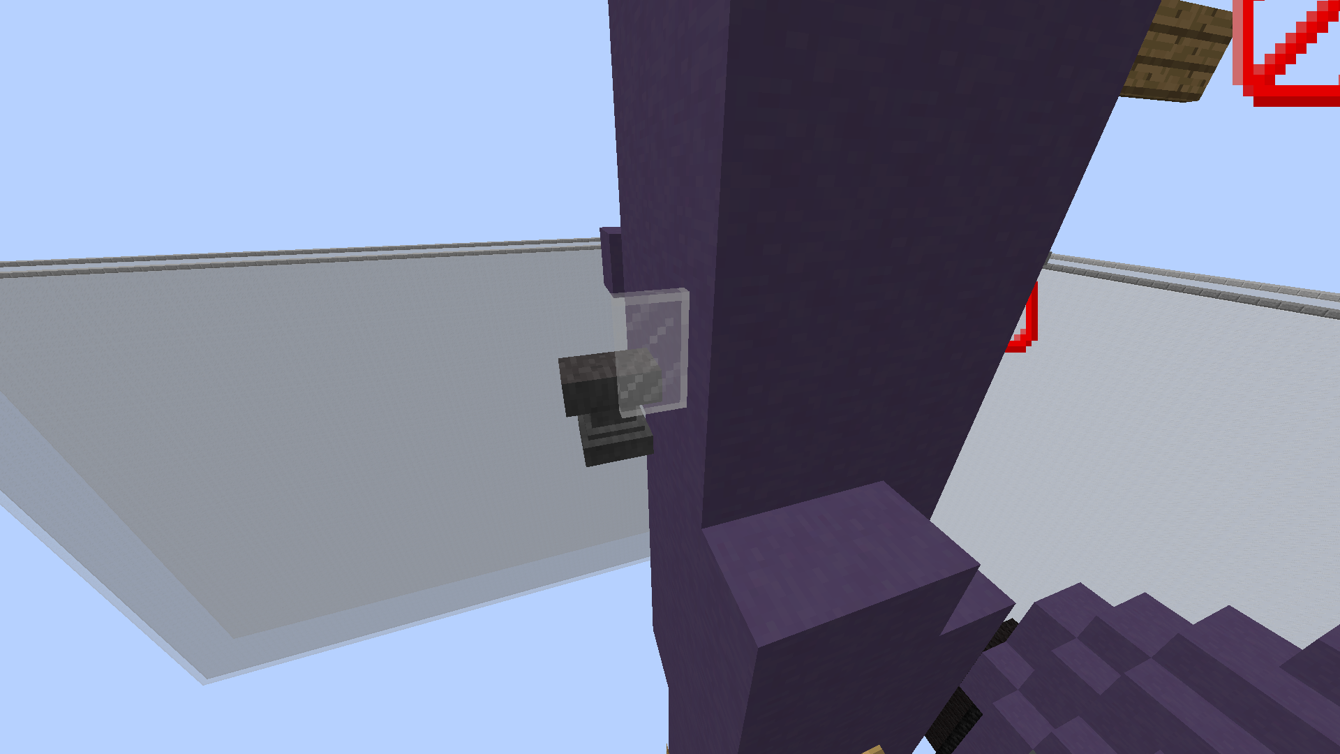
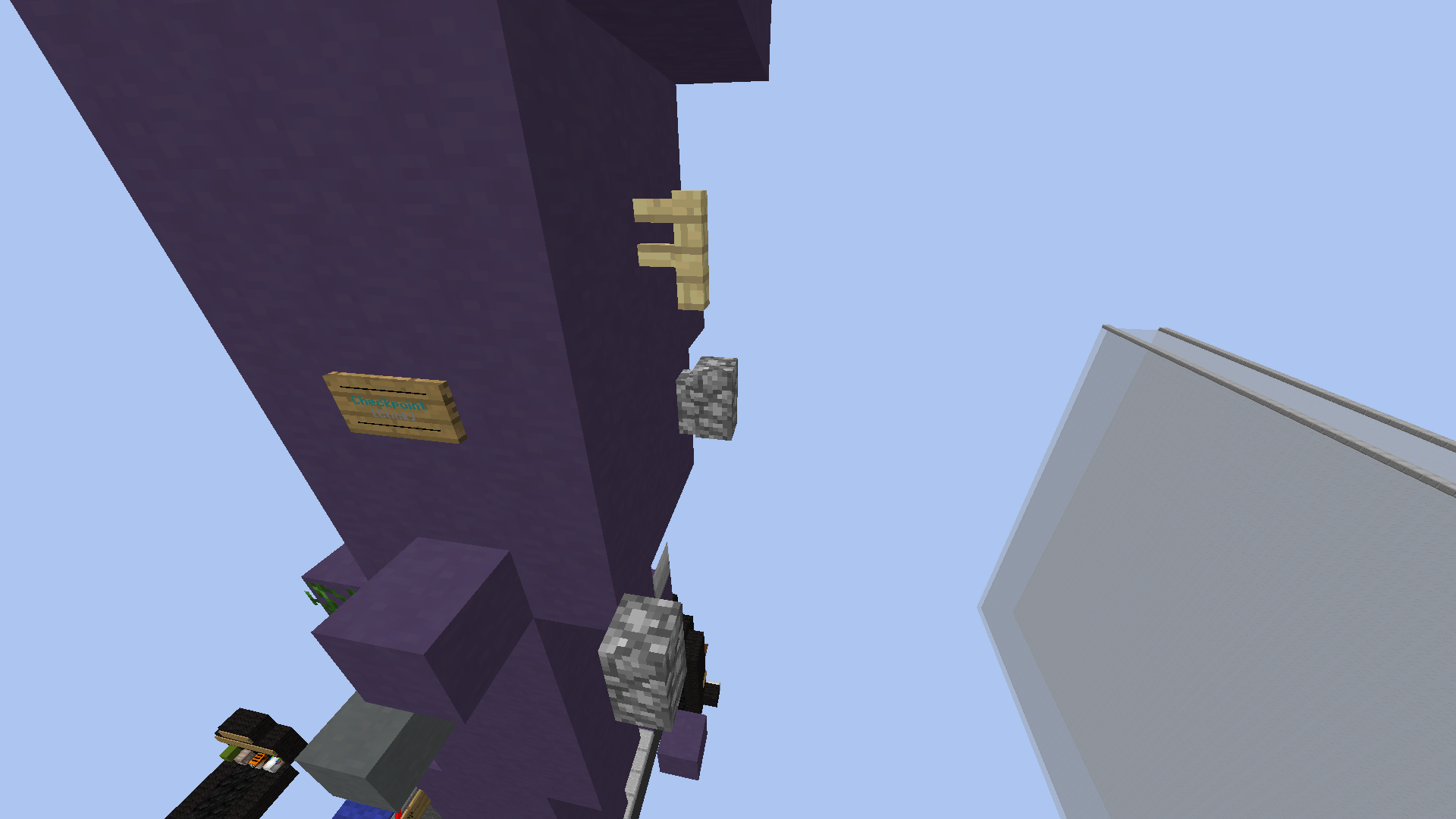
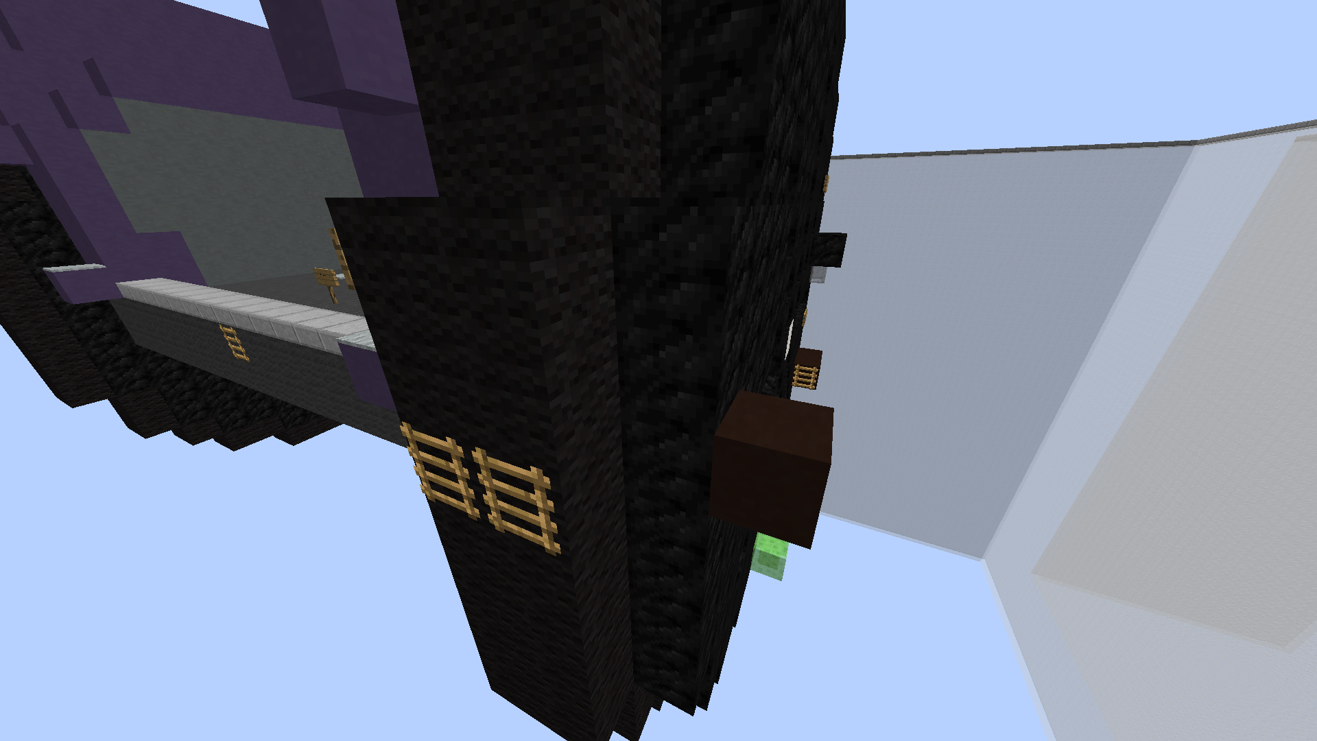
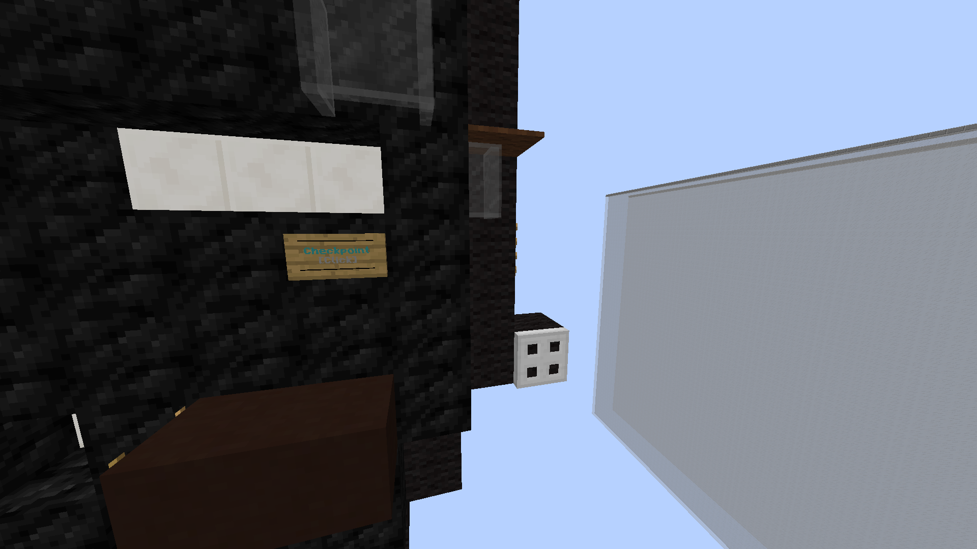
Lastly the PARKOUR of your map. To me, it was enjoyable to play through, so well done on that aspect! You also had great parkour block choices, that didn't make the map's aesthetic appearance any worse. The map is of appropriate length and has good and forgiving checkpoint placements. However, I find the parkour to be a little too difficult for an Easy map. There's a lot of tricky jumps that can be quite challenging to unexperienced players. Here's a few highlights, even though the entirety of the Parkour is a little tough for an Easy in my opinion.
View attachment 40505
View attachment 40506
View attachment 40507
View attachment 40508
(Notes: The third image isn't too bad, but it is X facing.)
(Notes: The fourth one is only annoying because of the ceiling carpet.)
I would go back and have a second look at the parkour, and work on what I could make a little bit easier on the map! You don't have to, but I think that would be a good idea! Again, if the Map Judges disagree with my opinion, they will go by what they think. REMEMBER THAT!!!
Right now, it's a +0.5 from me. :) Good luck!
I'll try to nerf the second photo
The third photo I'll put a double layer of ladders, so it's easier
For the fourth, oops, I putted the carpet without realising the parkour below
In the first photo, where the pane and anvil, there's a cp r¡ght there so I don't think it's much of a deal
I'll try to nerf the second photo
The third photo I'll put a double layer of ladders, so it's easier
For the fourth, oops, I putted the carpet without realising the parkour below
I'll try to nerf the second photo
The third photo I'll put a double layer of ladders, so it's easier
For the fourth, oops, I putted the carpet without realising the parkour below
based off of the photos the build is negatively affected by the parkour quite alot. the parkour hasnt been well blended and that is probably due to the colour of your segway being purple and not many parkour blocks being such a colour. in the future take into consideration this aspect of making a map so the end result is alot more visually appealing. you can try placing banners and replacing carpets to be purple but make sure not to inhibit sight to much as it is only an easy :). you can also help reduce the parkour's visual impact on most builds by a well thought out path. in your case it looks like it would be impossible to achieve a desirable result as the stem of the segway is quite thin, causing the protrusions to have a significant silhouette. proportion wise for the build, id say the stem was a tad short, this is because if you can imagine someones feet being placed on the segway the stem would only be at best 2 feet tall which is to short for an adult. that being said the form of the build looks decent and your colour choices suited the build well. i do feel however due to the theme maybe the colour palette is a bit limited. i know this is only meant to be an easy map but having the segway be dooing something or have some other aspect to the build can help balance this issue.
anyways, good job on this and good luck!
anyways, good job on this and good luck!
Hello MattTheCutie, TigerTwist, and Inktest,
I am happy to inform you that your map is being accepted!
The theme is original, as we don't have any maps like this, well done!
The build is accurate to what you were going for, and is pleasing to look at.
The parkour is varied throughout, and the length of the course and difficulty of the jumps are good for the easy difficulty!
Thank you for submitting this map, I would love to see more submissions from you!
Have a nice day,
Kristina
- Status
- Not open for further replies.
2013 - 2024 © ManaLabs Inc.
ManaLabs is an Official Minecraft Partner
ManaCube is a multiplayer network for Minecraft Java Edition. IP: play.manacube.com
The ManaCube server is not endorsed by Mojang, AB.
ManaCube is a multiplayer network for Minecraft Java Edition. IP: play.manacube.com
The ManaCube server is not endorsed by Mojang, AB.