Rejected Deadmau5 - Insane

Status
Not open for further replies.

zzykrkv

Dedicated Member
VIP+
zzykrkv
zzykrkv
VIP+
Joined
May 29, 2020
Posts
238
Ratings
203 5
#1
I'm back with another piece of cancer!

Name: Zzykrkv
Map: Deadmau5
/plot v zzykrkv 3 AND GO UP. ITS IN THE AIR GO UP.
Difficulty: Insane
Jumps: 122 (many of them are really easy transitions tho, real count is closer to 100)

So um this map was based of the epic producer deadmau5, I recommend u check him out his music is sexy af.

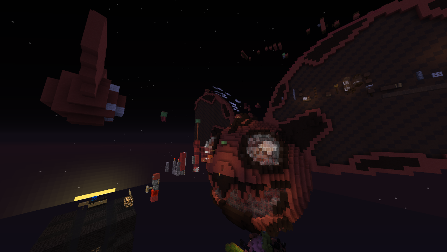
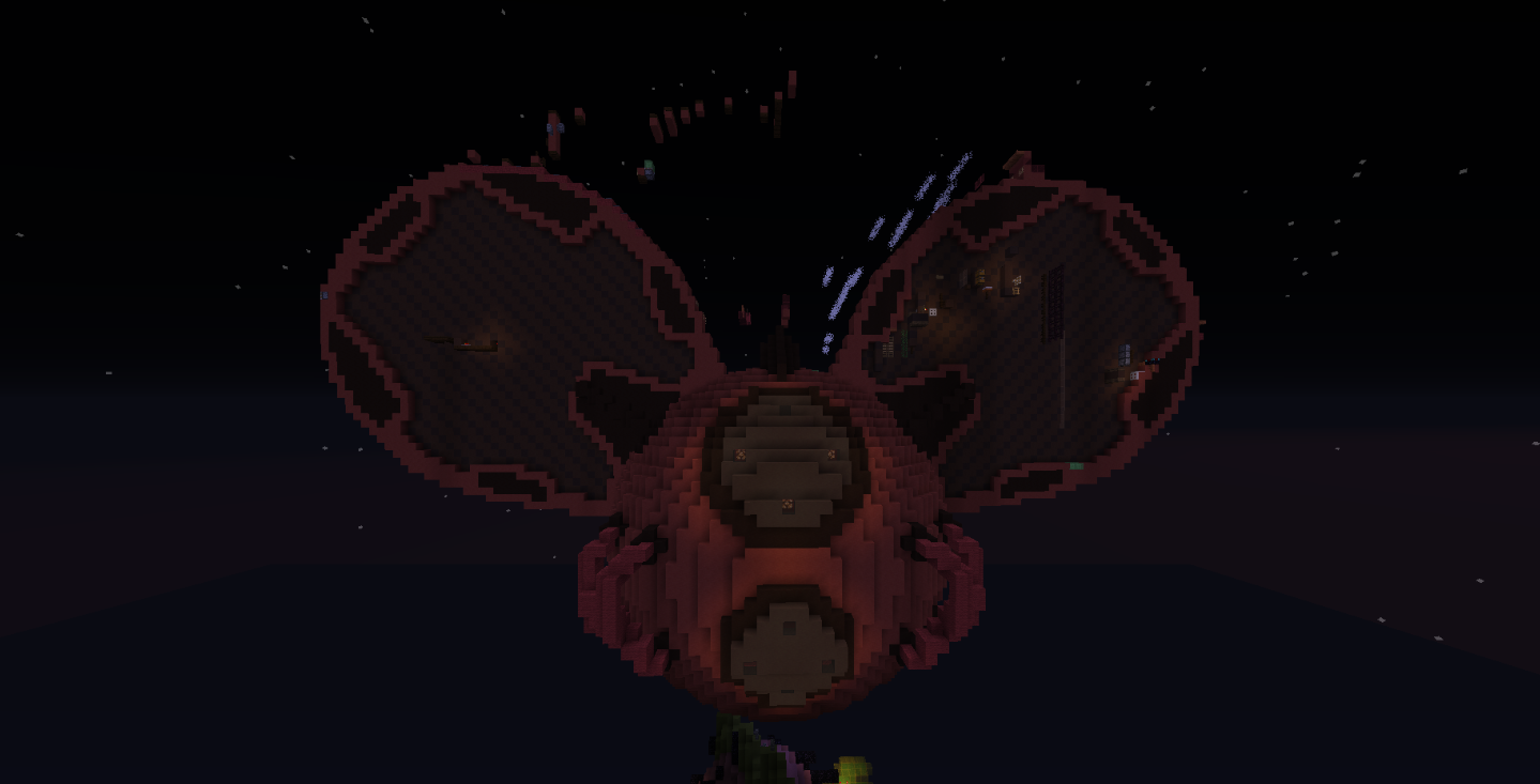
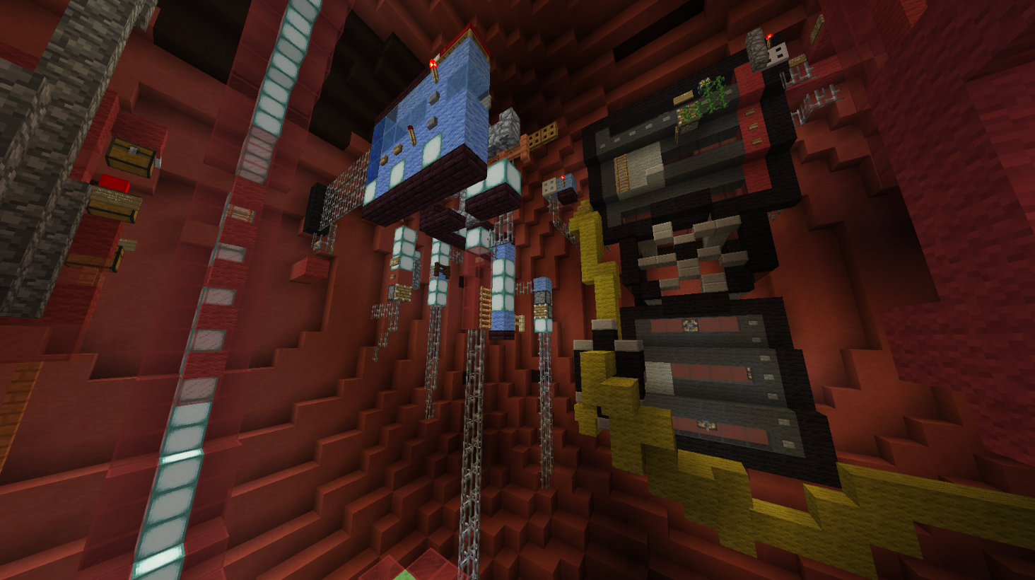
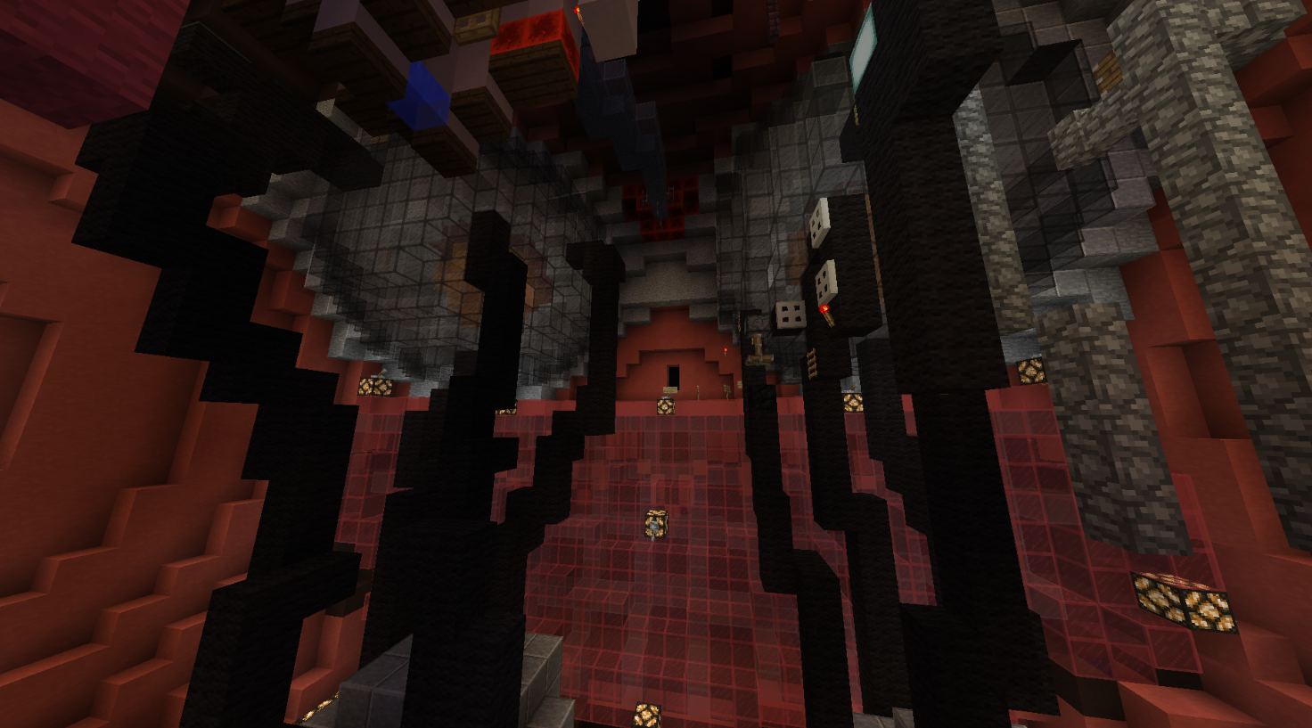
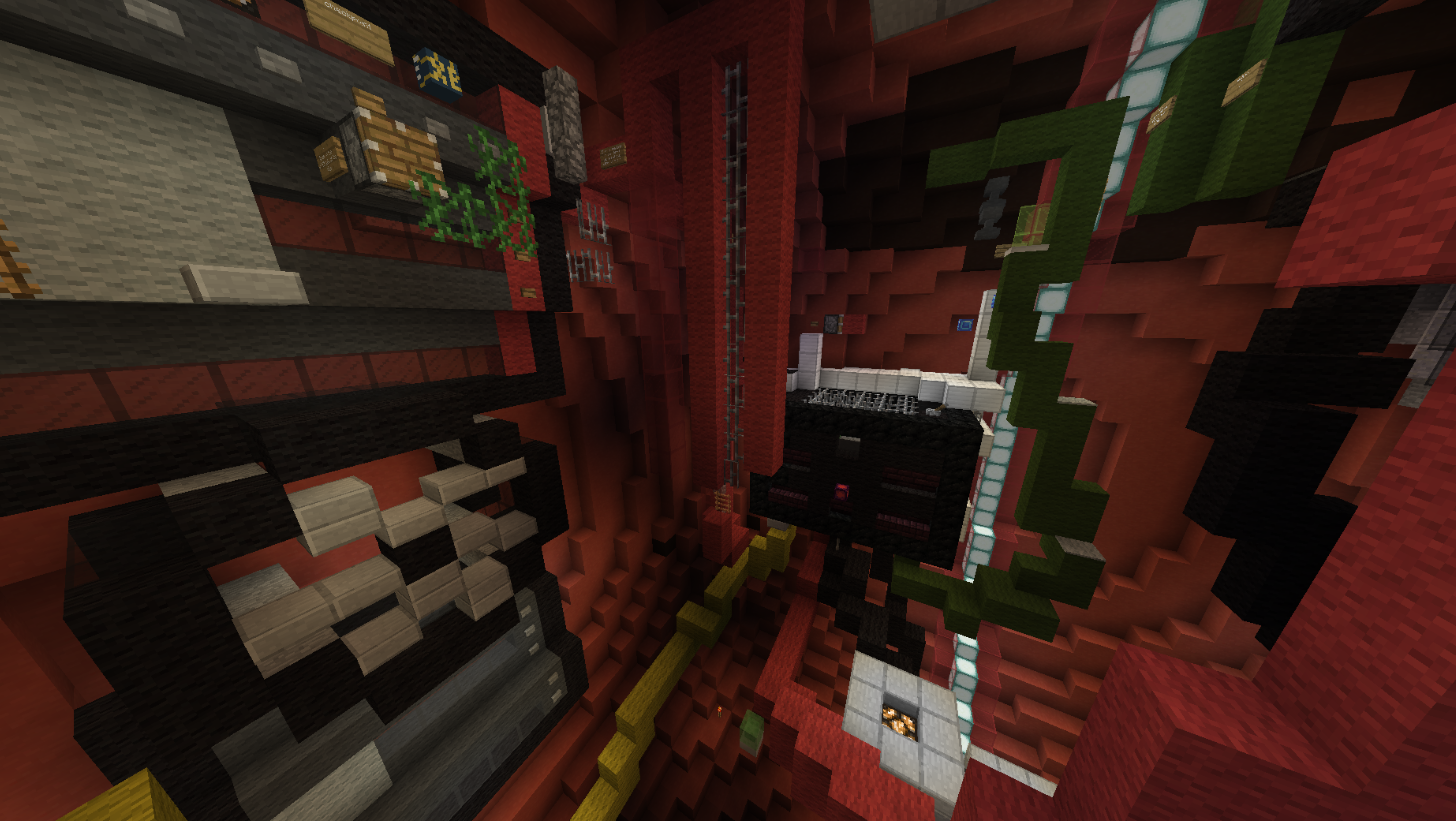
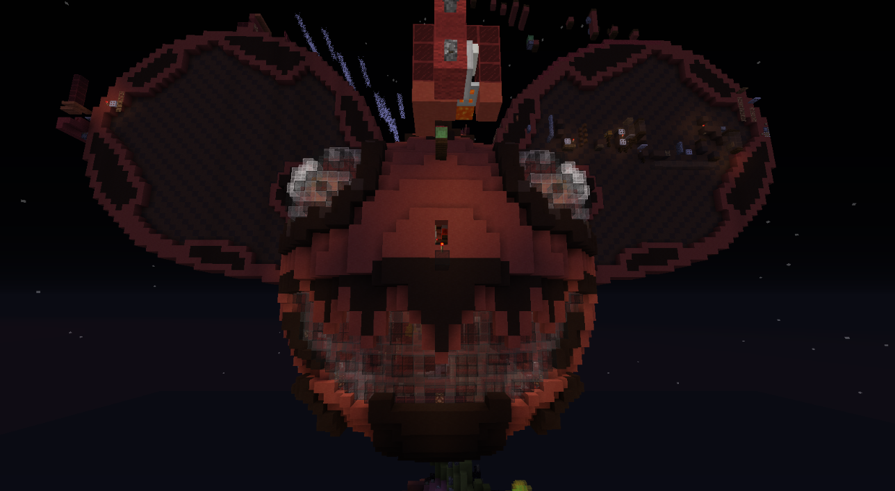
I always imagined the mau5head to be some robotic dude like Æsir from Cytus II. So, I designed him this way, making the inside of the helmet filled with electronics. Overall, i'm really proud of how this build turned out.

The parkour also sort of fits the theme, being heavily centred around redstone. I understand this is an issue, as piston redstone is banned, but the thing is, when I make maps, I don't make them so that they can fit in the regulations the best, I make them how I picture them in my mind. This was an idea I had been thinking about for a while, so i'm going to make it in my vision. I make maps for the server, yes, but more importantly, I make them for myself to have fun and challenge my own self. If changes are required, that's fine, but at least I can have a finished product that I am as proud of as can be.

I think there are some unbalanced parts, so anyone is free to play the map and give feedback on it, I might even credit you in the start :D.

Another thing to note, one of the jumps makes use of the west facing piston, so if that is not allowed, I'd request for that to be replaced with a dark oak fence, as that provides the exact same jump hitbox wise.

Anf btw, here's the inspiration for the design.

Photo Time
1599551469633.png

1599551490417.png

1599551509354.png

1599551520835.png

1599551535658.png

1599551551005.png
 

Blurpyfied

Forum God
ELITE
Blurpyfied
Blurpyfied
ELITE
Joined
Jan 1, 2017
Posts
1,856
Ratings
985 875
#2
Theme/Build: Original, Build personal opinion, it isnt the best imo as it just feels like a giant sphere with some circles on the side with insane detail.

Parkour: The parkour just looks like it's messy and not the best looking/appealing to me

For this I will give you a 0
 

Destroyer

Dedicated Member
ELITE
TheDestroyer7234
TheDestroyer7234
ELITE
Joined
Mar 27, 2020
Posts
218
Ratings
144 6
#3
Well just ignore Noah. The build isn't just a sphere with some circles on the side lmao. Although the base is just a sphere with some ears sticking out, that's the most iconic part. And how could the build be bad if it has "insane detail".

But I think this map is still as sick as the first time I saw it! The theme is amazing (deadmau5 is a really good producer), and I also think the build is amazing, considering it's not just what he usually shows or wears, but is from the Let Go music video which zzy provided at the top. I think it looks really accurate to what it shows, and I also think the parkour is new and at most parts, fun and interesting. Well, some jumps were pretty hard xD. But still different then most maps.
I wish you the best of luck!!
 

zzykrkv

Dedicated Member
VIP+
zzykrkv
zzykrkv
VIP+
Joined
May 29, 2020
Posts
238
Ratings
203 5
#4
Theme/Build: Original, Build personal opinion, it isnt the best imo as it just feels like a giant sphere with some circles on the side with insane detail.

Parkour: The parkour just looks like it's messy and not the best looking/appealing to me

For this I will give you a 0
Btw, what do those numbers mean? I've never quite figured out except that +1 is good and -1 is bad, but what does it actually mean tho?
 

WICKEDMagma

Dedicated Member
Mapper
WICKEDMagma
WICKEDMagma
Joined
Jul 5, 2020
Posts
127
Ratings
163 9
#6
Theme/Build: Original, Build personal opinion, it isnt the best imo as it just feels like a giant sphere with some circles on the side with insane detail.

Parkour: The parkour just looks like it's messy and not the best looking/appealing to me

For this I will give you a 0
If I had a dollar for every time you gave someone a +1 I would be in debt.
 

Blurpyfied

Forum God
ELITE
Blurpyfied
Blurpyfied
ELITE
Joined
Jan 1, 2017
Posts
1,856
Ratings
985 875
#7
After going in game and looking at your map, I have decided to change my 0 to a -1 for the following reasons

Firstly I really do think the build has potential into being a map but I found the parkour confusing and way to hard for an insane.

I think you should completely redo the whole parkour itself (not the build) but the parkour and make it way less confusing and complicated like this jump "slime to ladder" BUT I COULDN'T FIND THE LADDER
2020-09-10_09.28.39.png
and feel like this map is mostly timing which is just really repetitive and not the best if it's constantly timing. Other than that, there where only a few normal blocks and not much blocks like ice,soul sand,etc.

Overall this map doesn't have the best effort for parkour imo because of how many timings,the confusion of where to go,and not many normal block jumps gets repetitive and boring to play. You also need to go around and put some barriers down just in case we are going the wrong way and what not.

Sorry but I will be keeping my -1
 

zzykrkv

Dedicated Member
VIP+
zzykrkv
zzykrkv
VIP+
Joined
May 29, 2020
Posts
238
Ratings
203 5
#8
After going in game and looking at your map, I have decided to change my 0 to a -1 for the following reasons

Firstly I really do think the build has potential into being a map but I found the parkour confusing and way to hard for an insane.

I think you should completely redo the whole parkour itself (not the build) but the parkour and make it way less confusing and complicated like this jump "slime to ladder" BUT I COULDN'T FIND THE LADDER View attachment 36012 and feel like this map is mostly timing which is just really repetitive and not the best if it's constantly timing. Other than that, there where only a few normal blocks and not much blocks like ice,soul sand,etc.

Overall this map doesn't have the best effort for parkour imo because of how many timings,the confusion of where to go,and not many normal block jumps gets repetitive and boring to play. You also need to go around and put some barriers down just in case we are going the wrong way and what not.

Sorry but I will be keeping my -1
Thanks for the feedback

could you be a bit more specific on what you mean by "timings"? And also more examples of where it was confusing would also help a ton.
 

Destroyer

Dedicated Member
ELITE
TheDestroyer7234
TheDestroyer7234
ELITE
Joined
Mar 27, 2020
Posts
218
Ratings
144 6
#9
Thanks for the feedback

could you be a bit more specific on what you mean by "timings"? And also more examples of where it was confusing would also help a ton.
I think it was just confusing because it might look a little messy in places, and the signs help only sometimes. But I think because he wasn't added, he couldn't do most of the jumps considering they're redstone parkour. Although some jumps are pretty hard, it can't be too easy! I tried it again today and I made it outside of the head in about 10 min (without the redstone jumps tho). But I think adding arrow heads or carpets will make it easier. It's best to not use too many signs.
 

GeorgeVa

Well-Known Member
Joined
Apr 22, 2020
Posts
63
Ratings
43 1
#10
Wow, what a build. Certainly looks impressive. Unfortunately I do not think I will be able to test the parkour, but I wish you the best of luck zzyk!
 

Pris

Forum Expert
ELITE
Prisioner
Prisioner
ELITE
Joined
Apr 1, 2020
Posts
367
Ratings
383 7
#12
I really like the parkour and build is amazing, but it's hell for trackpad users like me :(
 

IPattyI

Forum Legend
PATRON
IPattyI
IPattyI
Patron
Joined
May 12, 2019
Posts
1,097
Ratings
501 11
#13
Hey zzy,

Unfortunately, I will be REJECTING this map submission.
  • Theme: There are no problems with the theme whatsoever as we have no Deadmau5 themed maps on the server. Great job on picking out something new!
  • Build: Personally, I think the build was pretty well-executed. Most importantly, it looks exactly like what you were going for and has a clear and strong focus. Furthermore, the detailing and shaping were superb, there's not a lot of negatives things to say about the build. If anything, the floating parkour does take it down a notch slightly.
  • Parkour: Now, as you probably suspected, the map is getting rejected due to the parkour. As you were well aware, pistons cannot be used in maps. It's not because we don't want them, but because they simply don't work. And, it's a shame because I enjoyed a lot of the piston jumps on this map (even if they were incredibly difficult). Now, the parkour is definitely long enough for the insane difficulty, but, it is way way way too difficult. The entire map judge team gave the map a look and we decided we are not up to accepting a map that is this difficult, and the issue with the pistons also cemented our decision. Listen, I don't want this map to go to waste as I really enjoyed it, so please try your best to resubmit it with a much more appropriate level of difficulty. Keep me updated.
I hope you take these criticisms into consideration if you decide to resubmit your map in the future!
 
Status
Not open for further replies.